Page 1 of 1
Different outputs
Posted: 09 Apr 2016, 22:03
by OCTO
What is difference between these two files?
Any comment is welcome.
Re: Different outputs
Posted: 09 Apr 2016, 22:43
by John Ruggero
The second example has some stem issues with 16th notes.
Re: Different outputs
Posted: 10 Apr 2016, 06:39
by OCTO
I don't know how it is rendered on your screen, what do you mean as "issue"?
Re: Different outputs
Posted: 10 Apr 2016, 06:57
by tisimst
OCTO wrote:What is difference between these two files?
I don't see any difference at all between the two. I even rotated the page so I could cross my eyes to see the difference (since I couldn't see anything different in the normal orientation) and I didn't see any aberrations in what my left eye saw vs what my right eye saw. Is there something truly different?
Re: Different outputs
Posted: 10 Apr 2016, 07:17
by Knut
tisimst wrote:OCTO wrote:What is difference between these two files?
I don't see any difference at all between the two. I even rotated the page so I could cross my eyes to see the difference (since I couldn't see anything different in the normal orientation) and I didn't see any aberrations in what my left eye saw vs what my right eye saw. Is there something truly different?
+1
Re: Different outputs
Posted: 10 Apr 2016, 10:06
by Alexander Ploetz
Grace note ledger line have different thickness, but I wouldn't have found it if I had not been looking for, well... anything.
Re: Different outputs
Posted: 10 Apr 2016, 10:27
by OCTO
Correct.
This is my test, which is connected and resulted from another thread. IMO, the grace notes and cautionary clefs should be emboldened to correct the BW-balance with the rest of music. Finale and I guess Sibelius don't do this, but just resize everything equally. The difference between thin lines of reduced symbols and the rest of regular sized music dramatically increases, which makes a "drop" in the visual perception and quick assimilation by musicians.
The items which are manually edited are:
- cautionary G clef is emboldened slightly
- grace-ledger lines are equal to normal ledger lines
- grace-stems are equal to normal stems
- grace-accidentals are emboldened
If none has noticed anything dramatic, it means this can be a good way to do this.
P.s. my ledger lines are pretty heavy, but my point here is to have the same thickness both graces and normals.
P.s.2 some items like g-clef could be emboldened even more. Knut has done a good versions of boldness: not all parts of the clef should be equally emboldened.
Re: Different outputs
Posted: 10 Apr 2016, 11:28
by Knut
I agree. This is essentially the same problem that arises when mixing different staff sizes in the same score.
In a widely spaced score like this, very slight changes are harder to see than in a denser score. Also, as I mentioned in another thread, a bolder music font is less sensitive to this issue than the incredibly thin fonts à la Maestro.
Re: Different outputs
Posted: 10 Apr 2016, 11:39
by John Ruggero
OCTO, your thickness revisions are excellent. However, the revision to the grace note stems is what caused the stem issue I noted above. A screen shot:
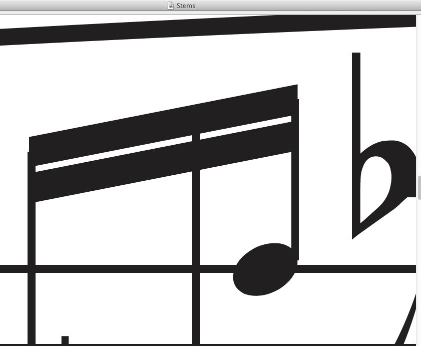
- Stems.jpg (34.74 KiB) Viewed 10108 times
Re: Different outputs
Posted: 10 Apr 2016, 16:46
by OCTO
John, that is correct. I just didn't have time to edit also these. It was to late...