Page 2 of 6
Re: Slurs again
Posted: 15 Aug 2017, 20:38
by benwiggy
I've got some where the G is flattened, which is trickier.
Re: Slurs again
Posted: 16 Aug 2017, 17:12
by OCTO
Knut, beautifully done indeed!
Dorico seems more like punched.
Re: Slurs again
Posted: 16 Aug 2017, 20:48
by Knut
OCTO wrote: ↑16 Aug 2017, 17:12
Knut, beautifully done indeed!
Dorico seems more like punched.
Thanks!
Yes indeed, they even punch some of us in the face.

But seriously, this inspiration for Dorico's slur design seems inappropriate to me, considering the relatively seldom usage of punched slurs in plate engraving. See this thread for further discussion on the topic:
viewtopic.php?f=3&t=321&start=10
Re: Slurs again
Posted: 17 Aug 2017, 12:24
by John Ruggero
Schonbergian wrote: ↑15 Aug 2017, 17:12
I find the shape of Knut's solution the most aesthetically pleasing so far (excepting the various visual issues with Dorico slurs), but it shouldn't curve backwards in my opinion.
If you mean the back bend over the stem, I agree.
Re: Slurs again
Posted: 17 Aug 2017, 13:51
by Knut
John Ruggero wrote: ↑17 Aug 2017, 12:24
Schonbergian wrote: ↑15 Aug 2017, 17:12
I find the shape of Knut's solution the most aesthetically pleasing so far (excepting the various visual issues with Dorico slurs), but it shouldn't curve backwards in my opinion.
If you mean the back bend over the stem, I agree.
If that is indeed what was meant, I agree in principle as well. But then again, to prevent this under these spacing conditions, there are only two options, both of which easily give worse results, in my opinion: (1.) flatten the bottom part of the slur, resulting in an even uglier shape, or (2.) move the tip over the notehead (as in Ben's initial screenshot), which is unacceptable placement to me.
This is basically the same aspect as was discussed
here, and I see no reason to distinguish between a notehead and a stem with regard to how perpendicular the slur end is allowed to be.
Re: Slurs again
Posted: 17 Aug 2017, 15:06
by tisimst
How about one of these?
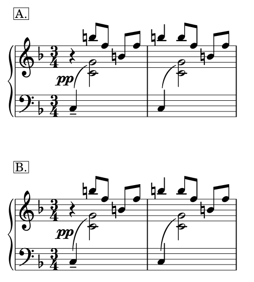
- slurs-again-tisimst.png (41.82 KiB) Viewed 10198 times
Re: Slurs again
Posted: 17 Aug 2017, 15:29
by OCTO
tisimst wrote: ↑17 Aug 2017, 15:06
How about one of these?
In my opinion I believe that if you need to compromise here, the slur should be attached to the upper NOTEHEAD, and the compromise would be done toward the stem of the first note. It feels somehow off.
Re: Slurs again
Posted: 17 Aug 2017, 15:33
by benwiggy
Thanks. I think I prefer A, I don't mind it not reaching the top notehead. My big problem is that I've also got this pattern with flats on the G, which gets in the way. Finale draws a crazy slur (much like the first Dorico example).
Incidentally, it's quite hard to move the anchor points in Finale when the slur is vertical like this.
Re: Slurs again
Posted: 17 Aug 2017, 15:38
by tisimst
To be completely honest, I'm not really satisfied with either, but A is preferable to B, IMO.
@benwiggy, I can see why you're in an even trickier situation with the addition of the flats on G. This is hard enough as it is to get something satisfying.
Re: Slurs again
Posted: 17 Aug 2017, 16:01
by Knut
I agree that A is cleaner than B, but I wouldn't recommend using any of them. If anything, I would lift the lower end of the slur up before going off the center of the stem, and I think you should always reach for the top note.
If accidentals are an issue, remember: You may cut the slur through the top part of the stem of a flat symbol. If that isn't enough, consider flipping the slur to the other side or even using an S-shaped slur.