Page 1 of 3
Braces
Posted: 27 Oct 2015, 21:11
by Fred G. Unn
Since this forum got up and running, I've been reconsidering lots of settings I haven't touched in a decade or more. After looking at many other braces, I've sort of come to the conclusion that I'm no longer satisfied with mine. Finale's brace editor is pretty clunky, but I've been experimenting with some different brace settings in Finale.
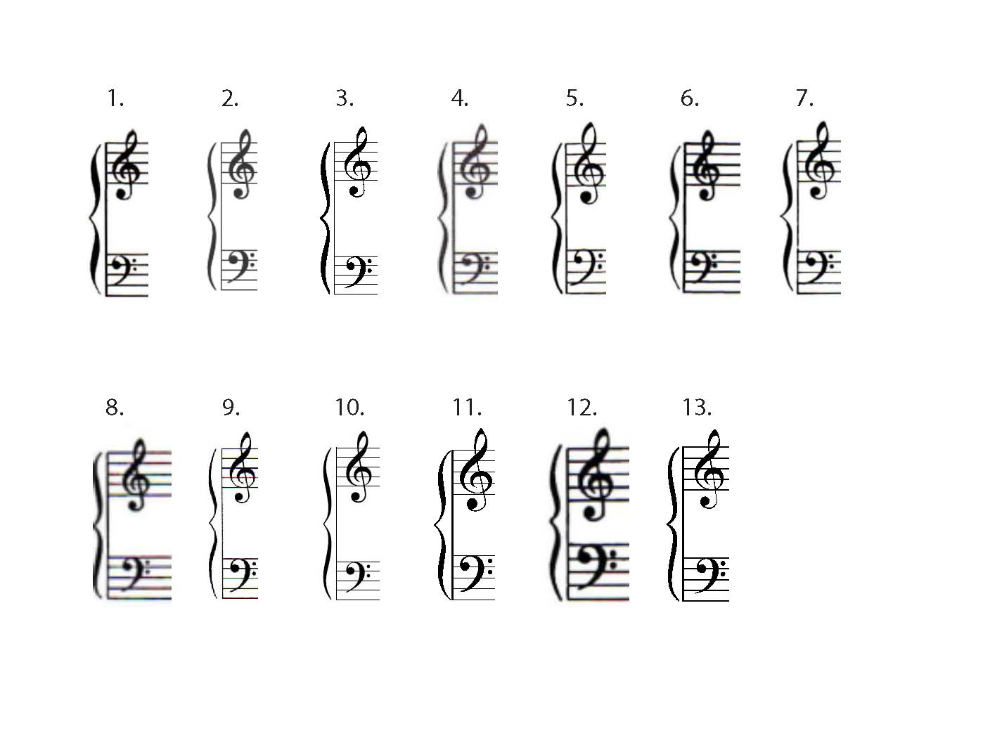
Publisher and/or software names are removed for objectivity, but is there any style of brace that is generally preferred? Any that is universally disliked? Here are a few from major publishers, authoritative texts, etc.:

- Brace Comparison.jpg (79.61 KiB) Viewed 12500 times
I tried to scale the scans so they were more or less equivalent in size for comparison purposes, but some are now a bit pixellated.
Re: Braces
Posted: 27 Oct 2015, 21:48
by Knut
Interesting!
I haven't really compared the braces of major publishers that much. The key for me is symmetry and balance, and I like the more generic type. I've seen good ones from both Boosey and Durand. Henle's braces fit their general aesthetic, although I have always found their style to be very characteristic, and have therefore stayed away from it when seeking aesthetical inspiration.
Of the ones you posted, I like nos. 6 and 7 the best by far, although both are a bit too short.
I have never been quite satisfied with my own settings in Finale either. The braces in my font look about right, but I've never been able to recreate them in the Brace Designer.
Re: Braces
Posted: 28 Oct 2015, 01:22
by Fred G. Unn
Knut wrote:
I have never been quite satisfied with my own settings in Finale either. The braces in my font look about right, but I've never been able to recreate them in the Brace Designer.
The Brace Designer is really clunky. I don't think the developers have touched it in over a decade. Figuring out how to recreate a design you like in the Brace Designer is certainly not an easy task.
Re: Braces
Posted: 28 Oct 2015, 10:44
by OCTO
Interesting, indeed. I was also thinking about it.
Hard to say, but I can say which I dislike: 9, 11, 13.
I would vote for 6 and 7.
About the BW-balance here as well: I find it that balancing well with clef is very important. Clefs of 6 looks similar to 1, but the brace at 1 takes to much black color.
In a way I like 2 as well.
No 11 is one of the ugliest, only because it is to much white and to much black.
Re: Braces
Posted: 28 Oct 2015, 17:08
by Fred G. Unn
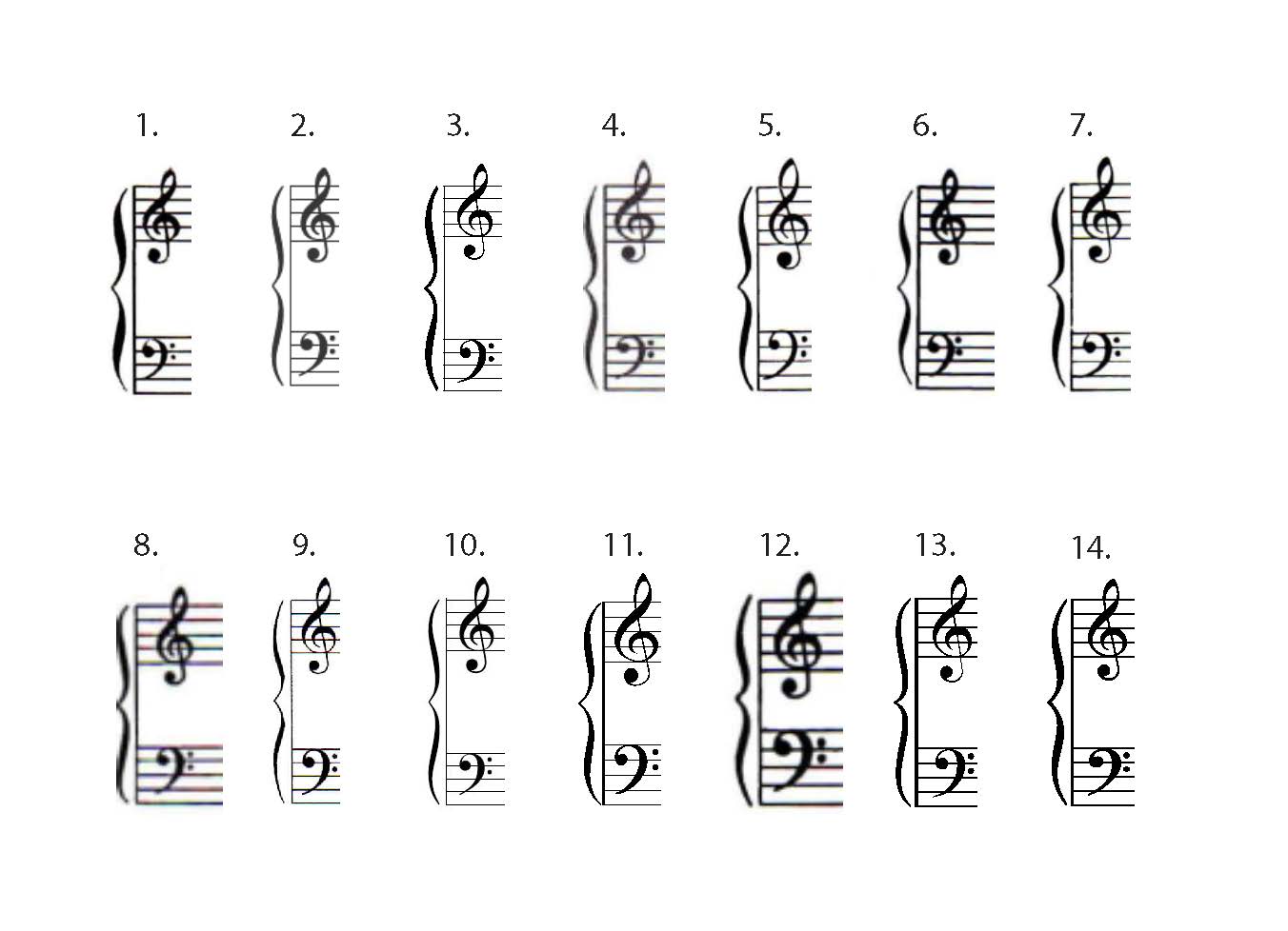
Ok, after messing around with it for the first time in a long while, I now definitely hate Finale's brace designer. I wonder what percentage of Finale users have every actually used it? Anyway, any opinions on #14? I've done so many variants on it my eyes are tired of looking at it. In other edits I slightly thinned the midpoint, but then that ended up greatly increasing the overall contrast between thick and thin, possibly too much. I also tried moving the two inner arcs slightly closer to the staff line, but was worried it came off looking a bit crowded. Does it work with the clefs? Any feedback would be appreciated, as at my current rate I probably won't revisit this until 2025 or later!

- Brace Comparison 2.jpg (82.68 KiB) Viewed 12462 times
Re: Braces
Posted: 28 Oct 2015, 17:56
by Knut
That is one beautiful brace, Fred, especially considering what you had to work with! Not much to say, except that I wouldn't mind you sharing your settings.
Re: Braces
Posted: 28 Oct 2015, 18:35
by Fred G. Unn
Knut wrote:Not much to say, except that I wouldn't mind you sharing your settings.
PM sent!
Re: Braces
Posted: 28 Oct 2015, 19:40
by OCTO
I like your brace as well!
I remember I have tried once to edit brace, but I got it very messy. It is not easy!
ADD: I would like to know your settings as well!
Re: Braces
Posted: 28 Oct 2015, 20:19
by Fred G. Unn
OCTO wrote:I like your brace as well!
I remember I have tried once to edit brace, but I got it very messy. It is not easy!
ADD: I would like to know your settings as well!
Thanks! Yeah, it's a pain using that brace editor. I just sent you a PM.
Re: Braces
Posted: 28 Oct 2015, 23:01
by John Ruggero
Dear Fred, judging from your creation, I think you understand the aesthetic issues of the brace very well, possibly because you have made plenty of them by hand. I remember enjoying making them, but also dreading it a little. Sometimes they would come out well, and other times a little off center or misshapen. (Notaset was a good substitute, but then it put your clefs in the shade, and it you notasetted those, everything else looked rotten.)
As a result of that experience and seeing them constantly in piano music for so many years, I have grown more accepting of the different styles. I still don't like the ones that look like someone shoved in their "nose" like 2, 8, 10 and 13.Nor the ones where the nose sticks out too far. (11 comes close, but is otherwise nice.)
Yours is definitely a winner. Please send me your settings, as well!