Page 3 of 3
Re: Braces
Posted: 29 Oct 2015, 18:43
by Schneider
Thank you Wess!
And yes, font is Century SchoolBook-L 'bold'.
Re: Braces
Posted: 29 Oct 2015, 20:38
by wess-music
Thank you again, Schneider,
this version of the font is great. I just downloaded and analysed it. It would probably solve many problems with visibility of the text blocks whatsoever may be.
Times is good and too modern for my consideration.
I am tired from all this new designed fonts. The recently engraved scores (most of the) do not look elegant as the old school ones.
That is why I developed two fonts dedicated to the layout of Peters and Henle, but here is not the place to talk about this, because the subject are the piano braces.
________
Last hours I am thinking over to test the "Lolly".
Do you know if there are any documentations (instructions) and can it be installed on Mac?
Thank you.
best regards,
Wess
Re: Braces
Posted: 29 Oct 2015, 21:35
by John Ruggero
Pierre or Schneider (I am sorry, I am not sure which you prefer),
In your latest example, the braces, brackets, and everything else is so clean and clear; it is beautiful. Perhaps LilyPond has a different look that one must acquire as a taste. However, for me, the brackets are too far from the staves, but the brace is an excellent distance from the bracket.
Wess, I tried that Opus brace on a grand staff and it was indeed not very good.
Re: Braces
Posted: 30 Oct 2015, 09:13
by wess-music
Dear John,
I assumed that you have right about the horizontal distance from the staff.
So, I made another attempt to create a new brace, based this time more or less on sample 6, which in my opinion looks very balanced.
Here it is.
- Screen Shot 2015-10-30 at 11.02.34.png (9.39 KiB) Viewed 11100 times
If you, or someone of our colleagues, is interested I could post the settings as part of Finale "piano brace designer".
Best regards,
Wess
Re: Braces
Posted: 30 Oct 2015, 15:18
by John Ruggero
Wess, that distance looks fine for a piano solo grand staff. Your brace is beautiful, and I am interested in your settings. Please post it! I didn't realized that you did it with Finale!
Re: Braces
Posted: 30 Oct 2015, 16:26
by wess-music
Dear John, here is the picture of the appropriate settings:
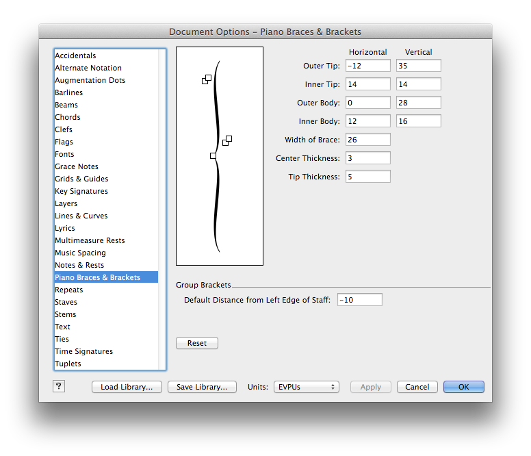
- PIANO BRACE NEW.png (102.27 KiB) Viewed 11087 times
As you can see, the distance I suggest is 10 EVPU (ca. 0,4166 spaces)
Best regards,
Wess
Re: Braces
Posted: 30 Oct 2015, 18:04
by John Ruggero
Thank you so much, Wess. I just ran into an issue with the Finale default brace of the type you illustrated with the staves of a grand staff set to 65%. This symbol is definitely not shrinkable without great distortion.
Re: Braces
Posted: 30 Oct 2015, 23:08
by wess-music
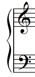
Dear John, I lead an attempt to solve this issue and here it is.
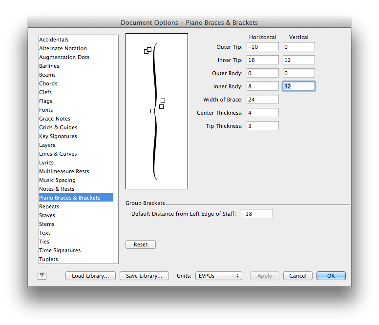
- PIANO BRACE 70% staff.png (101.41 KiB) Viewed 11072 times
And now you can see how it works.
Both staves on a grand staff are close enough. Even though there are no significant distortions. However, if you go to opposite – applying huge distance between both staves, the picture will be not as pleasant as the illustrated one.
- SAMPLE Brace.png (53.31 KiB) Viewed 11072 times
Re: Braces
Posted: 27 Jan 2016, 19:55
by John Ruggero
Dear Wess, I am very sorry for the unforgivably long time in responding to your help. I just tried the smaller brace and it works beautifully through a surprisingly wide range of staff distances, which is perfect for my application. Thank you so much.
Re: Braces
Posted: 27 Jan 2016, 21:39
by wess-music
I am glad, dear friend!
Wess