Page 1 of 1
Boosey twitters about accidental kerning
Posted: 28 Oct 2015, 19:53
by OCTO
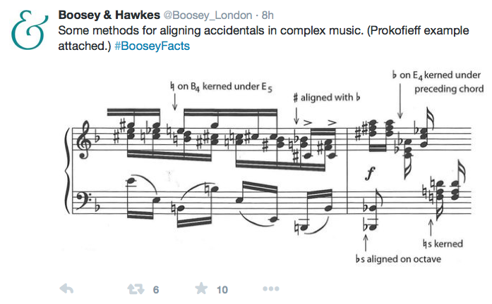
OMG! Engraving rules as tweets... Done in SCORE.

- Screen shot 2015-10-28 at 8.50.13 PM.png (147.15 KiB) Viewed 11536 times
However, I have examples of B&H's scores far from being so meticulous...

Re: Boosey twitters about accidental kerning
Posted: 28 Oct 2015, 20:06
by Fred G. Unn
That's great they are tweeting stuff like that. Now about that beam from B1 to B2 ...
Re: Boosey twitters about accidental kerning
Posted: 28 Oct 2015, 21:46
by Schneider
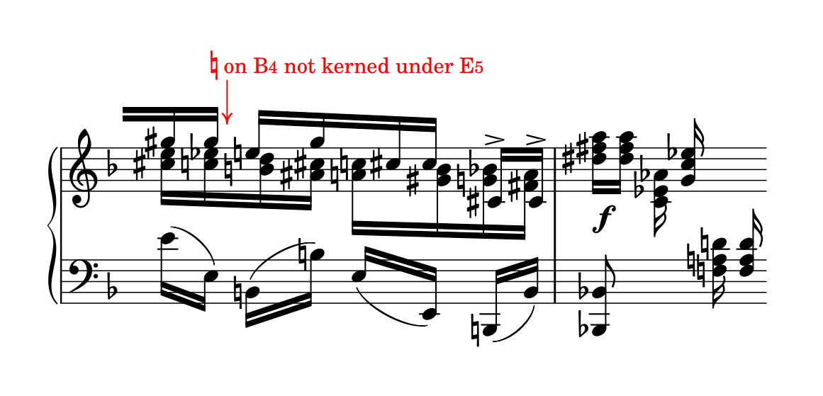
LilyPond's default settings shows almost the same alignments :

- proko-example-lily.png (80.82 KiB) Viewed 11527 times
Re: Boosey twitters about accidental kerning
Posted: 28 Oct 2015, 22:22
by John Ruggero
I've never cared much for the LilyPond clefs, which is a big turnoff for me. The note heads look a little heavy to me, as well. Can another font be substituted in LilyPond?.
I prefer the LilyPond placement of the naturals at your arrow and don''t feel that Boosey's exceptional placement was necessary, but I do prefer the Boosey spacing of the naturals on the last chord. The LilyPond naturals are too close together there. I also prefer the Boosey overall more even spacing and better handling of the clash between the C natural and C sharp on beat 2 of the first measure, where it is not completely clear that the two notes play together in the Lilyond. In general, I think the Boosey is easier to read.
Re: Boosey twitters about accidental kerning
Posted: 28 Oct 2015, 22:54
by Fred G. Unn
John Ruggero wrote: Can another font be substituted in LilyPond?
I know very little about LilyPond, but I did see there are quite a few fonts developed already:
https://fonts.openlilylib.org/
I think bunch of those are by Abraham Lee, and he has a pretty good engraving blog:
http://leighverlag.blogspot.com/
Re: Boosey twitters about accidental kerning
Posted: 29 Oct 2015, 00:59
by Schneider
Hi John,
John Ruggero wrote:I've never cared much for the LilyPond clefs, which is a big turnoff for me. The note heads look a little heavy to me, as well. Can another font be substituted in LilyPond?. [...]
Yes, see Fred's links
John Ruggero wrote:[...] I prefer the LilyPond placement of the naturals at your arrow and don''t feel that Boosey's exceptional placement was necessary, but I do prefer the Boosey spacing of the naturals on the last chord. The LilyPond naturals are too close together there. I also prefer the Boosey overall more even spacing and better handling of the clash between the C natural and C sharp on beat 2 of the first measure, where it is not completely clear that the two notes play together in the Lilyond. In general, I think the Boosey is easier to read.
Well, these are minor settings that can be done afterward, e.g.:

- proko-example-lily-bis.png (68.22 KiB) Viewed 11519 times
(clef's not the best here, just as an example).
Anyway, I was just curious about how LP would do by default.
Re: Boosey twitters about accidental kerning
Posted: 29 Oct 2015, 01:58
by John Ruggero
Pierre, the better settings made a great improvement in the spacing and appearance, and it is quite nice to read now. I do still find the note heads a bit bold for my taste, but that would change with a different font.
Thanks so much for contributing. I have been very curious abut LilyPond and would really profit from a LilyPond presence on this Forum.
Fred and Pierre, thanks for pointing me to the sites. The number and variety of the alternative fonts is impressive. I see several that might work well for me.
