Page 1 of 4
Flat slurs
Posted: 04 Nov 2015, 10:18
by OCTO
So far, only SCORE and manually engraved scores support flat slurs.
IMO, slurs should have ability to be flatten in the case when the curve goes to off, making an improper BW-balance:
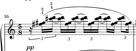
- Scriabin Sonata 9, Henle new edition.
- A 2015-11-04 at 11.14.02 AM.png (15.26 KiB) Viewed 16395 times
To avoid this, slurs should be able to be flatten in the middle of their shape:
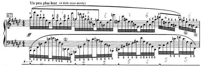
- flat slur example.png (136.18 KiB) Viewed 16395 times
- ABVK.jpg (57.24 KiB) Viewed 16395 times
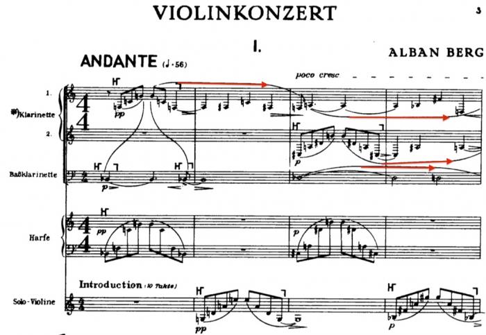
Here is an example by Wess from another forum (I hope it is OK for you, Wess?):
- flatslur.png (175.58 KiB) Viewed 16395 times
Any thoughts on this?
Re: Flat slurs
Posted: 04 Nov 2015, 12:03
by David Ward
This would definitely be useful in many situations if it were easier to achieve in Finale/Sibelius than seems to be the case at present.
Re: Flat slurs
Posted: 04 Nov 2015, 19:15
by John Ruggero
OCTO, in 1999, I complained about Finale's inability to make slurs of unusual shapes on the Finale Forum. At that point slurs had only four control points. Shortly after, the slurs gained another control point. If the slurs had still more control points, in fact, if the user could specify where the control points were located, flat slurs would be a reality.
Re: Flat slurs
Posted: 04 Nov 2015, 20:35
by Peter West
Currently Finale has 5 control points (to control the shape of the slur) and a positioning point that moves the whole slur without positioning it. The positioning point in the centre adjusts the overall depth by moving both handles either side of it. If this 5th, central control point could be made to move the apex of the slur without moving the two handles beside it (maybe with the use of a modifier key) then flattened slurs should be possible.
In one of Durand's custom fonts there are a range of beginning and endings of slurs which can be joined by a smart shape straight line. it's a bit clunky, but it works. The only other option currently available seems to be to export to a drawing programme.
Re: Flat slurs
Posted: 04 Nov 2015, 20:54
by OCTO
The problem of Finale's middle point (blue) is that it is useful for changing two handles at the same time, but it doesn't do anything particularly to change the shape. If that one could be moved downwards, keeping side-points fast (red) it could breake and maybe flatten the slur.
I believe that if the middle point (blue) is split in two points it could make the flat slur.
Basically, Finale's slur has 4 points, where only two are responsible for the shape (red) and only two for the length (green).
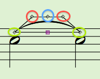
- A 2015-11-04 at 9.50.18 PM.png (14.38 KiB) Viewed 16366 times
Re: Flat slurs
Posted: 04 Nov 2015, 23:16
by John Ruggero
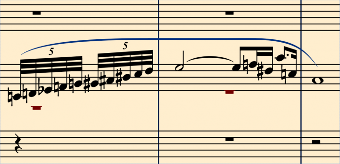
Peter and OCTO, I think that you are absolutely right. An independent middle point would allow flattening and be a big advance.
I still feel that the user should have the option of placing control points where needed so that any possible slur could be drawn:
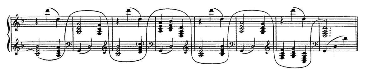
- Ravel Tombeau.jpg (62.71 KiB) Viewed 16361 times
Re: Flat slurs
Posted: 05 Nov 2015, 10:07
by wess-music
The real solution — that means without any extra work as adding 2 slurs joined by straight line, or custom font as Peter mentioned ("DSE ... 01b" – which I created for Durands some 4-y.ago) would be if Finale slur allows adding an extra anchor point. 6 instead of 5.
This will be an adventure for programers employed at MM, that IMO are not properly guided from their master, who instead drawing boats and so on just for fun with the limited graphic editor in Finale, had to open and learn how the modern Post Script language interprets the dictionary commands and to fix all vector import possibility of the program since there is no one competent to enlarge the possibility of the graphic editor at least on the level of the free or cheapest iDraw ($/€ 25) software.
Even more, the problems with import graphics remain and probably are going to sustain this status quo till kingdom-come.
Yesterday morning before to go to the University where I have some obligations I was thinking: sooner or later Mr Daniel S. will issue his new software. I will need a week to learn it and half month to become on the same level as I am with Finale, since Sibelius took me a week or so.
But comparing Sibelius and Finale, even I am very reserved about Sibelius, this application imports without any problems SVG — looks fine and prints fine too. Why the "greatest" Finale does not, since for ca. 10 years it had such (talking about Win. version) the possibility to draw EPS in real quality and now it does not work?
Why the import PDF imports in Finale as Bitmap, since it is dedicated to be vector format mainly.
Many months ago, even years, I proposed to some Finale users to observe the idea to unify together our desires and to sent to MM collective statement about the main thing that must be definitely changed – fixes, bugs, new features of improvements, better to say.
I am very hot-tempered man, speaking sharply and intolerable to the incompetence which MM in about last 8 years manifests.
However, even I do know this way of criticism is unhelpful and therefore I would kindly ask some of you, speaking educated English to help with the editing of our let me call it which list.
If we have a positive result, it would not be soon, at leaf an year or even more, but this could be good for at leaf Finale users, if they don't decide to switch to Daniels application!
What do you thick, colleagues?
Best regards,
Wess
Re: Flat slurs
Posted: 05 Nov 2015, 13:35
by Peter West
Hi Wess,
You did a fine job with this font, but the method of making flat slurs is extremely limited, both in the length and depth, but also in the thickness. To use this method limits the thickness of slurs to that determined by the font character. Increasing the font size in order to accommodate thicker lines is full of other problems.
Clearly the solution would be to add a 6th handle to the slur designer or be able to alter the function of the centre handle with a modifier key.
Re: Flat slurs
Posted: 05 Nov 2015, 14:53
by wess-music
Hi Peter,
for years I created complete flat slur (tie) font, however it is useless for more situations because of two main and few another reasons:
01. it is flat all the time. It could not be slanted (this way as it is dedicated for use with smart shapes
02. smart shapes do not respect any Font Annotation Tables which is unacceptable and it results more issue than help
03. using elements with huge width (like this ones) with smart shapes calls other issue: the length of the whole shape (including left start middle and end) extends over the appropriate dimensions as a bounding box rather than is expected.
04. In a single font (in combination with many other symbols) or even single font – dedicated to these curves only is uncomfortable to check each symbol either it is the proper one or is not talking about the depth. Also – I would prefer for my engraved assuagements to use 7 instead of 6 EVPUs and so on. This is also part of this.
and so on an so on...
But, Peter, considering the recent situation, it is kind of solution which really works for the layout mostly when it applies to whole length of the system (form clef till the most right bar line).
And when I were asked for this font this was one of my idea.
Well, as I have illustrated in MM forum, there are 2 alternative techniques – slur + line (better with 2 thin lines that combine the vertical thickness of the slur) + slur.
It is the best one with less issues, hover it takes lot of time to fix the perfect connections.
And the last, looking best, but I try to avoid it when I need to extract parts, is using shapes created in Illustrator (iDraw etc.) software.
Unfortunately the application does not really visualise the fine are of the embedded shape and as second paragraph – one never knows wither the custom imported shape is attached on the right place or little bit to the left, right, up or down.
At last resort – the "printed" PDF must be opened in Illustrator (or with another application) and there goes all extended postproduction.
However, after proofreading the same file must be altered again. For such situation I save the shapes in a new layer and when I need to copy and paste it onto the new file the access is very easy.
This is from me so far.
Best regards,
Wess
PS
Writing text in any languages (Russian, German, English, plus my own language, Bulgarian) I generate many mistakes, but what worst is that my Mac corrects them automatically in a awful way most of the time and sometime I read ... "miracles".
Therefore – sorry!
Re: Flat slurs
Posted: 11 Sep 2020, 17:11
by Den
John Ruggero wrote: ↑04 Nov 2015, 23:16
Peter and OCTO, I think that you are absolutely right. An independent middle point would allow flattening and be a big advance.
I still feel that the user should have the option of placing control points where needed so that any possible slur could be drawn:
Ravel Tombeau.jpg
yes , S-slurs in Igor
without much tweaking...only raw add all nested slurs, move and connect to each other, nothing special editing...about 15-20min.
ready for eps export to other dtp program