Page 12 of 16
Re: [WORKBENCH] Brahms Op. 119, No. 1
Posted: 23 Jun 2016, 18:25
by JoeBass
Thanks, I look forward to checking it out.
Re: [WORKBENCH] Brahms Op. 119, No. 1
Posted: 23 Jun 2016, 22:13
by John Ruggero
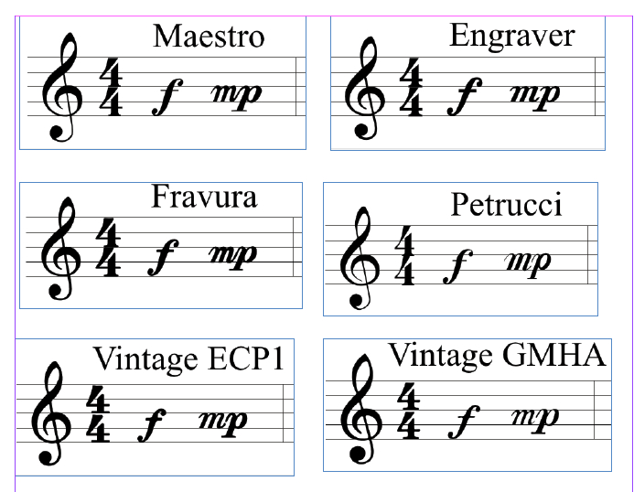
Here is a comparison of the dynamic size in six fonts from my meager collection. The last two are by forum member Wess.
Gould's and Ross's guidelines seem to be only very roughly carried out:
1. None of the fonts have a

of two spaces. They are all mostly about 1.66 spaces. A

of two spaces seems much too large to me. Of the six, I prefer the size and shape of the Vintage GMHA because it is not overpowering but distinct.
2. The first two (Finale) fonts have a

of 2.5 spaces and maybe even overflowing that. Fravura barely makes 2.5, and the last three seem around 2.25 spaces. To me, the Maestro and Vintage GMHA have the best shape with beautiful thick and thin balance, but I would prefer something between them in height and substance (width).
3. The modifier m, however, is generally very close to 1 space in height. I prefer the ones that are not larger than this.

- Dynamics size.jpg (194.45 KiB) Viewed 15041 times
Re: [WORKBENCH] Brahms Op. 119, No. 1
Posted: 23 Jun 2016, 23:28
by Knut
Thank you for this comparison, John.
For me, the key here, as it is with any music font in it's entirety, is balance of weight. It's a bit hard to tell from such a limited context, but based on these examples I think Maestro, Engraver, Fravura and Vintage EPC1 fares pretty well in terms of balance with the clef and time signature. The last two, on the other hand, seem pretty unbalanced to me.
This is much more important to me than the exact size, but I prefer a relatively large x-hight for dynamics symbols, and of course, uniformity is crucial. While none of the above are perfect, I think I prefer the Bravura dynamics.
Re: [WORKBENCH] Brahms Op. 119, No. 1
Posted: 24 Jun 2016, 10:48
by John Ruggero
You are most welcome, Knut. I obviously need to add more fonts to my collection, such as yours when it is available!
Different strokes for different folks. I like many of the qualities of the Fravura (Bravura): it is the right height and general substance but for me it is a little too thick in the middle and in its thinnest places. I would like delicacy as well as strength so the symbol isn't too black.
I also like the difference in weight between the

and then

in the Vintage GMHA.
Re: [WORKBENCH] Brahms Op. 119, No. 1
Posted: 24 Jun 2016, 11:06
by John Ruggero
And thank you, Knut and Joe, for your kind words about my commentary!
Re: [WORKBENCH] Brahms Op. 119, No. 1
Posted: 28 Jun 2016, 11:48
by OCTO
How does these fonts look in vivo?
A page of Brahms would help!
Re: [WORKBENCH] Brahms Op. 119, No. 1
Posted: 16 Aug 2017, 16:44
by Anders Hedelin
Knut wrote: ↑20 Apr 2016, 09:36
Attached is my initial re-engraving of Brahms Op. 119, No. 1
I'm new to this forum and might have missed where to find your initially attached file, Knut. I would very much like to be able to follow this very interesting discussion.
Anders
Re: [WORKBENCH] Brahms Op. 119, No. 1
Posted: 16 Aug 2017, 20:54
by Knut
I'm sorry Anders. I had to remove all these documents to protect the copyright of the font I was using (long story). I can send you the last version I posted via PM if you are interested. The differences between my submitted versions here were relatively minor anyway.
Re: [WORKBENCH] Brahms Op. 119, No. 1
Posted: 17 Aug 2017, 07:57
by OCTO
An alternative to do it, as you know Knut - but as a general tip, is to create a jpg or tiff picture of the score or to outline all fonts in pdf making thus just a vector file.
Sent from my SM-J510FN using Tapatalk
Re: [WORKBENCH] Brahms Op. 119, No. 1
Posted: 17 Aug 2017, 08:56
by Knut
OCTO wrote: ↑17 Aug 2017, 07:57
An alternative to do it, as you know Knut - but as a general tip, is to create a jpg or tiff picture of the score or to outline all fonts in pdf making thus just a vector file.
Sent from my SM-J510FN using Tapatalk
Yep, I think I may do that instead. It was a good thread, so it's kind of a shame that you can't see all the results anymore.
Edit: FYI, I've now replaced all (I think) my missing pdf uploads with jpegs.