Page 1 of 11
Clef design comparision
Posted: 08 Oct 2015, 16:09
by Fred G. Unn
Re: Clef design comparision
Posted: 08 Oct 2015, 16:15
by Fred G. Unn
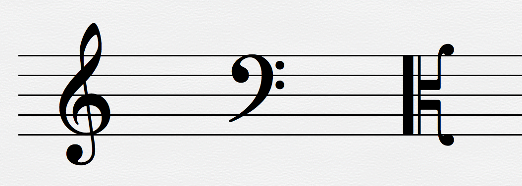
I sort of assumed the alto clef would be symmetrical, and would be a mirror image of itself flipped over the center line. That's clearly not the case with #4 and #6. I wonder what the significance of that is. Perhaps the added visual mass on the bottom makes it appear more stable, so that it won't topple over? I'm pretty sure I prefer a symmetrical alto clef, although that's something interesting to consider.
Re: Clef design comparision
Posted: 08 Oct 2015, 18:29
by OCTO
For

My favorites (in favorite order):
2, 5, 7.
2 and 7 are very similar. I have used mostly 2 and 5.
5 is somewhat small, but very balanced. I almost don't notice it - it can quickly be "digested"...
If I can vote for the most ugly it is 3 and 4.
3 - very thin and "strange" in many ways.
4 - it is default for many scores today, but it hits my eyes! In my opinion it is very unbalanced, I think it will fall off from page. Comparing to no5, I need to "digest" it longer and for that reason, more problem with reading...
For

2 and 7. Very balanced.
I like 7 over 1, because of somewhat more boldness.
Most unbalanced: 3 and 4 (again same reasons).
Fred G. Unn wrote:I sort of assumed the alto clef would be symmetrical, and would be a mirror image of itself flipped over the center line. That's clearly not the case with #4 and #6. I wonder what the significance of that is.
I think they are mirrored, but if you check carefully, they are slightly moved upwards.
For

...it is harder.
I prefer 5 and 7. Just because of the balance in power.
I can say, in general 2 5 and 7 are my favorites, if I should use them as a palette.
No force could compel me to use 3 and 4...
Re: Clef design comparision
Posted: 08 Oct 2015, 20:31
by Knut
So long as we're playing this game, here are my main clefs as well:
- Menuet Clefs.png (421.37 KiB) Viewed 17027 times
The font features most clefs recommended by SMuFL, except for a few of the historic ones. For those not into the french C clef variation, a set of ordinary ones, based on the one below, will be included as stylistic alternates.
Sorry for the humongous pictures, btw.
- Menuet Regular C.png (33.32 KiB) Viewed 17027 times
Re: Clef design comparision
Posted: 08 Oct 2015, 21:28
by John Ruggero
I have never seen a treble clef that I have loved without reservation, and Fred's group is no exception. Is it possible that the symbol is simply impossible to make beautiful? These are either misshapen or too small. 1 and 7 seem to be leaning forward. The others are upright.
On the other hand, I find that I am less picky about bass and alto clefs. Here, I definitely prefer bass clefs 1 and 7. And alto clef 5 because it is compact without looking squished.
Knut I like your clefs very much. Your regular alto and bass clefs are some of the best that I have seen. However, the treble clef, while well-shaped, is a little narrow for my taste and does lean slightly forward. I would prefer more bend in the thin crossing line so that the top "eye" is more vertical.
Re: Clef design comparision
Posted: 08 Oct 2015, 22:33
by Knut
John Ruggero wrote:I have never seen a treble clef that I have loved without reservation, and Fred's group is no exception. Is it possible that the symbol is simply impossible to make beautiful?
I don't know about impossible, but I can tell you from experience that it's one of the most difficult shapes to work out. It's also regarded by many as a music font's signature shape, establishing it's identity. I've gone so many rounds with mine, I can't even tell you!
John Ruggero wrote:However, the treble clef, while well-shaped, is a little narrow for my taste and does lean slightly forward. I would prefer more bend in the thin crossing line so that the top "eye" is more vertical.
In this case I completely agree with you about the slight rotation. Personally, I like it, as long it's done moderately. A slight rotation makes the most sense to me for clefs with a top counter on the narrower side, the reason being less white space between clef and sharp key signatures. However, I can certainly see how someone might prefer a differently proportioned clef altogether.
Rotated treble clefs are especially common in plate engraved scores, sometimes to an absurd degree, since I guess it would be easy to unintentionally rotate the punch just slightly before setting it.
Re: Clef design comparision
Posted: 09 Oct 2015, 06:02
by OCTO
John Ruggero wrote:I have never seen a treble clef that I have loved without reservation, and Fred's group is no exception. Is it possible that the symbol is simply impossible to make beautiful?
I totally agree. I think that Sonata and Engraver has the most balanced shape. Both are in my opinion a bit small.
Knut, what I feel about your treble clef is that it is moving somehow, a present unbalance. It goes forward, and also BW-balance of its parts are to exposed.
I don't have some technical words to explain it a better, I hope you understand.
Your
and
are gorgeous!
Re: Clef design comparision
Posted: 09 Oct 2015, 06:32
by Knut
OCTO wrote:Knut, what I feel about your treble clef is that it is moving somehow, a present unbalance.
That sounds distracting, but I'm not entirely sure what you mean.
OCTO wrote:It goes forward …
I take it you're referring to the slight clockwise rotation?
OCTO wrote:… and also BW-balance of its parts are to exposed.
Do you mean that the counters (the open space in a fully or partly closed area) are to large compared to the thickness of the strokes?
If it would be easier for you to elaborate in Swedish, please do so.
Anyway, thanks for the feedback, Octo!
Re: Clef design comparision
Posted: 09 Oct 2015, 06:49
by OCTO
Sorry, it is hard to elaborate in any language: I don't have the proper knowledge of that terms!

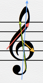
- Screen shot 2015-10-09 at 8.39.47 AM.png (69.03 KiB) Viewed 16992 times
I will "describe" like this:
The red and orange lines are to expressive. Particularly it is true for the orange. In my opinion they take to much force comparing to the green line, which disappear in a way.
The blue line describes move of the glyph, which is result of: orange boldness on the right side, force of the red, and weak counter-parting of the green. The top-bottom is turned also to the right (blue).
O.
Re: Clef design comparision
Posted: 09 Oct 2015, 07:25
by Knut
Thanks, Octo!
That makes it much clearer.
As I said, that shape is very difficult.