Page 2 of 3
Re: Muzitex - for music text
Posted: 15 Oct 2015, 09:32
by OCTO
Kepler is indeed one of the nicest on the sample you provided. Kepler and Utopia.
Re: Muzitex - for music text
Posted: 15 Oct 2015, 10:42
by OCTO
Hello. Here is the version 2:
repository
I changed some spacing.
Please, swap it with the old one, and try to print.
Best, O
- Screen shot 2015-10-15 at 12.38.43 PM.png (58.28 KiB) Viewed 11801 times
Re: Muzitex - for music text
Posted: 15 Oct 2015, 12:04
by Knut
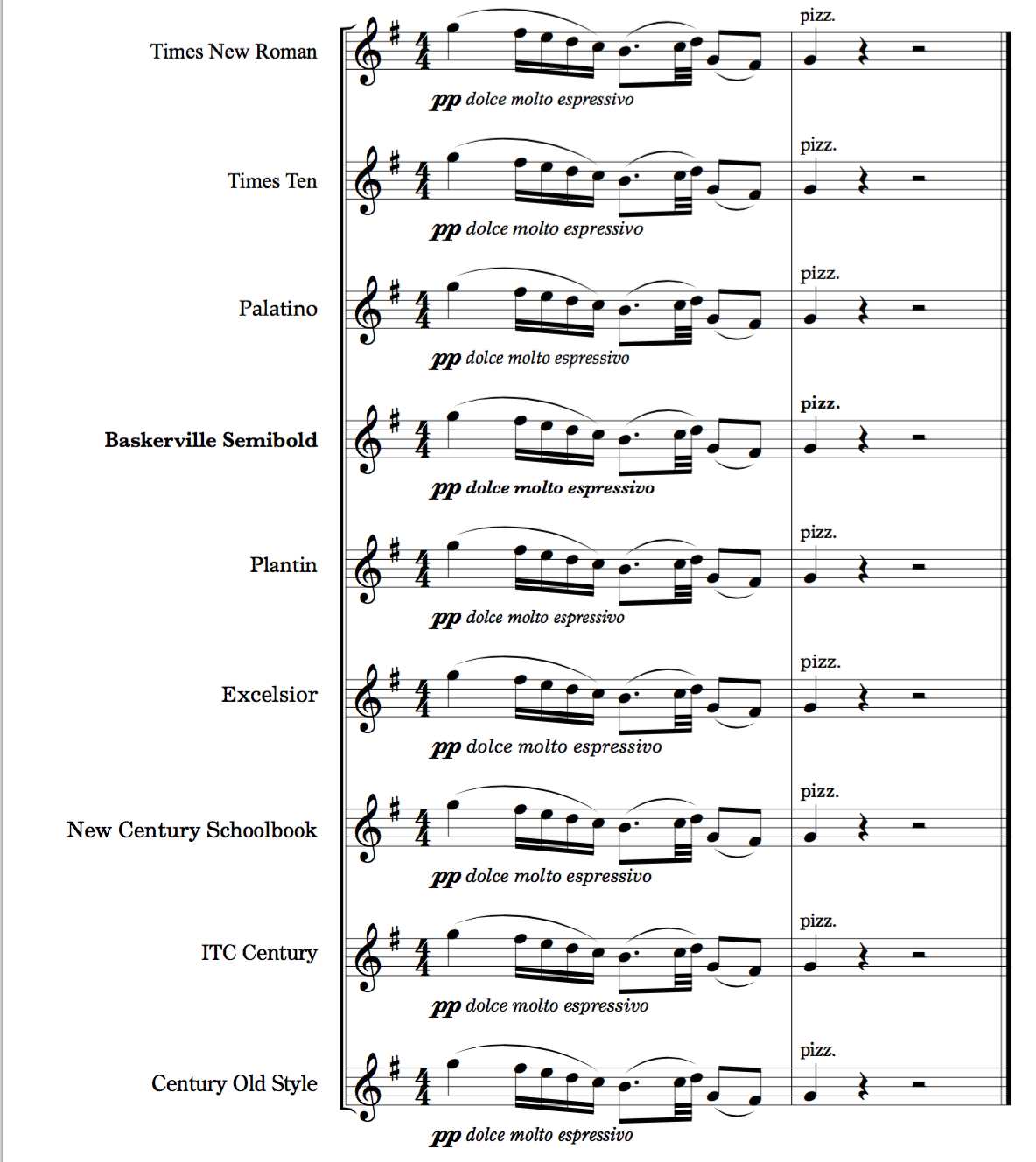
Here are some more fonts I've seen in use or have used myself. I used to use New Century Schoolbook a lot because of it's relative heaviness, but I don't like the italic that much. Now I usually use Minion like everyone else.

Palatino is the font used both for body text and the examples in Elaine Gould's book.
Plantin is a font included with Sibelius that I think is nice.
Times Ten is a slightly heavier version of Times, intended for small (caption) text.
- Text font preview.png (398.14 KiB) Viewed 11798 times
Re: Muzitex - for music text
Posted: 15 Oct 2015, 12:26
by OCTO
In my opinion Plantin is to wide, for my music it is ineffective. Particularly it is true for the Roman version.
Regarding Muzitex: I have printed (hi-q print by Peters/Boosey/Schott printer) my orchestral score (with many details, small texts, instructions etc), and it displays really excellent. It is definitely my font for full scores, and parts.
Maybe I will have another font for choral music. But perhaps I would not use it for lyrics.
Re: Muzitex - for music text
Posted: 15 Oct 2015, 13:44
by Knut
OCTO wrote:In my opinion Plantin is to wide, for my music it is ineffective. Particularly it is true for the Roman version.
There is a condensed version available as well, although it's not included with Sibelius.
Re: Muzitex - for music text
Posted: 26 Nov 2015, 14:55
by odod
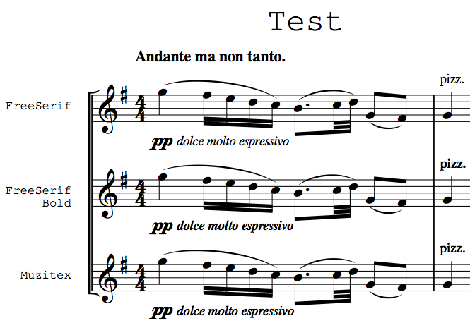
OCTO wrote:I have been searching for a "perfect" (well, in my opinion) text font for expressions and articulation, for many years.
I used so far: Times (and NR), Garamond, Minion, Caslon etc... Nothing was satisfying. Either to bold, or not enough visible, or to curved, or to wide...
I have created a font called Muzitex only for text in music notation.
What is the difference?
As you can see, Normal (here FreeSerif "Times"-looking font) is to thin in my opinion. It doesn't catch so much attention. On the contrary, Bold version of it is to much bold (serfs are to much bold).
Therefore I have
equally emboldened Normal for that purpose.
It displays excellent when printing. Please test and let me know what you think.
Screen shot 2015-10-12 at 3.16.39 PM.png
It is a GPL-font. Embedding in PDF allowed. License included. Muzitex is derivative from FreeFont.
https://www.gnu.org/software/freefont/
what is the music font that you used sir ? i am so fascinated with the G clef style .. best regards
Re: Muzitex - for music text
Posted: 26 Nov 2015, 19:25
by OCTO
It is a font designed by our forum member Wess. You might try contacting him.
Best, O
Re: Muzitex - for music text
Posted: 27 Nov 2015, 18:06
by John Ruggero
Wess's alternative Henle-style treble clef (slot 128) is contained in his VintageGHMA. I think that it is an excellent alternative to the Maestro treble clef.
Re: Muzitex - for music text
Posted: 07 Jul 2016, 20:04
by OCTO
Help needed again.
My copyist tells me that on his Windows machine my Muzitex font doesn't work at all. Can anyone help me to generate a proper variant for Windows?
Re: Muzitex - for music text
Posted: 07 Jul 2016, 20:22
by tisimst
OCTO wrote:Help needed again.
My copyist tells me that on his Windows machine my Muzitex font doesn't work at all. Can anyone help me to generate a proper variant for Windows?
It doesn't work *at all*? Can they see anything when they try to open it in charmap? Can they see anything at all in a word processor? Which app are they trying to use it in?
I'm happy to help you out if I can understand the problem more. Looking at the 2.0 files in the NOTATIO repository, I can already see some things that might be undesirable, but I've not had this extreme of a problem with OTF nor TTF files I've created.