Page 1 of 3
Fat Eighths!
Posted: 23 Jan 2017, 14:42
by benwiggy
To paraphrase Sir Mixalot, I like big eighths
(and I cannot lie). By which I mean curved, protruding flags on down stems. I also like a little gap between the flag and the notehead.
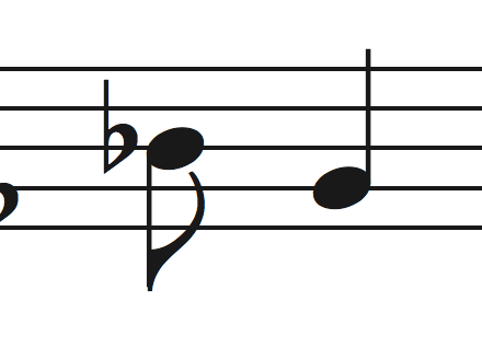
- Screen Shot 6.png (17.25 KiB) Viewed 11649 times
I'm wondering where this fondness came from? Most music fonts have thinner, straighter flags, which touch the notehead. However, a few do favour the fatter style.
Re: Fat Eighths!
Posted: 24 Jan 2017, 03:50
by odod
it's Leonardo or Engraver font right ??
Re: Fat Eighths!
Posted: 24 Jan 2017, 06:12
by OCTO
I think it is Engraver and I use it as well. Maestro with Engraver clefs, flags and rests is a good combo.
Try to use Engraver flags at 23 or at 22.
Re: Fat Eighths!
Posted: 24 Jan 2017, 06:52
by benwiggy
Yes! I use Engraver for notes, rests and clefs: Maestro for everything else. I'm very happy with it at full size. I'm going to look through my scores and see which publishers used flags like this: I must have picked up the preference from somewhere.
Re: Fat Eighths!
Posted: 24 Jan 2017, 08:05
by odod
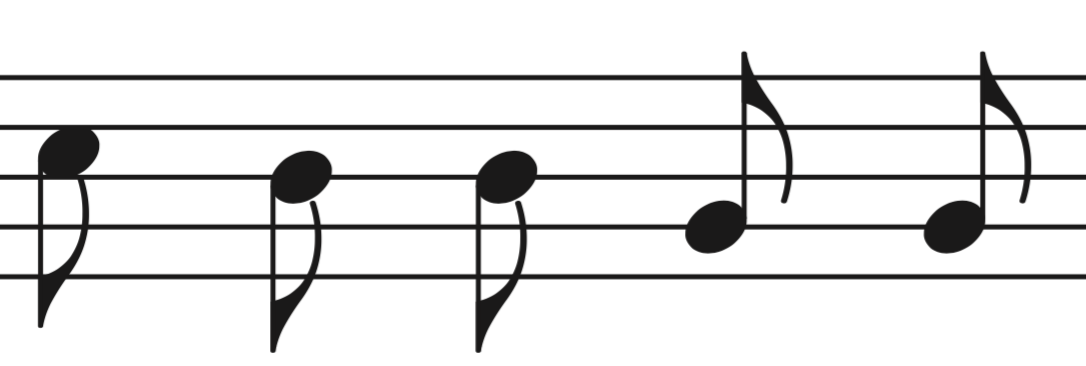
- Sonate_0001.png (8.82 KiB) Viewed 11610 times
I prefer my own like this .. inspired by most old scores actually
Re: Fat Eighths!
Posted: 24 Jan 2017, 08:47
by OCTO
benwiggy wrote: ↑24 Jan 2017, 06:52
Yes! I use Engraver for notes, rests and clefs: Maestro for everything else. I'm very happy with it at full size. I'm going to look through my scores and see which publishers used flags like this: I must have picked up the preference from somewhere.
Ben, have you tried using Maestro noteheads instead? They are not so wide, and the shape has flattened sides that touch longer staff lines. I think it is good for clarity. Engraver is very wide, yet not more "readable".
Re: Fat Eighths!
Posted: 24 Jan 2017, 10:15
by Knut
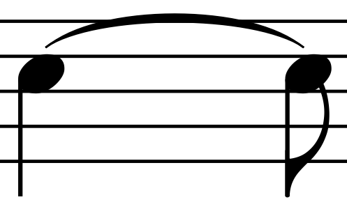
I'm with odod, and in fact, my own Durand-inspired flags are even narrower than his.
These flags have proven to be somewhat controversial, but personally I find them both space efficient and clearly subordinate to the notehead, as they should be.
I don't like flags that have too much prominence, like the Engraver flags. Combined with the wide noteheads of Engraver they look disproportionate to me, like a picture that has been stretched horizontally, beyond it's proportional size. To each his own, I guess.
- Skjermbilde 2017-01-24 kl. 11.05.50.png (49.52 KiB) Viewed 11602 times
Re: Fat Eighths!
Posted: 24 Jan 2017, 10:36
by benwiggy
OCTO wrote: ↑24 Jan 2017, 08:47
Ben, have you tried using Maestro noteheads instead? They are not so wide, and the shape has flattened sides that touch longer staff lines. I think it is good for clarity. Engraver is very wide, yet not more "readable".
Well, obviously I used Maestro in Finale before I started thinking about these things! My music tends to use quite small staff sizes, so a larger note head works better for clarity. I did try Maestro Wide, but the difference is slight. I also tried Maestro noteheads at 25pt, but Engraver is my preference.
Odod - I don't like the tiny white space below the notehead. It's probably not noticeable at regular sizes, of course.
Maestro does have a number of alternative flags that you can use: a straighter, more 'quill-like' style, and a shorter, fatter one. It's a bit too short for my tastes.
Here's Briard, which is quite nice. I think it's the steeper curve that I like, and that the flag should point back into the notehead at a more oblique angle.
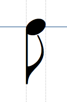
- Screen Shot 7.png (11.89 KiB) Viewed 11598 times
Re: Fat Eighths!
Posted: 24 Jan 2017, 19:10
by OCTO
Briard? Never heard about it. Will check...
Re: Fat Eighths!
Posted: 24 Jan 2017, 21:49
by benwiggy
It comes with Nightingale, a venerable notation package from back in the day. Ah: in fact, it might be heavily based on Sonata.