Cross Staff - spacing

Discuss the rules of notation, standard notation practices, efficient notation practices and graphic design.
User avatar
John Ruggero
Posts: 2454
Joined: 05 Oct 2015, 14:25
Location: Raleigh, NC USA

Re: Cross Staff - spacing

Post by John Ruggero »

OCTO wrote:
...any entry in that system will override the manual adjustments if you want to respace music correctly. After so many years working with Finale I start to dislike the very famous "leave it for the last stage"; because there are to many at the last
stage.
Thank you for explaining that. Finale's re-spacing and updating has never caused me issues, but I can see that there might be problems for those who use more complex notation than I do.

And leaving things until later is an invitation to forgetting about them completely. This was actually an "Arnstein" principal in hand copying: nothing was ever left until later. The use of different "tools" in computer engraving pushes the user toward the opposite approach, which I think is unfortunate.
M1 Mac mini (OS 12.4), Dorico, Finale 25.5, GPO 4, Affinity Publisher 2, SmartScore 64 Pro, JW Plug-ins, TG Tools, Keyboard maestro

http://www.cantilenapress.com
User avatar
David Ward
Posts: 527
Joined: 05 Oct 2015, 19:50
Location: Aberdeenshire, Scotland
Contact:

Re: Cross Staff - spacing

Post by David Ward »

John Ruggero wrote:… … … And leaving things until later is an invitation to forgetting about them completely. This was actually an "Arnstein" principal in hand copying: nothing was ever left until later. The use of different "tools" in computer engraving pushes the user toward the opposite approach, which I think is unfortunate.
I agree.

This is one of the aspects of computer notation (but my experience is only with Finale) which I find deeply frustrating. I still find manuscript more flexible and fluent, although unfortunately it's more expensive to reproduce, especially when it comes to preparing parts &c &c.
Finale 25.5 & F 26.3.1
Mac OS 10.13.6 & 10.14.6
https://composers-uk.com/davidward/news-links/
User avatar
John Ruggero
Posts: 2454
Joined: 05 Oct 2015, 14:25
Location: Raleigh, NC USA

Re: Cross Staff - spacing

Post by John Ruggero »

David Ward wrote:
This is one of the aspects of computer notation (but my experience is only with Finale) which I find deeply frustrating.
I know that you use many keyboard shortcuts in Finale, and I am now doing the same to be able to switch quickly from tool to tool to work in a more natural manner. They most frequently used are laid out under the fingers of my left hand so that I can "play them" them like an instrument.

(We are now deeply OT, but I guess OCTO will decide if this should be another thread.)
M1 Mac mini (OS 12.4), Dorico, Finale 25.5, GPO 4, Affinity Publisher 2, SmartScore 64 Pro, JW Plug-ins, TG Tools, Keyboard maestro

http://www.cantilenapress.com
User avatar
wess-music
Posts: 51
Joined: 05 Oct 2015, 10:40

Re: Cross Staff - spacing

Post by wess-music »

Dear friends,

I find this discussion very positive and I was curious to read your point of view.
As we know, the eyes are easy to be "seduced" and coaxed, especially when it comes to vertical & horizontal lines or reparative patterns.

Long time ago I attempt an experiment and till nowadays I continue using this experience – a funny trick, when such music model appears – as the one shown by our gentle friend and "householder" OCTO:
"(Page 2) Here is another tricky question:
How to notate simultaneously these two measures? What rule will be applied, and what is the reason behind it?"
_________________________________________

I would explain my test, because as I mentioned, it works (at least for me).
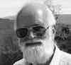
Here is the sample:
01.jpg
01.jpg (126.34 KiB) Viewed 7471 times
On first glance, mostly on 5 mm printed score, it looks convincing.
No doubt, we all know that the positions are altered.
On first staff (with G-clef) the intervals generate a perception as if the font is much heavier. (Please, find both sample provided by TISIMST and John – PAGE 2).
All the time when I see 3-ds I feel that the boldness of the note heads is an issue. Therefore in my custom fonts I always keep a narrow quarter note glyph for similar reasons (and for those, where the horizontal space is limited.)
The most important is to manipulate slightly and with care the distance between stems in order to look as even as possible.
Well, the note heads play also their role, but the eye follows the lines first.

In this sample the note heads on the first staff are between 90-95% narrower as a width compared to slot Nº207.
Second – the position of all note heads are moved individually to the left or right depending on stem direction and in relation to the usual stem's offset. As said, printed on paper, this effect looks almost invisible, but on the monitor is more prominent.
The third step: left-right slight "note movement" in order to equalise the stems in conjunctions with the bottom staff. The alternative position is "+" or "–" ¼ (even ⅓) of the normal stem and note position.
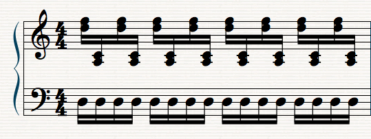
Here, on the next screen shot, you can analyse it using the grid lines.
02.jpg
02.jpg (193.95 KiB) Viewed 7471 times
It takes considerable time ended and that is the reason I perform this very occasionally, mostly when the distance between staves is bigger unlikely this one. I know, this is not perfect, but could help as an idea for test.
User avatar
John Ruggero
Posts: 2454
Joined: 05 Oct 2015, 14:25
Location: Raleigh, NC USA

Re: Cross Staff - spacing

Post by John Ruggero »

Wess, this kind of hand tweaking of position and note head size is exactly what one did naturally in hand copying by simply allowing one's eyes to guide one's hands, and it was possibly the same in some plate engraving as well. It is something that would humanize computer engraving.

In BOTH of your examples, the lower staff note heads look bigger than the upper staff note heads to me; is this an illusion or computer artifact? I think that your solutions would look even better if this were not the case.

In this particular case, possibly because of the repetition, my eyes seem to accept unevenness in the RH stem spacing for the sake of greater note head alignment; somehow the evenness of the LH compensates for the unevenness in the RH, so I think that I would prefer something a little closer to exact vertical alignment, but definitely along the lines of your solutions.
M1 Mac mini (OS 12.4), Dorico, Finale 25.5, GPO 4, Affinity Publisher 2, SmartScore 64 Pro, JW Plug-ins, TG Tools, Keyboard maestro

http://www.cantilenapress.com
User avatar
OCTO
Posts: 1751
Joined: 05 Oct 2015, 06:52
Location: Sweden

Re: Cross Staff - spacing

Post by OCTO »

When Wess comes with his solutions or experiments, I get astonished!

I was looking briefly at the pictures before I read the description and I didn't want to analyse them carefully, but I just understood there was a trick; however I enjoyed their alignment which was completely natural for me.

John, I think if you would print a score which has this measure tweaked as Wess did, you would perhaps not notice these "oddities", which are clever indeed. This example is in vitro which is prone to deep analysis.
About noteheads: he really used different notehead widths, perhaps to minimise the error-detection radius.
Post Reply