In my experience, most text fonts used in computer scores are inappropriate for the task. Fundamentally, while music fonts are (relatively) heavy, rounded, and have a consistent weight, modern computer text fonts are often too angular and light to properly complement the musical material. Times New Roman is one of the most egregious offenders in this category, and I have not seen a publisher aside from Boosey & Hawkes (which is also not perfect) that successfully averts this problem.
I started looking to scores of the past in order to study how to ameliorate this problem, and I found that (at least for lyrics, but often for other material as well) slab serifs are the most commonly used style of text font. The heaviness, rounded quality, and relatively low contrast of many of these fonts complement the music well and achieve excellent balance with the remainder of the page. One wonderful example from Edition Peters can be found here: http://ks.imslp.info/files/imglnks/usim ... berich.pdf I will post some more examples from my personal library later.
In your view, do slab serif fonts still have merit in these sorts of cases and, if so, what are some good digital examples? I have yet to locate a computer font that exhibits all of these qualities, and am thinking of creating my own from old specimens.
A case for slab serifs in music
-
Schonbergian
- Posts: 254
- Joined: 03 Feb 2017, 02:25
- Location: Toronto
Re: A case for slab serifs in music
I wouldn't call the serifs fonts usually used in plate engraved scores like the Peters 'Slab serifs', which, although there are overlaps into conventional serifs, are characterized by very obvious serifs and often geometric, low contrast shapes. Rather, the font(s) you're referring to is a variant of the Century Typeface, which was widely used in music engraving in the 19th and 20th centuries.
You are nevertheless correct that musical text from this period has a pretty modest contrast, but that is simply due to it's 'caption' quality of being especially cut for readability at a relatively small size.
To my knowledge, the closest commercially available roman equivalent to this style is New Century Schoolbook, which I've used extensively in the past. On the italic side there really are very few if any widely available good alternatives, although forum user Wess has a very nice option which also has been discussed previously on the forum. Belgian publisher Bayard-Nizet also has an alternative called Espressivo, which in my opinion is a bit too crude for modern purposes.
I'm currently working on designing fonts to meet exactly the demand your thinking of. This project, which has taken a lot longer to finish than originally anticipated, will at the bare minimum include roman and italics in regular, semibold and bold weights. Some aspects of it has been previously discussed here: viewtopic.php?f=4&t=165.

Re: A case for slab serifs in music
Except the above mentioned beautiful font by Knut, I have similar option and created Muzitex:
viewtopic.php?f=4&t=21
Download current version:
repository/
(p.s. I cannot translate "slab", I think I guess what you mean).
viewtopic.php?f=4&t=21
Download current version:
repository/
(p.s. I cannot translate "slab", I think I guess what you mean).
Freelance Composer. Self-Publisher.
Finale 27.5 • Sibelius 2024.3• MuseScore 4+ • Logic Pro X+ • Ableton Live 11+ • Digital Performer 11 /// MacOS Monterey (secondary in use systems: Fedora 35, Windows 10)
Finale 27.5 • Sibelius 2024.3• MuseScore 4+ • Logic Pro X+ • Ableton Live 11+ • Digital Performer 11 /// MacOS Monterey (secondary in use systems: Fedora 35, Windows 10)
Re: A case for slab serifs in music
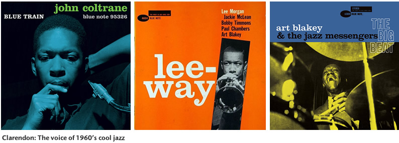
Rockwell is one of the most well known geometrical slab serifs. However, in this context, Clarendon is perhaps the most interesting, known to musicians for it's frequent use on jazz album covers:
Clarendon's style is very close to the classic Century typeface, albeit more symmetrical, and of course, with more pronounced serifs and lower contrast.
Clarendon's style is very close to the classic Century typeface, albeit more symmetrical, and of course, with more pronounced serifs and lower contrast.
-
Schonbergian
- Posts: 254
- Joined: 03 Feb 2017, 02:25
- Location: Toronto
Re: A case for slab serifs in music
OCTO, although your font is a welcome improvement on contrast, I find it lacks in two major areas:
- The font is too angular in comparison with the smooth and rounded musical fonts we use here.
- The original design of the font is simply not elegant enough.
These seem, to me, to be limitations of the FreeSerif font you based Muzitex on. Perhaps we can find another font to give the Muzitex treatment.
I would like to clarify that I was talking about the Clarendon-style slab serifs (Clarendon itself is used on old Novello scores for lyrics, in fact) and not the Rockwell-style ones, which I agree are not suited for music notation.
Re: A case for slab serifs in music
I've only seen versions of the afore mentioned Century and some kind of old style serif font used in Novello scores, but if so, I would certainly not recommend it for general purposes, and especially not for lyrics. It would look too pronounced on the page and take up way too much space. After all, lyrics fonts are often condensed to prevent them from influencing the note spacing too much. I've had this problem with Century Schoolbook as well, but Clarendon would be especially unsuitable, in my opinion.Schonbergian wrote: ↑13 Sep 2017, 02:06 I would like to clarify that I was talking about the Clarendon-style slab serifs (Clarendon itself is used on old Novello scores for lyrics, in fact) and not the Rockwell-style ones, which I agree are not suited for music notation.
It could work well for titling, though, which is what it's typically used for anyway.
-
Schonbergian
- Posts: 254
- Joined: 03 Feb 2017, 02:25
- Location: Toronto
Re: A case for slab serifs in music
I dunno, this looks like Clarendon to me.Knut wrote: ↑13 Sep 2017, 06:02I've only seen versions of the afore mentioned Century and some kind of old style serif font used in Novello scores, but if so, I would certainly not recommend it for general purposes, and especially not for lyrics. It would look too pronounced on the page and take up way too much space. After all, lyrics fonts are often condensed to prevent them from influencing the note spacing too much. I've had this problem with Century Schoolbook as well, but Clarendon would be especially unsuitable, in my opinion.Schonbergian wrote: ↑13 Sep 2017, 02:06 I would like to clarify that I was talking about the Clarendon-style slab serifs (Clarendon itself is used on old Novello scores for lyrics, in fact) and not the Rockwell-style ones, which I agree are not suited for music notation.
It could work well for titling, though, which is what it's typically used for anyway.
- clarendon.PNG (395.15 KiB) Viewed 13886 times
Re: A case for slab serifs in music
I think you're right. In any case, this is definitely a slab serif.Schonbergian wrote: ↑13 Sep 2017, 14:04
I dunno, this looks like Clarendon to me. clarendon.PNG
Not that I'd hold 19th-century Novello up as a paragon of engraving quality, but it does nonetheless have precedent.
With such a generous amount of space, which most often is not available, using Clarendon won't be a problem. But you would also need to consider the weight of the music font to get a balanced result, of course.
-
Schonbergian
- Posts: 254
- Joined: 03 Feb 2017, 02:25
- Location: Toronto
Re: A case for slab serifs in music
Of course. Generally, though, even with a font like Vienna most of the modern music publishers (Carus, Bärenreiter, etc.) still use basic line weights that are far too heavy compared to the font used (or, rather, that the font is far too light compared to the music), and those are quite conservatively dark. I feel that all engravers, even those not dedicated to an idiom as old as mine, could stand to benefit from a heavier font.
Re: A case for slab serifs in music
I agree wholeheartedly, which is why I've ventured into designing my own family of text fonts for this purpose. I'm not sure there are many music fonts available that could stand up to Clarendon, though. My recommendation would be to look into New Century Schoolbook or any of it's free equivalents.Schonbergian wrote: ↑13 Sep 2017, 18:36 Of course. Generally, though, even with a font like Vienna most of the modern music publishers (Carus, Bärenreiter, etc.) still use basic line weights that are far too heavy compared to the font used (or, rather, that the font is far too light compared to the music), and those are quite conservatively dark. I feel that all engravers, even those not dedicated to an idiom as old as mine, could stand to benefit from a heavier font.