Page 1 of 1
Accent shape
Posted: 10 Mar 2024, 14:56
by benwiggy
How do people feel about the shape of accents?
Should the angle be wide, or narrow? Should they be wider than the notehead?
Here are an assortment of different accents from various fonts. Any favourites? Any least favourites?
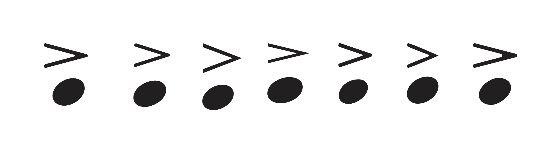
- Screenshot 15.png (59.02 KiB) Viewed 4223 times
I know that they ultimately derived from a "tiny hairpin dim", but some have thick and thin lines.
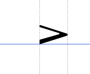
- Screenshot 16.png (28.57 KiB) Viewed 4220 times
Re: Accent shape
Posted: 10 Mar 2024, 15:22
by MichelRE
I'm partial to the very first one you have in your lineup.
however, I find it lagging a bit too far to the left in relation to the notehead.
Re: Accent shape
Posted: 10 Mar 2024, 15:51
by benwiggy
Yes, I knocked these up in a drawing app, so it might not be aligned properly.
Re: Accent shape
Posted: 10 Mar 2024, 18:41
by hautbois baryton
I like 1, 4, and strangely, 7.
Re: Accent shape
Posted: 10 Mar 2024, 19:12
by benwiggy
1. is Wess's Vintage GHMA font.
2. MuseGraph Vienna
3. Maestro
4. Engraver
5. Bravura
6. Sebastian
7. MTF Cadence
I also have November2, which is even narrower.
- Screenshot 17.png (29.68 KiB) Viewed 4205 times
Re: Accent shape
Posted: 10 Mar 2024, 19:29
by OCTO
benwiggy wrote: ↑10 Mar 2024, 14:56
Screenshot 16.png
I like this. I think I have seen it somewhere!
The bottom bold adds some spicy personality to it, I believe it is easy to percept.
Re: Accent shape
Posted: 11 Mar 2024, 00:19
by MichelRE
really, all I can say is that I despise the look of a very opened accent articulation (like #3 in the OP).
one of the first things I changed when I switched to Dorico was the default accent font to one that was slimmer (not that Dorico's was horribly wide, but still wider than I wanted.)
Re: Accent shape
Posted: 11 Mar 2024, 09:26
by benwiggy
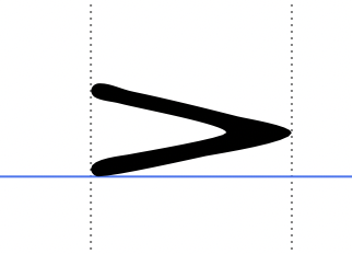
Here's my prototype for a revised accent for Sebastian:
- Screenshot 2.png (10.87 KiB) Viewed 4165 times
It has a very slightly thicker note-side edge, and a narrow angle.
Re: Accent shape
Posted: 11 Mar 2024, 13:43
by hautbois baryton
I like this greatly.
Re: Accent shape
Posted: 11 Mar 2024, 15:20
by John Ruggero
I also prefer narrow accent marks and replaced the Maestro one with the Engraver in Finale. Engraver does look little narrow when placed with the others in your example, but I like it a lot in actual use. I don't think I would like the thicker bottom line if used with Maestro, but it might look good with a more compatible font. The angle itself is excellent.