Page 1 of 2
Spacing problem
Posted: 18 Apr 2024, 17:50
by benwiggy
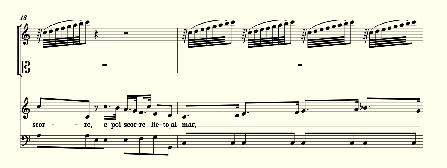
I have a piece where runs of very small notes in the Violins affect the spacing of the other parts. For example:

- Screenshot.png (98.01 KiB) Viewed 15718 times
Short of having one bar per system, I'm not sure how to improve it, but it's very hard to read.
Re: Spacing problem
Posted: 18 Apr 2024, 18:22
by OCTO
I don't see any problem, but yes, it is difficult to make it "better".
What is the spacing algorithm? Try using √2 (Sqr root of 2), instead of typically φ (Golden ratio).
Re: Spacing problem
Posted: 18 Apr 2024, 20:02
by benwiggy
It's already 1.41.!
EDIT: Actually , a larger ration seems to produce a better result overall.
Re: Spacing problem
Posted: 18 Apr 2024, 20:57
by John Ruggero
The perfect storm for layout.
1. Reduce the note size for the roulades?
2. If this is the only such measure and the next measure is not as full as the previous one, this measure might move to the next line. Then the previous layout would be reworked.
3. You probably considered a divided measure. It would be a shame since it is so close to OK as it stands. So we are back to no. 1.
Re: Spacing problem
Posted: 19 Apr 2024, 07:00
by benwiggy
Sadly, the whole aria is riddled with the things! I'll try reducing the notes.
Re: Spacing problem
Posted: 19 Apr 2024, 10:53
by NorFonts
if you can put the 1 measure to the previous system then you can get the 2nd measure on one system only..maybe? it depends on what you previously notated. Can I have a look at the score file?
Re: Spacing problem
Posted: 19 Apr 2024, 11:04
by OCTO
benwiggy wrote: ↑18 Apr 2024, 20:02
EDIT: Actually , a larger ration seems to produce a better result overall.
Yes, I meant the opposite.

Re: Spacing problem
Posted: 22 Apr 2024, 16:31
by Schonbergian
I wouldn't see any issue with moving the violin notes even closer to each other, and have seen this several times in published scores to save space.
Re: Spacing problem
Posted: 22 Apr 2024, 21:31
by OCTO
Also, from what I can observe (possibly due to the browser's antialiasing), the note-heads appear to intersect with the staff lines. Ideally, the terminal points should align with the middle of the staff lines or at least coincide with the outer boundaries of the staff lines. I've noticed these "enlarged" note-heads in a score from one of my students, also he uses Dorico. They may not have been aware of this issue (could it be a default setting?).
I prefer a more pronounced appearance in published scores ("boldish"), but I find that Dorico's output is a bit too bold, albeit inconsistently so. For instance, rests and augmentation dots appear excessively bold.
So, I suggest reducing the size of the note-heads and some other elements while also experimenting with increasing the line thickness, particularly for stems and staff lines.
Re: Spacing problem
Posted: 25 Apr 2024, 12:54
by John Ruggero
OCTO, the default version of Dorico offers the Bravura font and two sizes of noteheads, "default" and "larger". However, one can use noteheads, rests and augmentation dots from other fonts. So there is certainly the possibility of using noteheads with a different design for the situation being discussed. I use a mix of symbols in Dorico, many from the Maestro font.