John Ruggero wrote:Knut, I am finally looking through your beautiful engraving and admiring so many of the aspects that you have mentioned in your critique of mine. It has a more open look that I would like to attain and will do some experimenting with reduction and proportion to see if I can achieve it. It is also nice to finally see your font on display in a complete piece. This font is a great achievement. I also think that your combination of text and music fonts form an excellent ensemble.
Thank you so much for taking the time to review my work so thoroughly, John, and of course for your kind words and positive feedback. I agree with almost all of your thoughts, and appreciate them greatly. You can get pretty blinded by your own work with such a process, so any well founded critique is invaluable.
At the risk of sounding apologetic, I will say that a few of the issues you point out are results of the first step of this process; to copy the first edition engraving pretty closely. I would probably do certain things a little differently if the process didn't start with this exercise.
Nevertheless, let me reply to each of your points with a comment of my own:
The composer and opus number look a little high to me and might be closer to the music and further down from the title so that one's attention is not taken away from the title. The copyright notice also looks a little too close to the music given the space you have below it.
I agree on both counts. I usually have the composer's name centered between the title and the music. In this case, however I had it centered between the initial Tempo marking and the title, which made it a bit high. The last line of the copyright should go below the bottom margin, so that it is in equal distance form the edge of the page to the page numbers, which go above the top margin. In this case, it didn't.
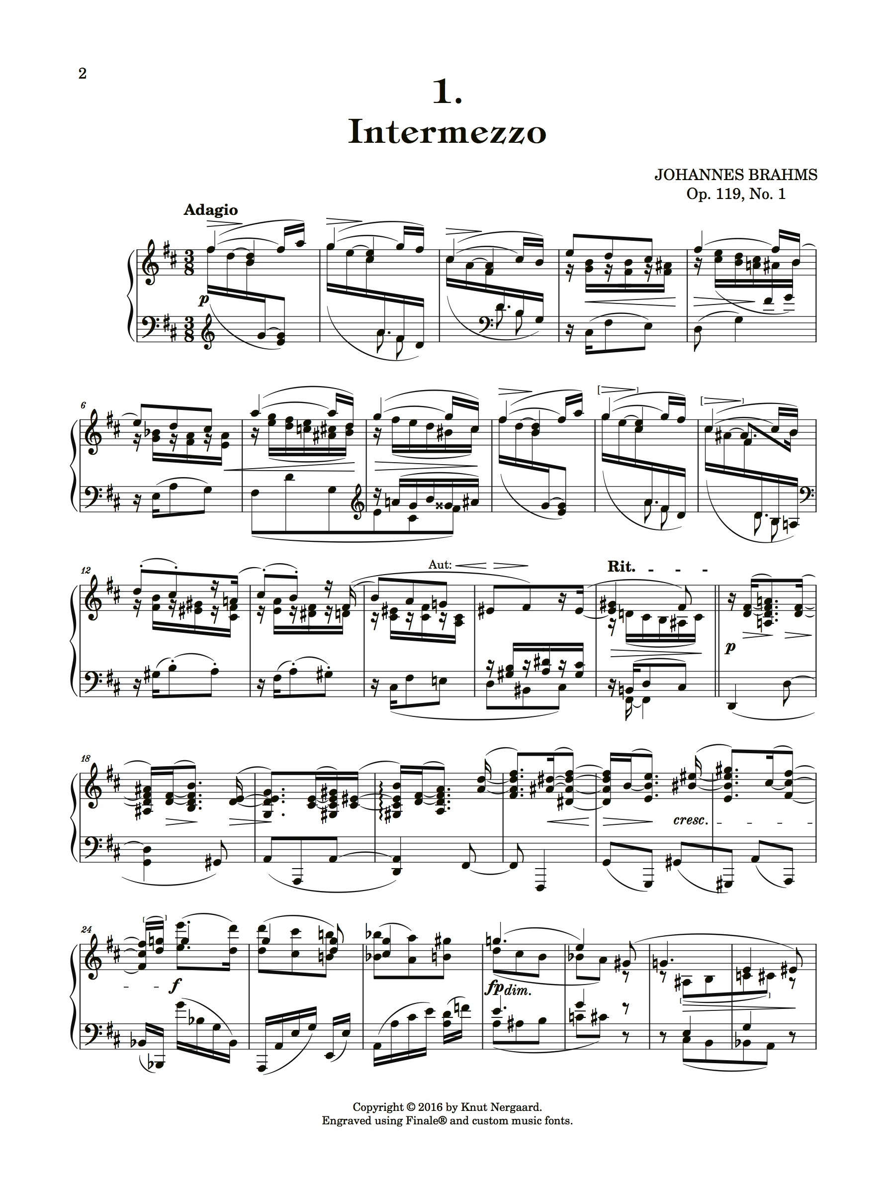
m. 7 There is a missing treble clef at the end of this measure.
m. 11 There is a missing bass clef at the end of this measure.
Thank you for spotting this. I am tempted to blame this on the beams over the barlines for this (or even the Patterson plug-in itself), because they make certain objects behave weirdly. I'm not sure if this is justified, though.
m. 10 The brackets look a smidgen close to the hairpins, but mine are too far away. I don't think that the brackets and hairpins should form one symbol.
I agree. You'll see a space saving 'personal touch' to these brackets in the version below, and I hope you like it.
m. 12 The RH 18th beam beam is too close to the top rest.
Agreed. It's actually a little difficult to decide on the best remedy in this case, but I think I got it.
m. 14 I am glad that you like the Aut. business!
Thank you for suggesting it.
m. 16 I would preserve the original lower case italics for the tempo changes and use less bold dashes. But this may now be the fashion and/or a style feature. But those dashes are pretty bold!
This is indeed a style feature and as such, probably mostly a matter of taste. This is my personal preferred style, adopted from Durand, and their dashes are just as bold!

I can see why you would prefer to keep the italic style because of it's presence in the first edition, but I prefer the Durand style because it keeps everything related to tempo in the same font, and thus is instantly recognizable. The Brahms probably isn't cluttered enough with expressions for this to be necessary, but Durand used this style for everything back in the day, so I went for it.
m. 17 It is truly unfortunate that the first measure of the next section is orphaned at the end of the line, as in the first edition. But placing it on the next line could lead to crowding. Layout is a difficult matter here.
I agree with you, but I think the engraver of the 1st edition went with the best solution possible.
m. 22 In the MS the cresc. starts on the first LH G#, so it is really unnecessary to break the bar line as in the first edition. I would not break a bar line unless absolutely necessary. For example, I don't see a need for it in m. 27.
I didn't notice this discrepancy in the MS, but given the correct placement of the
cresc. marking, I agree with you that breaking the barline is unnecessary. The same thing goes for the
fp in m. 27, which broke the barline unnecessarily in both the 1st and the complete editions.
m. 24 This use of smaller brackets occurred to me also yesterday, and I think that I will use it in my next version. But did you decide against parentheses?
Not exactly. I used square brackets mostly as an experiment, and to gauge the reaction. Also, I believe square brackets are more commonly used for editorial purposes than parenthesis. Since they were featured in your Chopin Edudes example, and since you didn't seem wild about the idea of using parenthesis exclusively (apologies if I misunderstood you), I wanted to at least try it, and in this case, I think it turned out fine.
m. 30 I am not fond of sloping hairpins, especially here! (The one in 7 is OK.)
I do like them if they are appropriate, but I agree that this particular case, a horizontal hairpin is preferable.
m. 33 I think that you have accomplished this much better than the first edition so that it is not objectionable at all. Maybe I should change mine? Yet I am still not convinced.
Thank you, that's reassuring!
Like with angled hairpins, I really like cross beams if they are appropriate and aesthetically pleasing. Both demands need to be fulfilled for me to consider them (provided it is actually possible to use conventional beams instead). In this case, I think the conventional version is more appealing because of the deviation in the stem lengths that a cross beam inevitably will produce. Except for the clef change, I really don't see any advantage to a cross beam either, but this may very well be due to ignorance on my part.
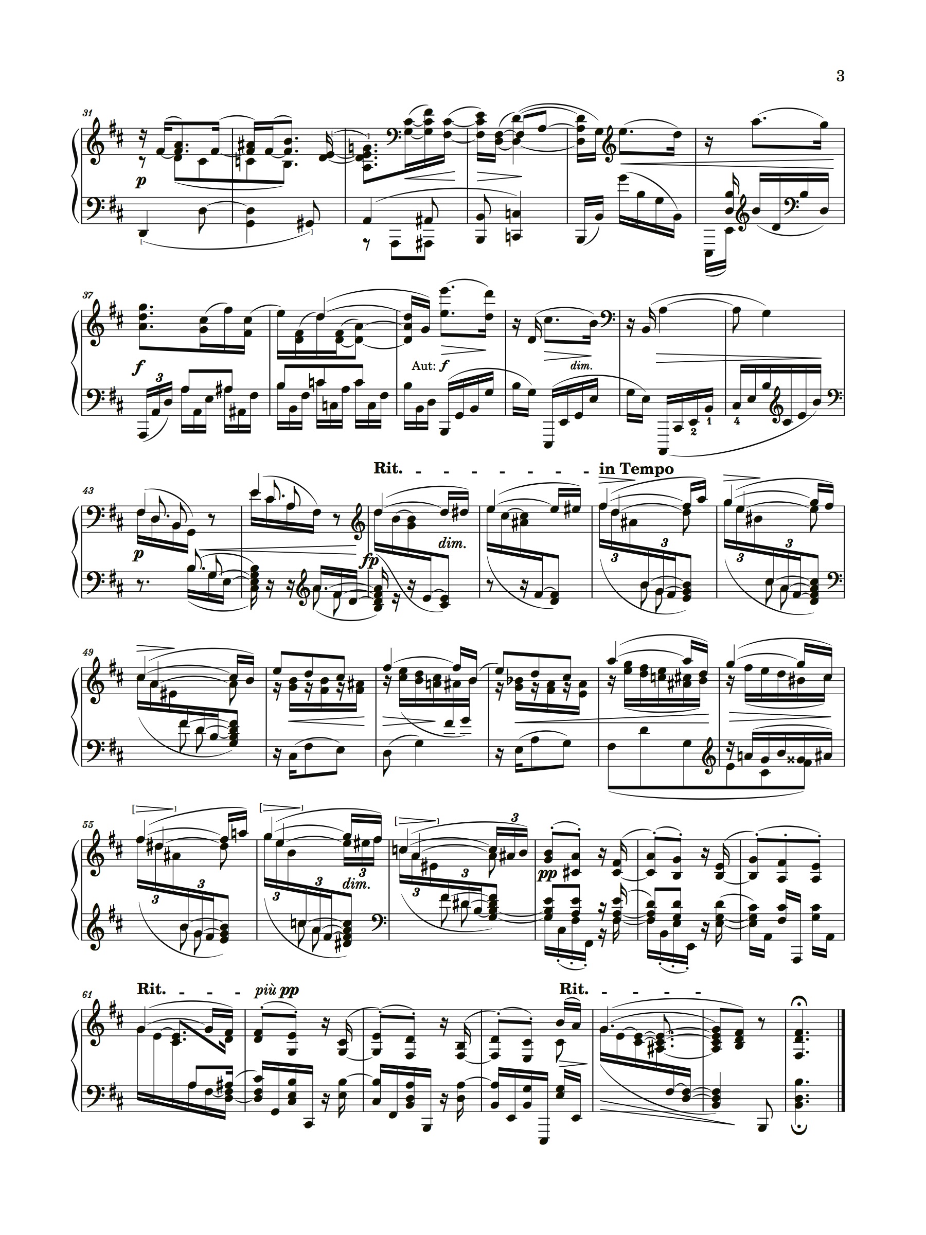
m. 45 Very clever slur! And here the broken beam is a necessity.
Thank you!
While the shape of your slurs is flawless, I prefer that they point a little more toward the center of the note head. Comparing m. 55-57 in the two versions shows our different perspectives on this.
I suspect that the way I handle slurs has more to do with Finale's limitations than anything else. By now, I'm so used to seeing them this way, that they don't bother me, which might be a shame.
Anyway, I've tried to edit them according to your preference to the best of my ability in the version below. I'm not completely sure I got them all (Finale crashed at the moment I was done), but I'm pretty sure you'll find some improvement.
And here is the latest version with some of my own edits in addition to John's excellent points above.
- Intermezzo-Corrected-02p1.jpg (727.72 KiB) Viewed 7084 times
- Intermezzo-Corrected-02p2.jpg (848.63 KiB) Viewed 7084 times
