Page 5 of 16
Re: [workbench] Brahms Op. 119, No. 1
Posted: 25 Apr 2016, 18:47
by OCTO
Sorry for interrupting, but here is the first row in my first use of MuseScore!
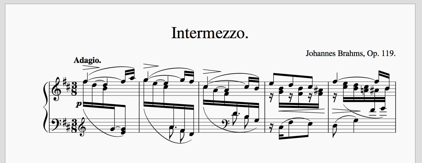
- shot 13.png (93.82 KiB) Viewed 10629 times
Re: [workbench] Brahms Op. 119, No. 1
Posted: 25 Apr 2016, 18:58
by John Ruggero
Knut, thanks so much for the care with which you are doing this. I will correct the the ties etc. which makes me nervous that the 2% reduction and additional margin may have changed some things. I noticed this with some the brackets and will need to recheck the entire piece. But I am glad that you are now happier with the L-R margins, and I agree that the top number margin could be lower. It is also a vestige of my letter size template.
I am trying not to miss any of your corrections, but didn't really understand the one about the accidentals, which is terra incognito and which I will now delve into. I also will definitely bring up anything that I disagree with and not just leave it unaddressed, for my own information and also because it might be helpful to all.
So far, the only correction that I don't agree with concerns the width of the steep cross-beams. I do prefer that they be thinner, and believe that I have seen this in hand engraved music but can't find an example at the moment. There should be examples in Bach and Chopin engraving.
I am concerned right now about getting a "Critical Report" online in a coherent fashion and have some more comments to make in it (not actual edits), so I may not post a new version for a while. I also want to finally look over your version.
Re: [workbench] Brahms Op. 119, No. 1
Posted: 25 Apr 2016, 19:43
by Knut
John Ruggero wrote:Knut, thanks so much for the care with which you are doing this. I will correct the the ties etc. which makes me nervous that the 2% reduction and additional margin may have changed some things. I noticed this with some the brackets and will need to recheck the entire piece. But I am glad that you are now happier with the L-R margins, and I agree that the top number margin could be lower. It is also a vestige of my letter size template.
I am trying not to miss any of your corrections, but didn't really understand the one about the accidentals, which is terra incognito and which I will now delve into. I also will definitely bring up anything that I disagree with and not just leave it unaddressed, for my own information and also because it might be helpful to all.
You're most welcome. I wouldn't do it if it wasn't interesting.
I had two related issues with the accidentals; the first concerns the gap between accidentals and left barlines, and the second concerns the distance between accidentals and the note(s) preceding them. The first one is easily fixed with different document settings, while the second is a result of Finale overcompensating the space for notes with accidentals, and can only be remedied through manual tweaking. I use TG-Tools Compress Spacing plug-in for this, which isn't perfect, but a lot faster than fiddling with the beat chart.
John Ruggero wrote:So far, the only correction that I don't agree with concerns the width of the steep cross-beams. I do prefer that they be thinner, and believe that I have seen this in hand engraved music but can't find an example at the moment. There should be examples in Bach and Chopin engraving.
Really! I've never seen that in plate engraved scores before. If it does occur in some editions, I don't agree with it, and I'm glad it's not a more established feature.
As a side-note to this, Daniel Spreadbury has written a very interesting post on the beaming features and algorithms of the Sternberg project, in which he stresses the necessity for rotating the beams (rather than shearing them as Finale and most other software currently do) to keep the thickness consistent regardless of angle. This is also a common mistake in Font design, since vectorized triangles behave in essentially the same way when they are slanted.
John Ruggero wrote:I am concerned right now about getting a "Critical Report" online in a coherent fashion and have some more comments to make in it (not actual edits), so I may not post a new version for a while. I also want to finally look over your version.
I'm looking forward to reading the report as well as your reactions to my effort above.
Re: [workbench] Brahms Op. 119, No. 1
Posted: 25 Apr 2016, 19:52
by Knut
OCTO wrote:Sorry for interrupting, but here is the first row in my first use of MuseScore!
shot 13.png
That's an excellent start, OCTO. Keep at it!
Re: [WORKBENCH] Brahms Op. 119, No. 1
Posted: 25 Apr 2016, 20:26
by John Ruggero
Looks very nice, OCTO. What a great opportunity to get to know a new program as well as to show what it can do.
Re: [WORKBENCH] Brahms Op. 119, No. 1
Posted: 25 Apr 2016, 20:50
by John Ruggero
Knut, there are many examples of thin beams for space reasons in cross-beamed and non-crossbeamed notes in early editions of the Chopin Prelude no. 1, two can be seen at the following. Clicking on the arrows will show more:
http://www.chopinonline.ac.uk/ocve/brow ... =5&range=1
http://www.chopinonline.ac.uk/ocve/brow ... =1&range=1
I consider m. 11 in my engraving to fall into the same category. M. 33 is a little different and is such a unique case that it is had to find a precedent for it, but I to my eye, slightly thinner beams are more pleasing.
None of this, of course, has to do with the general matters of computer beaming as discussed by D. Spreadbury etc.
Re: [WORKBENCH] Brahms Op. 119, No. 1
Posted: 25 Apr 2016, 21:20
by Knut
John Ruggero wrote:Knut, there are many examples of thin beams for space reasons in cross-beamed and non-crossbeamed notes in early editions of the Chopin Prelude no. 1, two can be seen at the following. Clicking on the arrows will show more:
http://www.chopinonline.ac.uk/ocve/brow ... =5&range=1
http://www.chopinonline.ac.uk/ocve/brow ... =1&range=1
I consider m. 11 in my engraving to fall into the same category. M. 33 is a little different and is such a unique case that it is had to find a precedent for it, but I to my eye, slightly thinner beams are more pleasing.
None of this of course, has to do with the general matters of computer beaming as discussed by D. Spreadbury etc.
Thanks, John. Those are very interesting examples, and upon seeing them, I too can recall coming across something similar in works by Bach.
However, these are very special cases where a normal beam thickness wouldn't work without altering the notation entirely, and I disagree that the same category applies to m. 11 (and 61) in the Brahms. As demonstrated by the 1st and the complete editions, there is no practical need for a thinner than usual beam in this case, and I therefore doubt that any plate engraver would treat it as such.
Whether or not thinner beams in such cases are aesthetically pleasing, however, is more a matter of opinion. Personally, I am a big proponent of consistent weights whenever possible, and therefore disagree.
Re: [WORKBENCH] Brahms Op. 119, No. 1
Posted: 25 Apr 2016, 21:31
by John Ruggero
Knut, I didn't answer some earlier questions:
Do the cue staffs on one of the pages represent errors of pitch?
In the WU edition of the Chopin Etudes the cue staff measures generally give alternate readings of notes and markings from the MS or sketches. It is very helpful to see the evolution of Chopin's markings as one layer casts light on the other. There is a lot of detail in his music and he often could not decide on definitive notation for it.
The main problem with this solution is the extra space it requires for each page.
I am not advocating this style for the Brahms, but the Wiener Urtext uses no more pages than any other standard edition of the Etudes! The best page layout for these pieces has been set for many years in many editions, and the WU doesn't deviate from it. Pretty amazing, isn't it? This is definitely an edition for an engraver to study. I prefer it to all other editions because it is a pleasure to play from as well as its authenticity.
My main issue with square brackets is that they require a larger shift in the placement of some objects they apply to, particularly the intensity marks. Ideally, these should be placed consistently regardless of wether they are bracketed or not, but the closing bracket will cut through the slurs if they aren't shifted vertically. None of the alternatives look very good to me.
I don't understand this, possibly because I am still hand copying with a computer and don't rely as much as I should on computer settings for placement.
I hope that I didn't miss any of your other questions, Knut. This is quite an involved business.
As far as the beam thickness, I guess it comes down to a matter of taste as with so many things.
Re: [WORKBENCH] Brahms Op. 119, No. 1
Posted: 25 Apr 2016, 22:02
by Knut
John Ruggero wrote:
In the WU edition of the Chopin Etudes the cue staff measures generally give alternate readings of notes and markings from the MS or sketches. It is very helpful to see the evolution of Chopin's markings as one layer casts light on the other. There is a lot of detail in his music and he often could not decide on definitive notation for it.
John Ruggero wrote:I am not advocating this style for the Brahms, but the Wiener Urtext uses no more pages than any other standard edition of the Etudes! The best page layout for these pieces has been set for many years in many editions, and the WU doesn't deviate from it. Pretty amazing, isn't it? This is definitely an edition for an engraver to study. I prefer it to all other editions because it is a pleasure to play from as well as its authenticity.
That is very interesting indeed. As I don't own a single Wiener Urtext edition, this is likely to be my first. Thank you for turning me on to it!
John Ruggero wrote:My main issue with square brackets is that they require a larger shift in the placement of some objects they apply to, particularly the intensity marks. Ideally, these should be placed consistently regardless of wether they are bracketed or not, but the closing bracket will cut through the slurs if they aren't shifted vertically. None of the alternatives look very good to me.
I don't understand this, possibly because I am still hand copying with a computer and don't rely as much as I should on computer settings for placement.
This has nothing to do with settings.
The rounded shape and thin, semi vertical ends of parenthesis lend themselves better to close placement and even cutting through other objects without being too obstructive. Square brackets, on the other hand, most often has a thick vertical spine and thin horizontal ends, which require a bit more space around them.
This is especially evident for the small square brackets commonly used for slurs in editorial editions. They often need to be placed within the staff, and as such, require a larger margin of space to the staff lines than a parenthesis would because of their horizontal ends.
John Ruggero wrote:I hope that I didn't miss any of your other questions, Knut. This is quite an involved business.
Indeed! I think that was it, and I really appreciate you taking the time to answer them all.
John Ruggero wrote:As far as the beam thickness, I guess it comes down to a matter of taste as with so many things.
I guess so. Luckily, though, even the most personal opinions seem to result in something more collectively interesting on this board.
Re: [WORKBENCH] Brahms Op. 119, No. 1
Posted: 25 Apr 2016, 23:38
by John Ruggero
Knut wrote:
The rounded shape and thin, semi vertical ends of parenthesis lend themselves better to close placement and even cutting through other objects without being too obstructive
Ah, I understand now. I try to avoid placing brackets or parentheses on the staff or having them cut through anything. And I would use dashed slurs instead of enclosing them if necessary.
You'll really like the Chopin, Knut. For me, there are three essential editions of piano music: the Bischoff/Bach WTC, the Schenker/Beethoven Sonatas and the Badura-Skoda/Chopin Etudes.