Page 1 of 2
16th century keyboard notation
Posted: 18 Feb 2017, 19:32
by benwiggy
Quite esoteric this one. I'm transcribing an early 17th-century keyboard part. It keeps using the "custos" symbol (the pitch indicator normally found at the end of a staff line) throughout the inner parts.
It seems to represent a "ditto" mark, i.e. "same note values as the other parts, but at these pitches". Or one instance of it might possibly mean "thirds with the upper part".
I can't share a picture of the ms, as the owners are particularly severe about such things. Has anyone come across it, or seen it described in a text?
Re: 16th century keyboard notation
Posted: 19 Feb 2017, 04:55
by OCTO
Are you able to do by your hand a copy of it (or similar to it)? I am not sure how it would look like, but that sounds very contemporary for the Baroque area. Very interesting, indeed.
Re: 16th century keyboard notation
Posted: 19 Feb 2017, 08:59
by benwiggy
Here's a quick mock-up of one of the instances. The descent of the symbols clearly suggests that notes at those pitches sound at the values of the notes above. "Ditto".
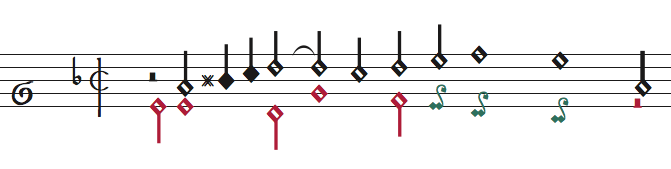
- Screen Shot 4.png (19.11 KiB) Viewed 10136 times
Re: 16th century keyboard notation
Posted: 19 Feb 2017, 09:10
by benwiggy
Here's another instance, where I've taken it to mean "follow the lower line in thirds for a bit". (Well, that seems to fit, up to the dotted minim.

)
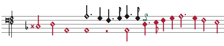
- Screen Shot 5.png (19.32 KiB) Viewed 10135 times
Re: 16th century keyboard notation
Posted: 19 Feb 2017, 11:04
by Christof Schardt
Never ever seen this shape before. Without your explaination I would have take this as the Loch Ness Monster.
Re: 17th century keyboard notation
Posted: 19 Feb 2017, 11:13
by benwiggy
It's usually found at the end of a staff line, to give warning of the pitch on the following line. But I've not seen it in this context before.
Actually, checking the dates, the source is early 17th century, so moving towards Baroque.
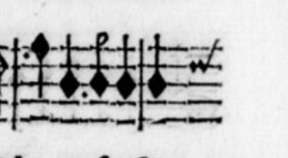
- Screen Shot 6.png (55.81 KiB) Viewed 10125 times
Re: 16th century keyboard notation
Posted: 19 Feb 2017, 19:22
by David Ward
Christof Schardt wrote: ↑19 Feb 2017, 11:04
…Without your explaination I would have take this as the
Loch Ness Monster.
Now, now, don't take poor Nessie in vain! (I'm due to be visiting friends who live by Loch Ness this next weekend, including my 76th birthday.) She (Nessie) is good for the tourist trade, if nothing else.
Apologies for the OT, but…
Re: 16th century keyboard notation
Posted: 21 Feb 2017, 03:19
by John Ruggero
When we visited Loch Ness awhile ago, we did encounter Nessie, who looked remarkably like that custos, but a bit larger...
Re: 16th century keyboard notation
Posted: 21 Feb 2017, 12:15
by John Ruggero
Could it indicate that the note is to be ornamented (trilled?)?
Re: 16th century keyboard notation
Posted: 21 Feb 2017, 14:08
by benwiggy
I thought about that, but they seem to appears always as part of an inner voice. If it were an ornament on the upper notes in my first example, then I would expect them to be above, or nearer the notes. They are often over an octave away.**
Also, the pitch of the symbol seems to be significant. For instance, the pitch of the symbol is the same as that found in the viol part that has the same line.
** Ooh, I wonder if it indicates a part that is too large for a hand-stretch? That doesn't account for the second example, though.