Examples are indeed interesting.
But of course it also depends on what one is trying to prove with an example.
On my side I try to search and find out what is possibly working.
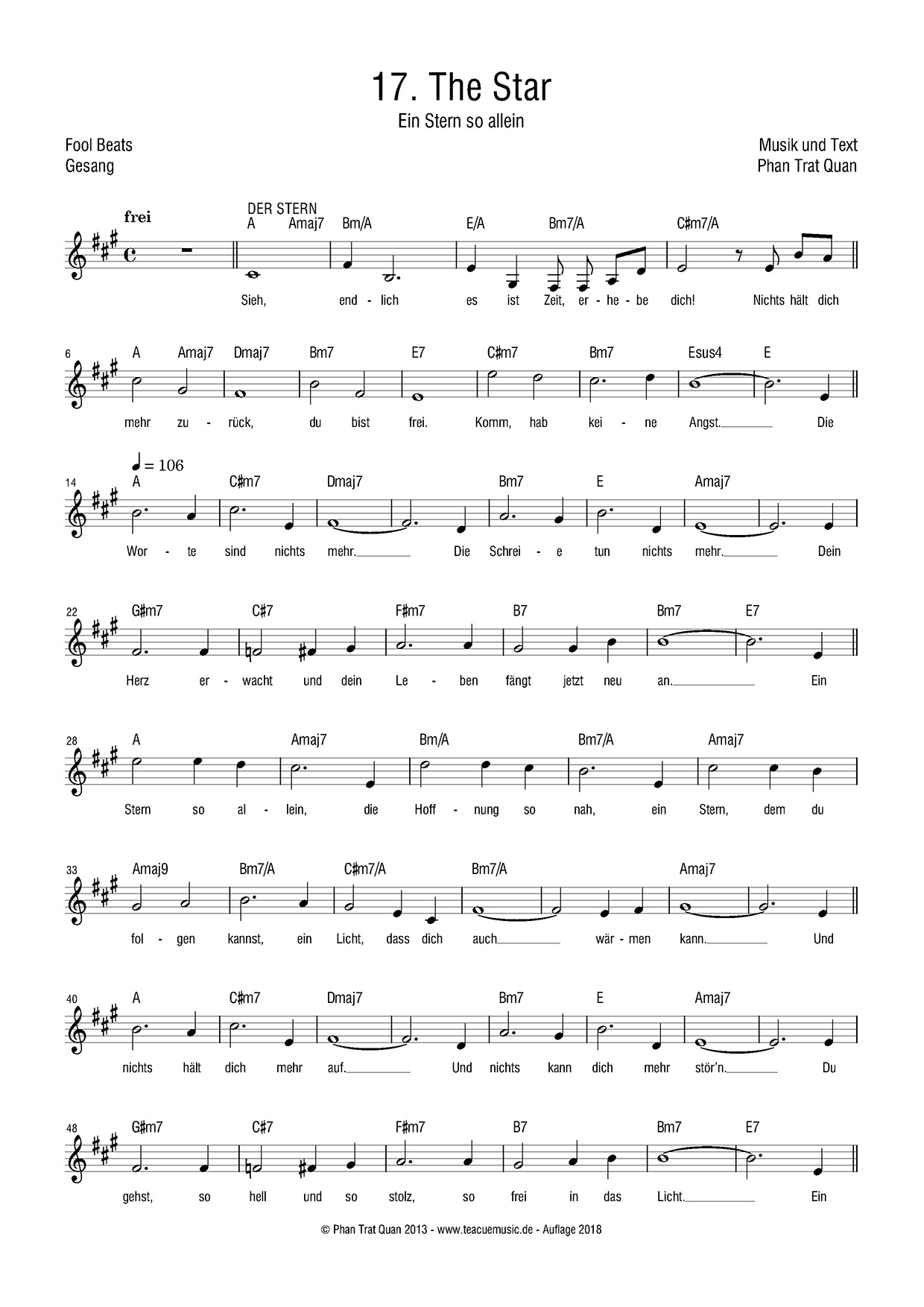
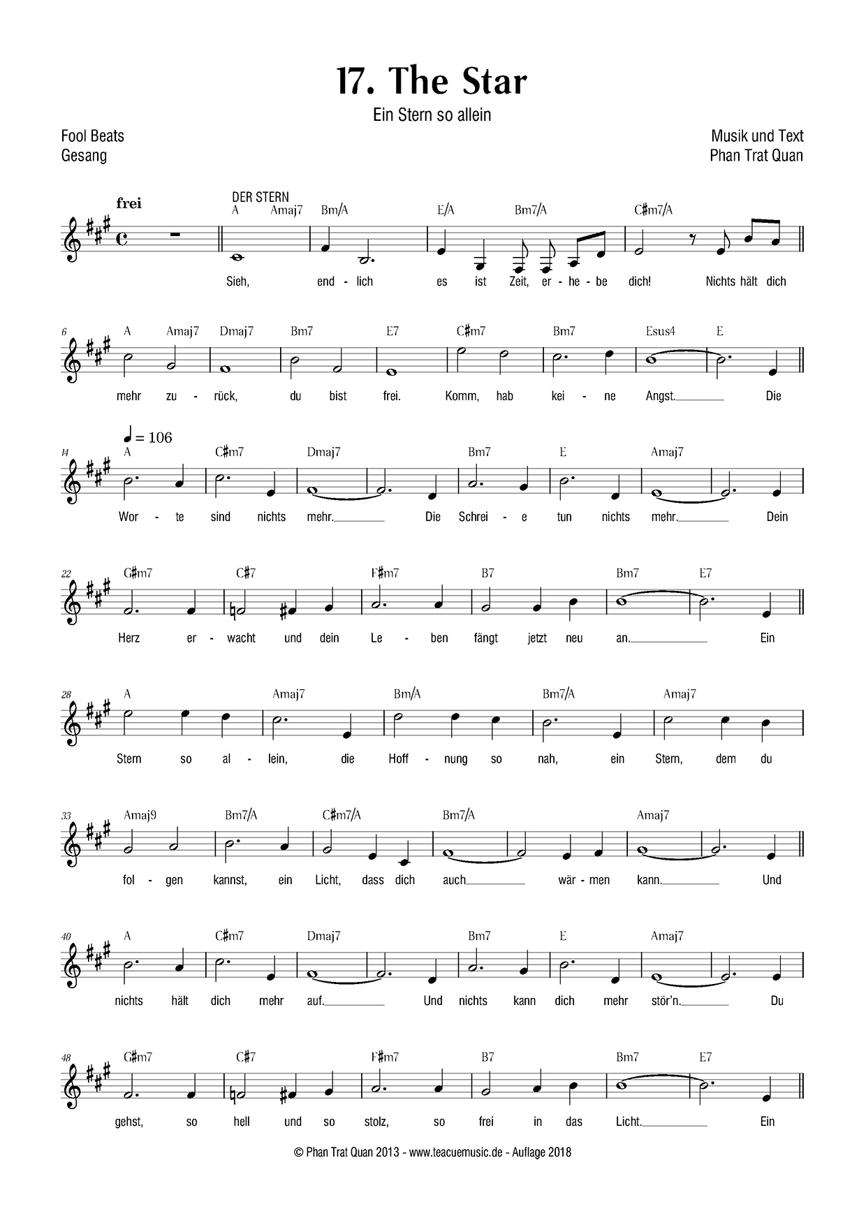
Here are some examples of the same score each using different fonts.
(Edit: for some unknown reasons after uploading the pictures have been cropped to the right and at the bottom, if someone knows why please tell me! Ok this was a user error, it is now solved)
"dorico-default"
This is almost the default output of Dorico with Bravura and Academico.
I like it a lot and if I was not looking for something new I probably could imagine to use it as it is for this particular score.
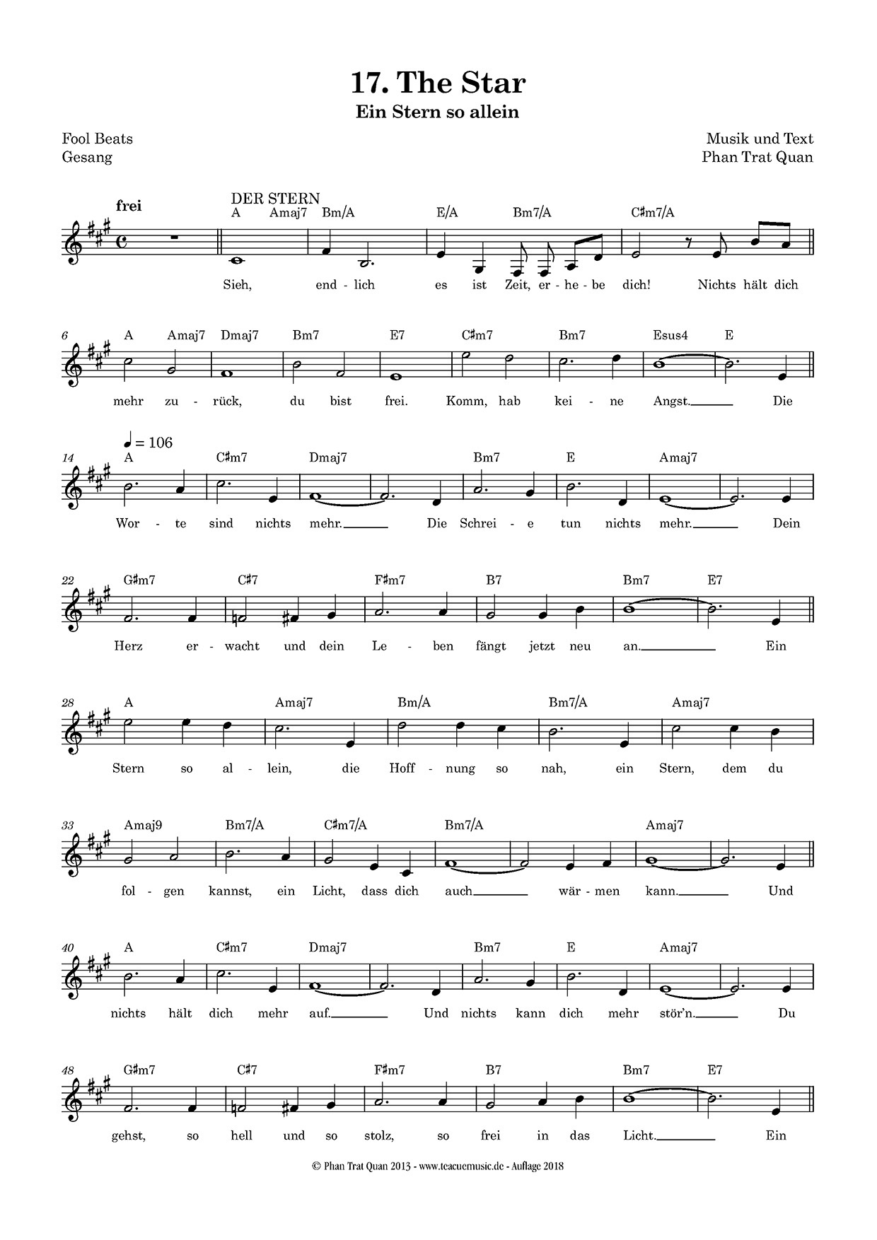
- 01-default-dorico.jpg (343.46 KiB) Viewed 16209 times
"garamond"
This uses MTF Cadence and a Garamond condensed font.
A condensed font suits my needs much better for a very practical reason: I have a lot of lyrics and chord symbols in my scores and very often both can be very wide.
A condensed font helps a lot and as I prefer to keep the same look for a work consisting of several pieces I use a condensed font even if it is not absolutely necessary like in this example.
A condensed font for title and other texts is also not necessary but I find it not easy to mix condensed font with wider fonts.
BTW this is how I engrave my works at the moment and I enjoy it a lot.
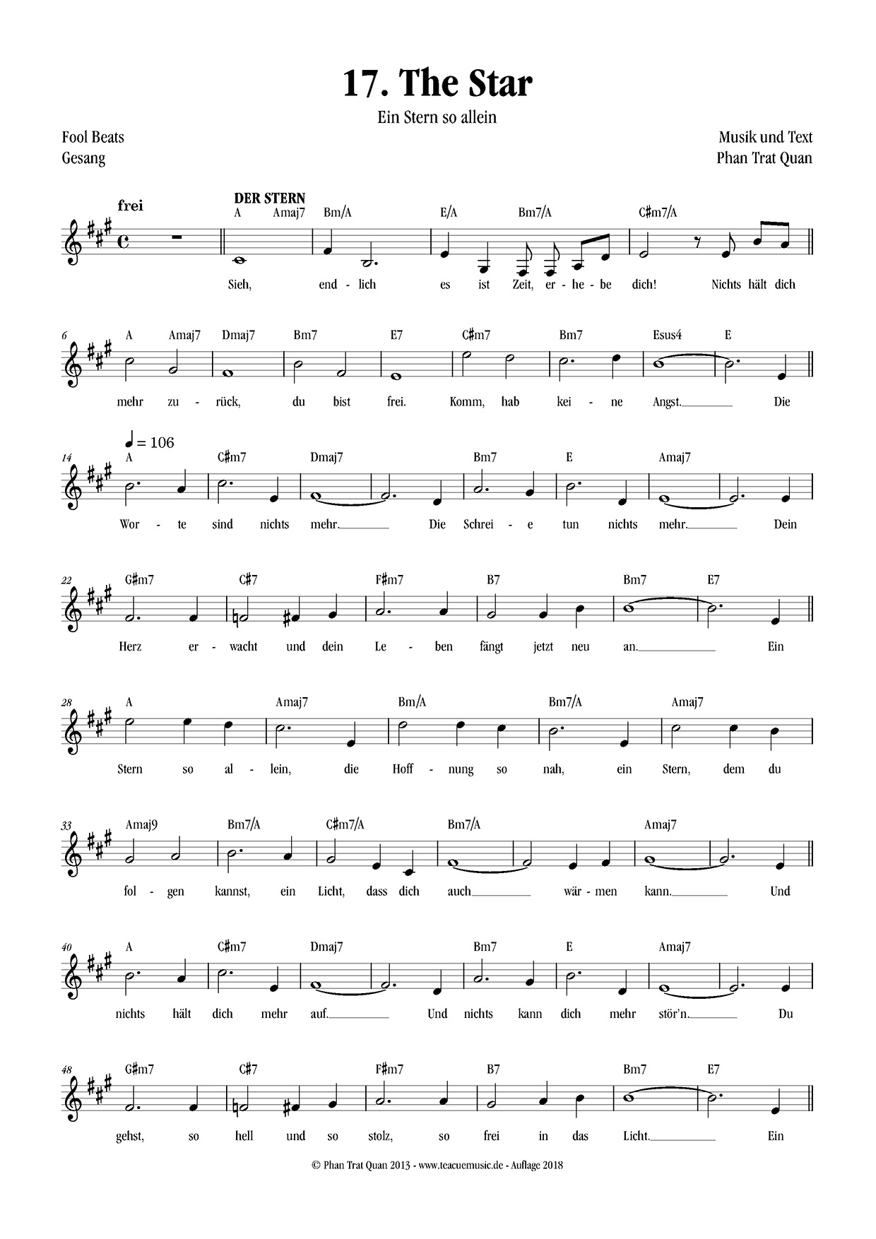
- 02-garamond.jpg (322.47 KiB) Viewed 16209 times
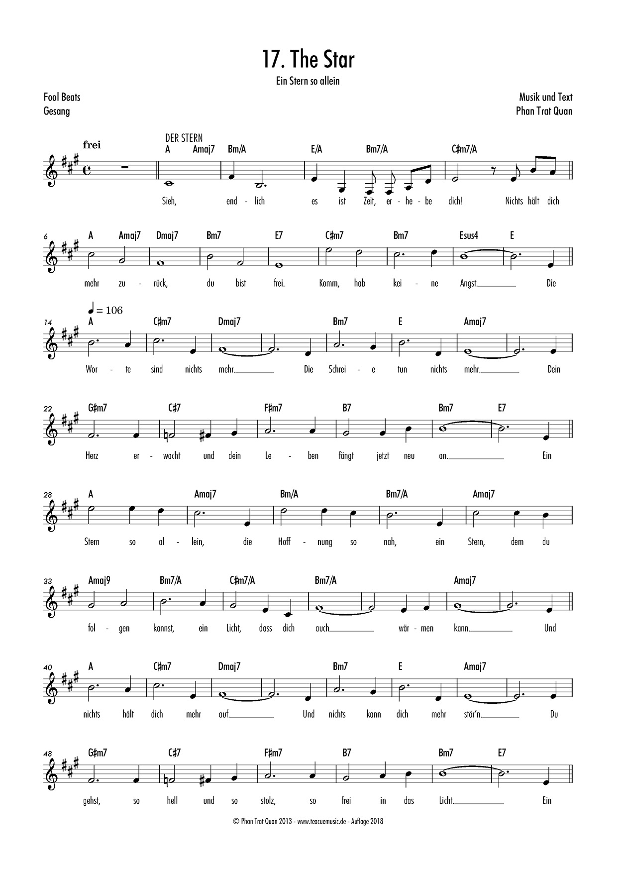
Each of the next three examples "futura", "humanist" and "swiss" uses a sans serif condensed font.
My preference goes to the Swiss font but to me all are readable.
I worked many years as a chor conductor using my scores/songbooks printed with the Swiss font and it was always very good readable.
In my last working years I printed and worked with the Garamond font and curiously this was a tad harder for me to read.
But maybe it was because of my old eyes

From an aesthetical point of view I find Futura a bit too hard and Humanist a bit too special.
I like the Swiss font very much and I find it pleasant to the eyes.
Maybe the fact that it is less condensed than the two others makes it softer.
(BTW Dorico seems to have problems with some fonts and it did not print the bar numbers in italic and did not print the title bold)
If I decide to use sans serif only I will probably use the Swiss font.
"Futura"
- 03-futura.jpg (314.92 KiB) Viewed 16209 times
"Humanist"
- 04-humanist.jpg (325.79 KiB) Viewed 16209 times
"Swiss"
- 05-swiss.jpg (324.68 KiB) Viewed 16209 times
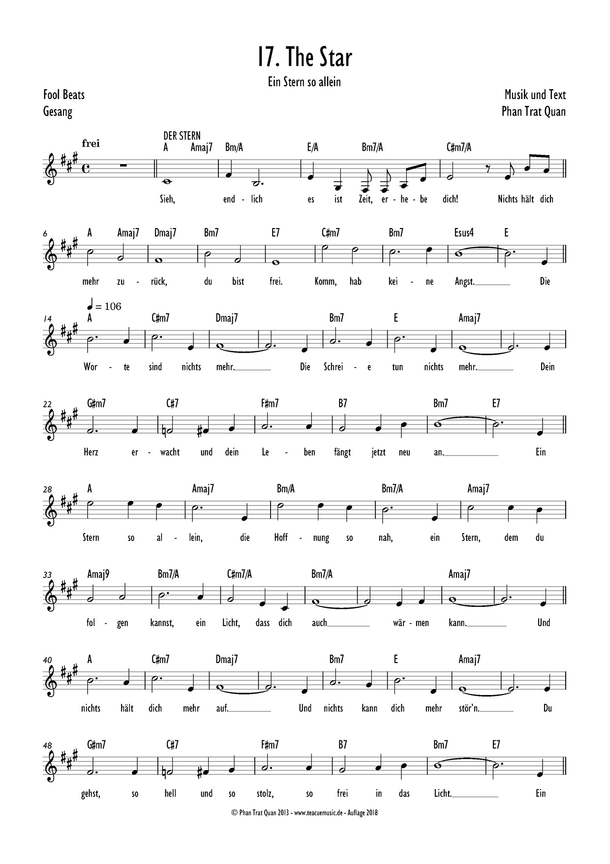
mix
This example combines a semi serif font for title, chord symbols and bar numbers and a sans serif fonts (one condensed and one less condensed) for the other text elements.
The reasons why I would eventually mix fonts and width are:
1. I prefer a softer font for titles but it should not be as baroque as a traditional serif: a semi serif could fullfil this.
2. Subtitles, labels for composer and so on do not need to be condensed, I choosed then a less condensed font from the same type.
3. I stated earlier that chord symbols need to be narrow, on the other side I find that chord symbols build a category in themselves and can be distinct from other text elements. There are like a very distinct voice.
Also using the same semi serif font for title and chord symbols could possibly unify (I am absolutely not sure that it does this!) So if the font is not too wide it can possibly fit.
To also unify numbers I use the same font for bar numbers.
4. As previously mentioned lyrics in my scores have to be condensed even if this is not really visible in this score.
I find a serif condensed font less readable than a condensed sans serif this is why I choose a sans serif.
I am not completely convinced with this example of combined fonts and I am not sure why.
- 06-mix.jpg (322.53 KiB) Viewed 16209 times
Some other conclusions
Without a notation font more towards a sans serif style (which unfortunately does not exist at the moment) the use of a sans serif font is not really easy and most of the time a serif font seems to work better and seems to be more pleasant to the eyes.
But to me this is only from an aesthetical point of view and this is not about readability.
I also begin to think that my approach focussing on fonts is too one-sided and I should better look and study other design elements that can lead to a modern aspect.
I will do two things in the next time:
1. Continue to learn and sharp my eyes to better engrave independently of a "style"
2. Continue to design a hand written font in the hope that it will also teach me a few things about engraving