Page 1 of 4
Font collections
Posted: 29 Oct 2015, 05:43
by OCTO
I don't know if it is better place than "Sites" sub-forum, but I guess anyone interested in fonts will look first here.
Interesting collection, worth to mention:
https://fonts.openlilylib.org/
My favorites:
- Beethoven
- Cadence
- Profondo
- Sebastiano
- Scorlatti
Re: Font collections
Posted: 29 Oct 2015, 13:07
by Fred G. Unn
Perhaps a serious LilyPond user like Schneider will chime in, but I believe LilyPond handles music fonts quite differently than other notation programs. If you download Beethoven for example, you'll notice that there are actually 8 fonts plus a brace font. From the naming structure, Beethoven-11, 13, 14, 16, 18, 20, 23, 26, I'm guessing these are optically sized fonts that are meant to be used at that size, not scaled to other sizes like most music fonts. Is that correct?
I'd love to see Abraham Lee on this forum as it seems like he's just about the only one developing other fonts for LilyPond. I actually emailed him when you first got this up and running OCTO and let him know about it.
Re: Font collections
Posted: 29 Oct 2015, 17:18
by John Ruggero
The fonts themselves look very nice, but as usual, I think that the treble clefs leave something to be desired. Always that treble clef.
Re: Font collections
Posted: 29 Oct 2015, 17:58
by Schneider
Well, honestly speaking, I do not have all the answers...
Not much here:
http://www.lilypond.org/doc/v2.19/Docum ... -feta-font
Abraham give us a little more info here:
https://sites.google.com/site/tisimst/H ... ont-how-to
BTW, Abraham's the one who gave me the address of this board

.
Anyway, here's something I did to try 'Haydn', clearly a vintage look.
Re: Font collections
Posted: 29 Oct 2015, 21:53
by John Ruggero
Pernambuco:
Breathtaking! So elegant! So clean! So retro! And the treble clefs work so well! I am exhausted from the superlatives! For me, this is essentially beyond criticism, but I do have a couple of questions.
1. Are the fermatas and accent marks slightly too large in comparison to the rest of the font?
2. Should an exception be made and the dotted slurs in measures 2 and 7 be on the beam side to avoid the ledger lines?
3. 18-28 Some of the inner ties (and one lower one) look a little suspicious to me. Maybe not right into the note head?
Bravo!
Re: Font collections
Posted: 29 Oct 2015, 22:22
by Schneider
John Ruggero wrote:Pernambuco:
Breathtaking! So elegant! So clean! So retro! And the treble clefs work so well! I am exhausted from the superlatives! For me, this is essentially beyond criticism, but I do have a couple of questions. [...]
Well, thank you very much John!

John Ruggero wrote:[...] 1. Are the fermatas and accent marks slightly too large in comparison to the rest of the font? [...]
Yes, definitely!
John Ruggero wrote:[...]2. Should an exception be made and the dotted slurs in measures 2 and 7 be on the beam side to avoid the ledger lines? [...]
I choose this option to stay closer to the retro look. Scores I have from the 20s/30s have barely slurs over the beam.
John Ruggero wrote:[...]3. 18-28 Some of the inner ties (and one lower one) look a little suspicious to me. Maybe not right into the note head? [...]
Hum, probably. It was just a test for this font, I don't remember having spent so much time on it...
Thank you again for you kind comments !!
Re: Font collections
Posted: 29 Oct 2015, 22:54
by John Ruggero
You are very welcome, Pierre. I had one other question. The beaming is so well done and has such a natural and musical appearance. Is this LilyPond? Or you? We were having an interesting discussion on beaming on one of the other threads.
Re: Font collections
Posted: 29 Oct 2015, 23:17
by OCTO
Except that it looks astonishing, I would love to have noteheads in the frame of the staff-lines, they look like jumping out.
Or maybe THAT was the purpose?
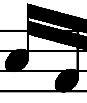
- A 2015-10-30 at 12.15.00 AM.png (13.28 KiB) Viewed 11851 times
Re: Font collections
Posted: 30 Oct 2015, 10:05
by Schneider
The beaming setting is mine, and noteheads are 'Haydn's' (latest version), and you're right, this height should be fixed.
Re: Font collections
Posted: 30 Oct 2015, 16:00
by John Ruggero
I am afraid that if you change the size of those note heads, the astonishing look might be lost! But I hope that you will post the new version for comparison. I wish that you would contribute your thoughts on beaming, as well.