Page 1 of 4
Very Short Octave Sign Rant
Posted: 26 Sep 2019, 20:28
by John Ruggero
Re: Very Short Octave Sign Rant
Posted: 27 Sep 2019, 03:22
by Schonbergian
The larger, more widely spaced dashes are more bothersome to me than the redundant va.
Re: Very Short Octave Sign Rant
Posted: 27 Sep 2019, 06:02
by MalteM
Finale’s right edge is too short.
LilyPond 2.19.83 default:
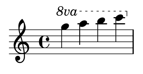
- lilypond.png (13.37 KiB) Viewed 8185 times
IMO the full-size “va” looks very bad but the right edge looks cleaner than the dashed ones (especially Durand).
MuseScore 3.2.3 default:
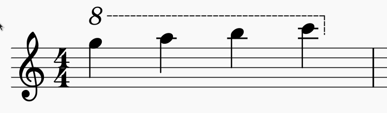
- musescore.png (15.21 KiB) Viewed 8185 times
Too small gaps between the dashes.
Re: Very Short Octave Sign Rant
Posted: 27 Sep 2019, 09:17
by Florian
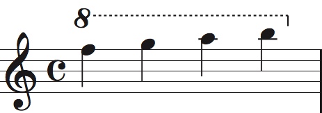
You can get pretty close by changing three engraving options and saving them as default in Dorico:
- ottava_dorico.png (17.92 KiB) Viewed 8175 times
Unfortunately, it’s still impossible to get the vertical position of the line right. Oh well...
For what it’s worth, I hardly ever used Finale’s built-in octave lines. I had my own.
Re: Very Short Octave Sign Rant
Posted: 27 Sep 2019, 12:11
by OCTO
Florian wrote: ↑27 Sep 2019, 09:17
For what it’s worth, I hardly ever used Finale’s built-in octave lines. I had my own.
Agree, I use also my own.
Re: Very Short Octave Sign Rant
Posted: 27 Sep 2019, 14:22
by John Ruggero
Florian, the Dorico is excellent and has a nice vertical, but what does the default look like? The point of the thread is that the defaults, as kindly shown above by MaiteM and the comments by Schonbergian and OCTO. make one wonder if the designers ever looked at engraved music when it comes to octave signs. And examples at the Dorico forum make me wonder about Dorico as well.
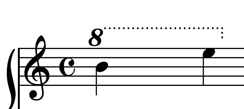
I too use my own but am considering modifying it to look more dotted and less dashed. I like a lowish attachment point as shown and sorry to hear that it can't be done in Dorico. I think I now prefer the dashed vertical and will definitely change that if it is possible in Finale. The va is anathema to me, as is the 8vb business that seems to have provoked the recent resurgence of the va. Suggestions are welcome:
- octave sign.jpeg (18.59 KiB) Viewed 8155 times
Re: Very Short Octave Sign Rant
Posted: 27 Sep 2019, 17:12
by Schonbergian
MuseScore's default is definitely the best, but I think I still prefer John's overall for consistency with engraved scores.
Re: Very Short Octave Sign Rant
Posted: 27 Sep 2019, 22:41
by John Ruggero
Thanks very much, Schonbergian!
A characteristic seen even in the first uses (with which I am familiar) is that the octave sign extension line is more continuous than the other dashed lines. That is one way in which Finale and Lilypond fail, and in which Dorico might be improved. However, I agree with MaiteM that the Musescore appears too solid so that it begins to compete with the staff lines. Beethoven and Chopin used a solid wavy line ended by a loco rather a vertical. it was therefore easily distinguished from all the other horizontal lines.
And it is no accident that the 8 is large, bold and not easily missed. I think that Lilypond and Musescore both fail on that account.
The idea that complex music is easier to grasp visually if each element is distinguished in some special way is something that may have escaped designers of software who sometimes seem to go off on their own without understanding the reasons for some characteristics of older engraving. Of course, inventing new notation is great if it is an improvement or needed addition; for example the semi-dotted line and ending vertical won out over Beethoven's system because it accomplishes the same result with less fuss and greater accuracy. But to me the changes to the octave sign seen in notational software represents degeneration, rather than improvement.
Re: Very Short Octave Sign Rant
Posted: 28 Sep 2019, 08:19
by Florian
John Ruggero wrote: ↑27 Sep 2019, 14:22
Florian, the Dorico is excellent and has a nice vertical, but what does the default look like?
Unfortunately I can’t show you because that would mean to reset ALL my engraving options to the default — unless I want to do some surgery on the user data xmls for which I don’t have time. But I think it’s 8va. (I hope they’ll make it possible to reset just one option at some point.)
The point of the thread is that the defaults, as kindly shown above by MaiteM and the comments by Schonbergian and OCTO. make one wonder if the designers ever looked at engraved music when it comes to octave signs. And examples at the Dorico forum make me wonder about Dorico as well.
Yes, and I agree with your assessment. However, in such cases the Dorico developers usually respond that it is very easy create your own defaults — which it is indeed. Don’t get me wrong: I think our ideas of beautiful and correct octave lines are very similar. But keep in mind that Dorico is (also but) not exclusively targeted at engravers of highbrow classical music. There may be other conventions in other genres and it’s impossible to make everyone happy with the defaults.
I think I now prefer the dashed vertical and will definitely change that if it is possible in Finale.
Not for the standard octave line, I think. That’s why I ended up designing my own smart lines for this.
Yours is beautiful — except for the hook. I might lift the line a little bit so it attaches at the rightmost point of the 8, but that’s just a matter of taste.
A characteristic seen even in the first uses (with which I am familiar) is that the octave sign extension line is more continuous than the other dashed lines. That is one way in which Finale and Lilypond fail, and in which Dorico might be improved.
That, too, is very easy. I’m kind of torn between dots and very short dashes for the lines. Dashes would certainly look more continuous.
Re: Very Short Octave Sign Rant
Posted: 28 Sep 2019, 15:17
by John Ruggero
Florian wrote: ↑28 Sep 2019, 08:19
Unfortunately I can’t show you because that would mean to reset ALL my engraving options to the default
Sorry, Florian, the Finale default file concept is so ingrained in my thinking. But I can look at the Dorico board for examples.
Florian wrote: ↑28 Sep 2019, 08:19
But keep in mind that Dorico is (also but) not exclusively targeted at engravers of highbrow classical music. There may be other conventions in other genres and it’s impossible to make everyone happy with the defaults.
I am not sure that these octave signs meet anyone's conventions; they look more home-grown to me.
Florian wrote: ↑28 Sep 2019, 08:19
I think I now prefer the dashed vertical and will definitely change that if it is possible in Finale.
Not for the standard octave line, I think. That’s why I ended up designing my own smart lines for this.
Yours is beautiful — except for the hook. I might lift the line a little bit so it attaches at the rightmost point of the 8, but that’s just a matter of taste.
Thank you very much, Florian.Maybe I should leave well enough alone then except for the hook. I didn't understand "Not for the standard octave line." When I said "dashed vertical" I meant the hook. All the examples in my OP have a dashed hook to end, which is more in keeping with the rest of the line and allows the hook to be extended downward when necessary and also for sudden changes in elevation. I think you are right about the attachment. It could be a little higher.