Page 1 of 1
New treble clef
Posted: 15 Apr 2021, 13:07
by Dan Kreider
Here's my first attempt at a treble clef (SVG
here).

Feedback welcome. Be nice; this is hard. Yes, I know it looks nothing like a conventional clef...
My goal is ultimately to harmonize it with
Trinite. For starters I'm just trying to make it look respectable.
Thanks!
Re: New treble clef
Posted: 15 Apr 2021, 13:47
by NorFonts
Nice! looks like a vintage clef, I see your bass clef there, even the 8th note rest, I also see the Alto clef there

You can extract them from the same glyph you designed.
Re: New treble clef
Posted: 15 Apr 2021, 14:25
by Dan Kreider
Thanks. Here it is on the staff. I think it's a bit too wispy, for one thing.

Re: New treble clef
Posted: 15 Apr 2021, 14:29
by Dan Kreider
The smaller (default) noteheads seem to fit better:

Re: New treble clef
Posted: 15 Apr 2021, 18:10
by benwiggy
Dan Kreider wrote: ↑15 Apr 2021, 13:07
My goal is ultimately to harmonize it with Trinite.
That's a nice font. I looked at buying it, but £374.16 per weight, or the complete set discounted to £1,867.93 is a little out of my range.
Font designers gotta eat, but still....
As for your clef: really interesting. It reminds me (and this is meant in a good way) of a style of animated cartoons in the late 50s/early 60s.
Re: New treble clef
Posted: 15 Apr 2021, 19:46
by Dan Kreider
benwiggy wrote: ↑15 Apr 2021, 18:10
As for your clef: really interesting. It reminds me (and this is meant in a good way) of a style of animated cartoons in the late 50s/early 60s.
Ha! Well, not quite what I was going for, but I'll take it.
Re: New treble clef
Posted: 16 Apr 2021, 01:04
by tisimst
Dan, you are endeavoring to do something even more challenging than most attempt. When staying within the world of music symbols, you can take a lot of liberties when it comes to creating a cohesive design because most symbols don't have a lot of similarities. However, when trying to match up to a text font, which has A LOT of similarities, you're going to have to synthesize music symbols a bit differently.
I recommend pulling curves/features from the text glyphs themselves with minor modifications as a starting point paying careful attention to thick & thin. Since text on a music score tends to be sized such that the x-height is roughly a single staff space, this makes for a pretty small thick/thin ratio to base music glyphs off of. Thus, I'd use the BOLD version of Trinite as more of a design guide for the treble clef since it also has a higher contrast between thick & thin, probably for other music symbols, too.
Here are some stylistic examples I had a small hand in, but mostly designed by a friend of mine, Giovanni Murolo. One sample is synthesized to work well with Bodoni, a high contrast serif font with a lot of finesse, and the other with Akzidenz Grotesk, a low contrast sans serif font that uses simple, blocky shapes. He did a great job, but I know it was quite the challenge for him. He borrowed features quite heavily from glyphs in the text font and I think they turned out great.
I hope you continue working on this! You're off to a fantastic start and hopefully the samples below give you some inspiration.
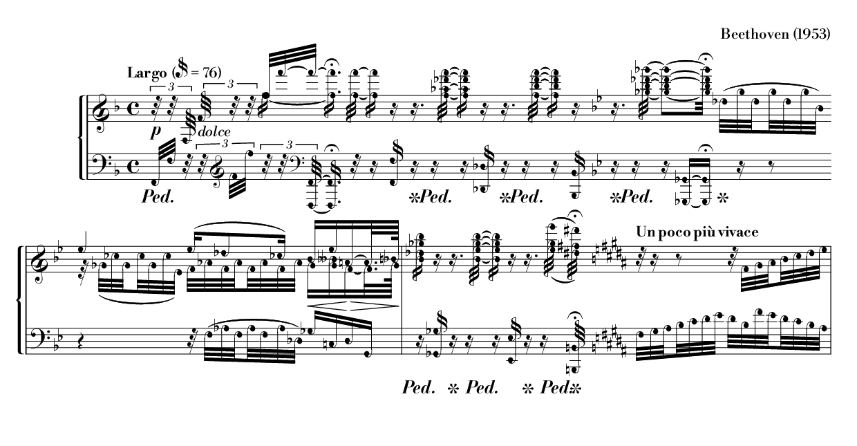
- MusicBodoni-1.0-1953-beethoven.png (80.14 KiB) Viewed 4801 times
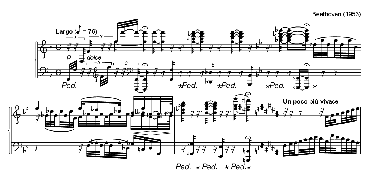
- MusicalAkzidenz-1.0-1953-beethoven.png (70.9 KiB) Viewed 4801 times
Re: New treble clef
Posted: 16 Apr 2021, 02:01
by Dan Kreider
Thanks Abraham, that’s really helpful.