Page 1 of 3
My Clef
Posted: 22 Dec 2015, 19:11
by John Ruggero
Here is my first attempt at font design, a clef modeled after one I found in a Wiener Urtext edition but widened to work better with the Maestro font which seems to require something with some heft. I now understand how difficult font design is and this may be my last as well as my first attempt!
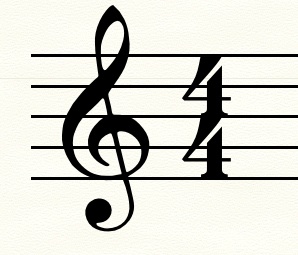
- NewClef11b.jpg (26 KiB) Viewed 10883 times
Re: My Clef
Posted: 22 Dec 2015, 21:01
by tisimst
Nice job, John! Does this clef have a name yet?
Re: My Clef
Posted: 23 Dec 2015, 01:01
by John Ruggero
Thanks, tisimst. For some reason, the clef appears slightly wider above as a jpeg. than in real life and too wide to me. But I am happy with what comes out in Finale and will use it as a replacement for the Maestro clef. I have no idea what to call it.
Re: My Clef
Posted: 23 Dec 2015, 12:20
by Knut
John Ruggero wrote:For some reason, the clef appears slightly wider above as a jpeg. than in real life and too wide to me.
JPEGs at lower resolution tend to alter the shapes a bit, making them somewhat bolder and, needless to say, less nuanced. It might also be because of lacking or faulty hinting. (Hinting is information embedded in the font to make it display well on screen, but has no impact on the printed result.) Since your curves aren't smooth, you might need to hint the glyph manually, if you want a better screen display. Otherwise, I wouldn't bother.
Oh, and very nicely done, John! Congratulations on your first glyph!
Re: My Clef
Posted: 23 Dec 2015, 13:02
by John Ruggero
Thanks, Knut. I will work on smoothing the curves. Is it just more hand work that needs to be done, or something else, or is it hopeless at this point? Here is a tiff which looks like what I am actually seeing on my monitor; not so wide. It is in the inline attaching that seems to be widening the clef.
Re: My Clef
Posted: 23 Dec 2015, 13:43
by John Ruggero
Here is what placing a png inline does to the Maestro clef and my clef; they are both "fattened".
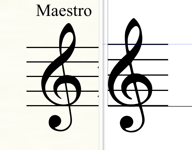
- Maestro and NewClef.png (396.11 KiB) Viewed 10861 times
Re: My Clef
Posted: 24 Dec 2015, 07:15
by OCTO
Well done John!!!
Re: My Clef
Posted: 24 Dec 2015, 14:10
by John Ruggero
Thanks, OCTO. Knut pointed out that it needs more smoothing, which I will do. I may also make it just a little smaller. It may be almost too dominant in Maestro.
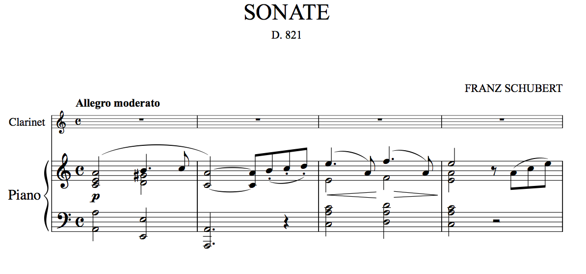
- Schubert Arpeggione 1st mov Score Am edited copy.png (70.38 KiB) Viewed 10829 times
Re: My Clef
Posted: 26 Dec 2015, 15:21
by Knut
John Ruggero wrote:Thanks, Knut. I will work on smoothing the curves. Is it just more hand work that needs to be done, or something else, or is it hopeless at this point?
Your main proportions are very good, so it is definitely not hopeless. In FontLab there are a few tricks to achieve smooth curves more easily. Otherwise its a matter of trial and error, making sure you use correct connections, and that the control points on each side of a curve is of similar length. Often it is also a good idea to delete a node at an 'extremium point' (the midpoint of an arch), only to use the nodes at the base to adjust the curve and replacing the node at the extremium when you're satisfied with the result. It is also much easier to achieve smooth curves with a minimum of nodes. You can always add more after the curves have been adjusted.
Apart from the lack of smoothness, it seems that the arch at the very bottom is thinner than the vertical stroke running through the spiral. Personally, I would prefer the same thickness for the entire stroke, from the intersection at the d line to the bottom extremium point, with slightly increased thickness as it transitions into the bowl. The same stroke width should be used for the right side of the eye as well, giving the impression that the entire glyph was drawn with the same pen.
Also, if you want your clef to be entirely compatible with Maestro, I would make all the corners straight, as opposed to the smooth, 'inky' look you have chosen.
Re: My Clef
Posted: 27 Dec 2015, 03:47
by John Ruggero
Knut, thank you so much for your positive reaction and very detailed help with this clef. I will endeavor to put it to good use and post a new result when I think that it is ready. I am learning so much through this endeavor!