Ledger line thickness
Posted: 06 Oct 2019, 09:58
Hi All,
Regarding this pic:
I also think that you can misjudge the final result because of the bad quality of the picture.
When I started to digitally edit scores, it was with Finale 2000. My first thoughts were that the output was really elegant, mostly because of its thin lines. But Finale was not flexible enough for my needs so I changed for LilyPond; I then tried to customized LP so that the output looked like a Finale score... Bad idea. Musicians made me realised that de default output was much more readable, especially when lots of ledger lines.
Actually, I often hear that my scores do not look like digital ones.
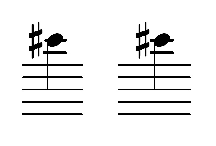
Regarding this pic:
These are standard rules -- AFAIK -- and it's much more readable.John Ruggero wrote: ↑05 Oct 2019, 21:35You are so right. I was so fixated on the length of the ledger lines, that I completely missed the difference in width, which exaggerates the effect of the former.
I also think that you can misjudge the final result because of the bad quality of the picture.
When I started to digitally edit scores, it was with Finale 2000. My first thoughts were that the output was really elegant, mostly because of its thin lines. But Finale was not flexible enough for my needs so I changed for LilyPond; I then tried to customized LP so that the output looked like a Finale score... Bad idea. Musicians made me realised that de default output was much more readable, especially when lots of ledger lines.
Actually, I often hear that my scores do not look like digital ones.