Henle then and now

Discuss the rules of notation, standard notation practices, efficient notation practices and graphic design.
User avatar
John Ruggero
Posts: 2464
Joined: 05 Oct 2015, 14:25
Location: Raleigh, NC USA

Henle then and now

Post by John Ruggero »

As discussed in a previous thread, there seem to be big style changes in Henle engraving: perhaps the biggest are that the beam angles are now highly restricted to stay entirely with the staff lines and the slurs are much more arched, which seems forced by the intent to make the ends of the slurs a fixed distance from the note heads and stems. This is a marked change from the past, as seen in the first example from Beethoven's Andante favori, which was hand engraved, as one can tell from imperfections in some of the slurs:

Henle 1975
Henle 1.jpeg
Henle 1.jpeg (269.22 KiB) Viewed 3912 times

vs. Henle 2020
Henle 2.jpeg
Henle 2.jpeg (280.03 KiB) Viewed 3912 times
To me, these changes have consequences. The new Henle engraving looks lighter (I'm not referring the darkness of the print, which is an artifact) but also somewhat cold and detached from the music, as the beams and slurs go one way and the notes another. I find the first inviting to play, the second, not so much, nor is it very distinctive. But it's certainly a matter of taste and past experience. What do other Notat.io readers think?

In anticipation of one issue, the scan makes the junctures of the beams and staff lines in the first example look terrible. It is nothing like that in my printed copy.
Last edited by John Ruggero on 02 Nov 2021, 15:56, edited 3 times in total.
M1 Mac mini (OS 12.4), Dorico, Finale 25.5, GPO 4, Affinity Publisher 2, SmartScore 64 Pro, JW Plug-ins, TG Tools, Keyboard maestro

http://www.cantilenapress.com
benwiggy
Posts: 852
Joined: 11 Apr 2016, 19:42

Re: Henle then and now

Post by benwiggy »

Their treble clef has gone from leaning forwards with urgency to listing backwards with lethargy!

They've clearly made a decision to avoid white triangles entirely. I agree that any sense of 'direction' has been lost as a result. You're right about the ballooning slurs.

I'm not wild about the old beam in the middle of 114, either: something between both the old and the new would be better.

The slurs curves are better in the old version, though the endpoints are more consistent in the new one. The fingering is placed more clearly in the new one, too.

The new one seems to have a clinical uniformity. While computer or mechanical processes will always be less 'free' than an artist's hand, this is too far.
Last edited by benwiggy on 30 Oct 2021, 09:56, edited 5 times in total.
benwiggy
Posts: 852
Joined: 11 Apr 2016, 19:42

Re: Henle then and now

Post by benwiggy »

"Just for fun", I made my own quick stab at it. These are using my current Dorico settings: the only manual adjustments were that I changed the first long slur (left hand) to a Flat slur. Dorico also wanted the last beam of the 2nd bar (right hand) to be stem up, so I flipped it.

I seem to have elements of both styles: the slightly longer stem lengths of the new style, and the beam angles closer to the old style. I dare say that I would want to change a few more options for this piece, and/or make more manual adjustments.
.
Screenshot.png
Screenshot.png (91.88 KiB) Viewed 3880 times
User avatar
John Ruggero
Posts: 2464
Joined: 05 Oct 2015, 14:25
Location: Raleigh, NC USA

Re: Henle then and now

Post by John Ruggero »

Ben, I t agree with you on almost every point, "clinical uniformity" sums it up well, and I think your version is better than both. Your version reminds me a little of the Associated Board piano publications in being both clear and warm. It makes me wonder if there wasn't an Associated Board influence on Dorico itself.

The only caveat concerns the finger numbering in your version. I actually prefer the position of the numbers in the old Henle and consider what was done in m. 111 in the new version to be an error. Yours is better than the new version in its relationship with the slurs, but a bit far from the notes in ms. 112 and 114, and way too far in m. 111. I don't agree with the proposition that finger numbers should avoid staff lines at all costs. Keeping them relatively close to the note heads of stems takes priority in my opinion, although I am not sure that I would have put them on the staff in m. 111 of the old version.
M1 Mac mini (OS 12.4), Dorico, Finale 25.5, GPO 4, Affinity Publisher 2, SmartScore 64 Pro, JW Plug-ins, TG Tools, Keyboard maestro

http://www.cantilenapress.com
benwiggy
Posts: 852
Joined: 11 Apr 2016, 19:42

Re: Henle then and now

Post by benwiggy »

John Ruggero wrote: 30 Oct 2021, 13:17 I think your version is better than both.
Well, 'that'll do nicely'. Thank you.

I leave it to Daniel to detail the extent of ABRSM influence on Dorico: though the results above are from my own settings, rather than the factory defaults.

Yes, I haven't paid much attention to fingering settings in Dorico (as I don't do much piano music), and I'm sure there's some improvements that could be made to the options.
User avatar
John Ruggero
Posts: 2464
Joined: 05 Oct 2015, 14:25
Location: Raleigh, NC USA

Re: Henle then and now

Post by John Ruggero »

Here it is in Finale with a a lot of hand changes. I went back to the first edition and changed the stem direction in m. 111, and added missing slurs in the lower staff of ms. 113-115. I also changed the fingering. Henle's fingering has always been the weakest part of their editions, and I am not the only pianist with that opinion.
Beethoven Andante favori.jpeg
Beethoven Andante favori.jpeg (311.28 KiB) Viewed 3832 times
M1 Mac mini (OS 12.4), Dorico, Finale 25.5, GPO 4, Affinity Publisher 2, SmartScore 64 Pro, JW Plug-ins, TG Tools, Keyboard maestro

http://www.cantilenapress.com
benwiggy
Posts: 852
Joined: 11 Apr 2016, 19:42

Re: Henle then and now

Post by benwiggy »

Very nice. I notice that the Old Henle version has the last slur ending on the first note of 117; the new Henle has it ending on the previous note.
User avatar
John Ruggero
Posts: 2464
Joined: 05 Oct 2015, 14:25
Location: Raleigh, NC USA

Re: Henle then and now

Post by John Ruggero »

Thank you very much, Ben.

Regarding the slur, the only primary source for this piece is the first edition:
Beethoven Andate favori 1st ed.jpeg
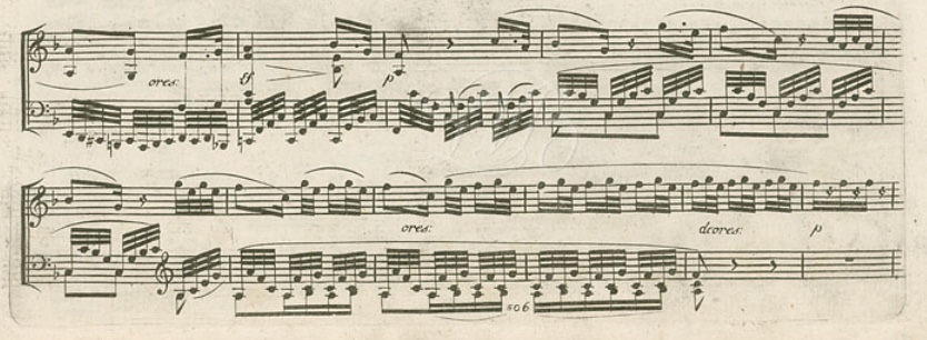
Beethoven Andate favori 1st ed.jpeg (116.21 KiB) Viewed 3813 times
While the slur seems to end on the final F as expected, the ending might make someone who is experienced with Beethoven's piano manuscripts wonder a little since the endings of many of his slurs lack precision and often overshoot their intended target. In cases like this, the engravers often took the safe way out and simply imitated the manuscript as closely as possible, often leaving ambiguity.

So I am guessing that the current Henle editor assumes that the slur overshot the E. This solution seems counterintuitive to me, given the dynamic scheme, which does not end with a subito piano which would provide a rationale for the slur to end prematurely. In a case like this, I would assume that a cigar is really a cigar, and that Beethoven was doing what 99% of musicians would do in this case, especially given the humorous effect intended. The opening four note motive G E F C is first elaborated and then reduced to three fast notes and finally only a single note remains like the grin of the Cheshire Cat. The single note then becomes the third of the following D-flat major triad to accomplish a single-tone modulation. In my opinion, breaking off before the F would work against this scheme. It should be mentioned, however, that the passage occurs three times. The first time the slur ends on the E, the second the third times apparently on the F. The long left hand slur that ends one measure earlier appears in three forms. Once without a slur, once with a slur that ends before the final chord, and the third time continuing on the chord as shown in all the examples above. Perhaps, we are dealing with a case of "progressive correction" as described in earlier threads about the Beethoven piano sonata manuscripts.

Henle editors sometimes make curious decisions about things like this; this and the awkward fingering is why I prefer other editions. A recent blog article describes how a previous Henle edition of a Schubert Impromptu had decided against a adding a chromatic trill auxiliary that most editions have assumed was missing. Why? Because it wasn't actually in the manuscript. Now, they've changed their mind and decided it should be there like everyone else. Why they didn't originally supply the missing accidental in brackets and continue to do this, since no one will ever know for sure which version is correct, is bewildering to me.

Here is the blog article:

https://www.henle.de/blog/en/2021/09/13 ... -935-no-2/

Anyone interested in the two versions of the Beethoven Andante favori may go to:

https://www.henle.de/us/detail/?Title=A ... vori%29_21

https://www.henle.de/us/detail/?Title=A ... ri%29_1476
Last edited by John Ruggero on 31 Oct 2021, 15:30, edited 3 times in total.
M1 Mac mini (OS 12.4), Dorico, Finale 25.5, GPO 4, Affinity Publisher 2, SmartScore 64 Pro, JW Plug-ins, TG Tools, Keyboard maestro

http://www.cantilenapress.com
User avatar
tisimst
Posts: 419
Joined: 08 Oct 2015, 17:57
Location: UT, USA
Contact:

Re: Henle then and now

Post by tisimst »

Very interesting thread, John and Ben. Just for comparison, I ran this passage through MuseScore 3.6, which is purported to have some significant engraving improvements over 3.5, which it probably does (but I didn't compare to that). Here is the raw default, no edits whatsoever:
Henle-then-and-now-MS3.6-default.png
Henle-then-and-now-MS3.6-default.png (245.78 KiB) Viewed 3794 times

And here's the next basic step where I've only edited the beam groups to match the source as well as flipped the RH beam in the last beat of m. 111:
Henle-then-and-now-MS3.6-beam-group-and-direction-only-edits.png
Henle-then-and-now-MS3.6-beam-group-and-direction-only-edits.png (269.46 KiB) Viewed 3794 times

I wouldn't say it's great, but it's not a horrible starting point. I can see this as totally tolerable for many people. However, in order for me to feel good about the MS output, the note spacing in particular is really going to need a lot of manual adjustments (to be fair, though, I'd probably make some note spacing adjustments to the Henle editions, too). Beams are also rather bad. Slurs could do with some improvements, too. Very curvaceous! I also don't love the gap that the cautionary treble clef inserts in m. 112 in the LH. This is one thing the Henle versions do quite nicely so as to minimally disrupt the rhythmic spacing.

Just another data point.
Music Typeface Designer & Engraver - LilyPond | Sibelius | Finale | MuseScore | Dorico | SMuFL | Inkscape | FontForge
User avatar
John Ruggero
Posts: 2464
Joined: 05 Oct 2015, 14:25
Location: Raleigh, NC USA

Re: Henle then and now

Post by John Ruggero »

Thanks for doing that, tisimst. As you said, Musescore does a good job, good enough for many uses. In fact a much better job than Finale with the first pass at the continuing left hand slur in ms. 114-115, which went a little crazy, at least with my settings. The other slurs not as well, because I didn't have to retouch the others except where there were fingering issues in ms. 111-112. Perhaps there are settings in Musescore to make them a little less curved.

I knew I would make at least one error when I posted the Finale version since I always seem to. Yes, the treble clef is too set off in m. 112. Finale does this habitually, and I have to correct every one of them by hand. I just experimented with a possible setting change, with no result. Dorico does this better than the others, but still there is too much room and needs to be corrected. And I just noticed another error in mine...oh well. Here it is again corrected:
Beethoven Andante favori corrected.jpeg
Beethoven Andante favori corrected.jpeg (316.28 KiB) Viewed 3766 times
M1 Mac mini (OS 12.4), Dorico, Finale 25.5, GPO 4, Affinity Publisher 2, SmartScore 64 Pro, JW Plug-ins, TG Tools, Keyboard maestro

http://www.cantilenapress.com
Post Reply