Page 5 of 7
Re: Dorico slurs and beams
Posted: 17 Oct 2021, 15:00
by benwiggy
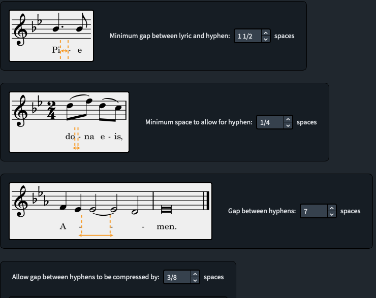
One related topic is Dorico's default options for hyphens. I think I get a better result with the following settings:
- Screenshot 9.png (69.17 KiB) Viewed 241471 times
Dorico's defaults are 2, 1, 7.5 and 1/5 respectively.
The first two options are a bit confusing. The first option, "Minimum Gap", is (it seems to me) the distance to the first hyphen
in a string of hyphens. It also acts as a kind of threshold beyond which more than one hyphen will be created.
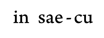
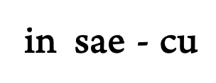
The second one, "minimum space", is the distance to be kept between a syllable and a hyphen: so large values push apart syllables (and consequentially their notes).
- Screenshot.png (13.03 KiB) Viewed 241471 times
Above is my value of 1/4; below is Dorico's 1 space. (Sorry, different zooms.)
- Screenshot 11.png (11.99 KiB) Viewed 241471 times
Dorico's default often causes considerable alteration of the spacing.
Increasing the 'compression' value also seems to produce more even results, as it smooths out places where there's not quite enough space to add another hyphen, but enough to leave a large gap.
In short: the second of the 4 options can have significant effect upon the spacing of the page: requiring more space between syllable-hyphen-syllable will push notes further apart. The first and fourth options have an effect on the evenness of consecutive hyphens: the third option just defines how frequent they are.
Re: Dorico slurs and beams
Posted: 09 Feb 2022, 01:51
by Romanos401
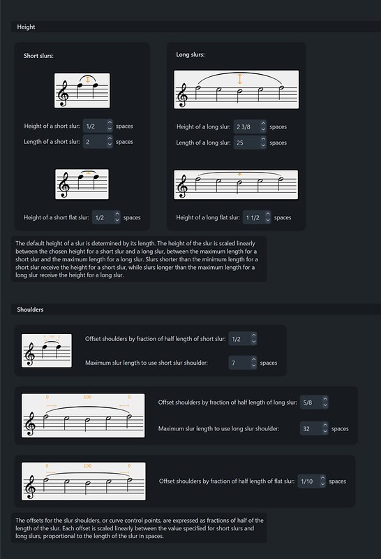
1. To me, the most glaring Dorico deficiency are the slurs, which have a strange contour with a long flat middle and the ends suddenly dipping down toward the noteheads. And the belly of the slur is too thin, so the slur doesn't catch the eye. Many have pointed this out since Dorico 1. However, with some changes to the settings, as proposed by Fred G. Unn in a Dorico thread, they can be much better. Yet the ties have a beautiful contour and fullness in Dorico! So strange.
I am suuuuper late tot his thread, but I couldn’t agree more. A year or two ago I remarked on the dorico forum that I wished there was an option to make the slurs behave like ties. The ties are so vastly superior. It’s mind boggling, really.
Re: Dorico slurs and beams
Posted: 09 Feb 2022, 04:48
by Fred G. Unn
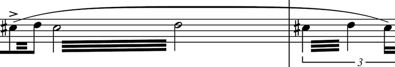
You can get pretty close by simply tweaking the settings. Here are my default unedited ties and slurs:
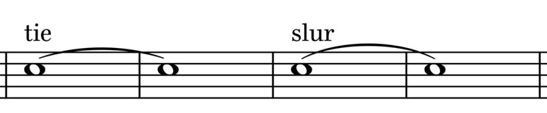
The slur has more height as obviously it will usually have more items to clear, but I could make them almost identical if I wanted, it would just mean a lot of manual slur editing later on.
Another bummer for me is that while the flat slur option is a great idea, the very odd and unconventional shape makes them mostly unusable for me. Here's a flat slur in SCORE:
Here's the same thing in Dorico (forgot to convert a tremolo, oops):
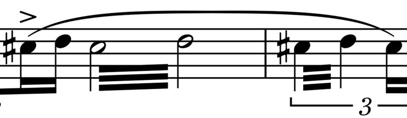
The Dorico flat slur has a very unusual shape as the shoulders of the slur are thicker than the center. If I increase the slur thickness to something fairly ridiculous it makes it easier to see what I mean:

A SCORE flat slur gradually tapers through the shoulders so the middle is the thickest part of the slur. A Dorico flat slur increases in thickness to the shoulder, decreases to the center, increases again to the next shoulder, then decreases to the tip. I don't recall seeing flat slurs with this odd shape in print before.
Re: Dorico slurs and beams
Posted: 09 Feb 2022, 13:55
by John Ruggero
Does the situation improve if you apply your special slur settings to the flat slurs?
Re: Dorico slurs and beams
Posted: 09 Feb 2022, 15:12
by Fred G. Unn
John Ruggero wrote: ↑09 Feb 2022, 13:55
Does the situation improve if you apply your special slur settings to the flat slurs?
Unfortunately it's just the design of the flat slurs. I think Dorico is simply combining two shapes together to create this, but each individual shape is thickest in the middle. In the SCORE flat slur, it is thickest in the middle flat part of the slur and looks much better to my eye. It's subtle, but I can't unsee it now and the Dorico flat slur just looks weird to me.
Re: Dorico slurs and beams
Posted: 09 Feb 2022, 15:26
by tisimst
Fred, that’s a rather unsavory discovery. There was always something that didn’t quite look right to me and I think this must have been it. The curve shoulders visually always stuck out just a little bit more.
Re: Dorico slurs and beams
Posted: 09 Feb 2022, 19:18
by Romanos401
Fred, what is your special sauce for slur settings?
Same as here?
https://forums.steinberg.net/t/octave-s ... ?u=romanos
Re: Dorico slurs and beams
Posted: 09 Feb 2022, 19:47
by Fred G. Unn
Those are pretty close. I haven't tweaked these in a while, but my current default has a few settings different. I can't remember when or why I changed them though.
Re: Dorico slurs and beams
Posted: 09 Feb 2022, 23:44
by John Ruggero
I wish that the Dorico had some really knowledgeable engravers to consult about these things, and I am not talking about someone who only knows computer engraving.
"Fred", don't you love the white on black? It's so easy on the eyes. Not.
Re: Dorico slurs and beams
Posted: 09 Feb 2022, 23:57
by Fred G. Unn
John Ruggero wrote: ↑09 Feb 2022, 23:44
"Fred", don't you love the white on black? It's so easy on the eyes. Not.

I actually do like "dark mode" and use it on most of my devices/apps. I've been wearing progressives though for a few years now and just recently got my first pair of music eyeglasses. My eye doc calls them "computer glasses" but I only got them because I had a lot of gigs in November and December where I was sightreading and realized I wasn't quite so sure what lines and spaces all the little black dots were on anymore so I got them specifically for that distance, LOL! I had a reasonably high profile gig
at the Kennedy Center last Friday so I was glad to have them. I'm still a dark mode fan, but the writing may be on the wall. I'm definitely no longer the youngest guy in the band!