Page 1 of 1
Comparison of music text fonts
Posted: 20 Jan 2021, 11:22
by OCTO
I would appreciate if you could give me a response what of these fonts look best to you. You can sort them also.
All are at 12pt.
(the text is nonsense, just testing)
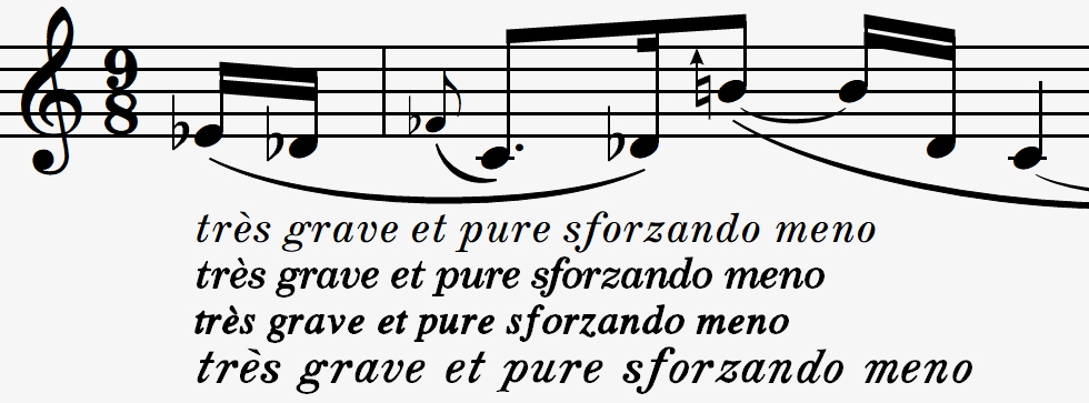
- 2021-01-20 (3).jpg (167.21 KiB) Viewed 3908 times
Re: Comparison of music text fonts
Posted: 20 Jan 2021, 13:58
by benwiggy
No. 1 is the most "Traditional Modern"

. But it could possibly be a bit heavier. 3 is second favourite. Again ,very much like classical engraving punch type.
No.4 is a kind of hybrid of the two.
What are they?
Re: Comparison of music text fonts
Posted: 20 Jan 2021, 19:34
by Harpsichordmaker
N. 3. It is dark and very legible notwithstanding the low x-height. It’s condensed, which helps in many scores.
Re: Comparison of music text fonts
Posted: 20 Jan 2021, 20:17
by Schonbergian
#4 looks the most "musical" to me. #3 has a bit too much Times in it for me, and #1 is too light to balance against the music in your example.
Re: Comparison of music text fonts
Posted: 21 Jan 2021, 11:47
by OCTO
Well, thanks for the response.
No1 is Nepomuk, No2 is my own creation, edited of 21 Century (basically a schoolbook), No3 is my fourth version of Muzitex, No4 is Espressivo.
I think I will release the latest Muzitex version soon. Good you liked it! And yes, Schonbergian, it is based on FreeSerif.
Re: Comparison of music text fonts
Posted: 26 Jan 2021, 12:54
by benwiggy
With one simple command in FontLab, I've made Bold and Bold Italic weights of Nepomuk. Some manual kerning is probably in order, but it's a good start.
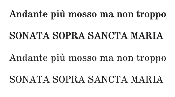
- Screenshot 4.png (146.27 KiB) Viewed 3775 times
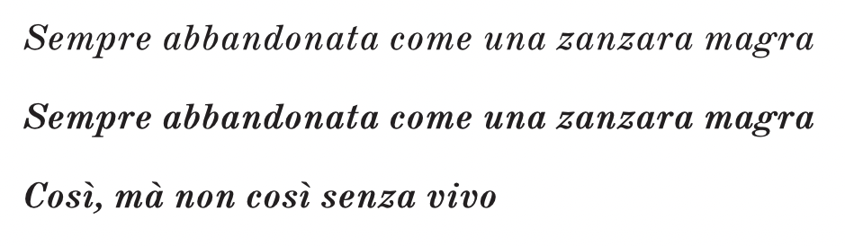
- Screenshot 6.png (132.36 KiB) Viewed 3775 times
Re: Comparison of music text fonts
Posted: 26 Jan 2021, 15:22
by tisimst
That is a good start. When I first encountered Nepomuk, I did the same kind of thing, by changing its "weight", but that's not quite the same as making it "bold", even though it is visually more black. Increasing the weight is a great way to improve a typeface's optical presence at smaller sizes (think "caption" variant). That's not all that should be done to make a typeface more legible at smaller sizes, of course, but it's an important factor. The opposite direction (i.e., un-emboldening it) can also help make a typeface more of the "display" style.
Modifying the weight slightly is also a clever way to adjust a typeface's "grade" without changing its metrics. This is useful when the typeface might be used on different media in order to keep a consistent look across them. For example, if a typeface is used on a paper that tends to spread ink a bit, a lighter grade might be preferable. If shown on a screen, a different grade might be better.
Re: Comparison of music text fonts
Posted: 26 Jan 2021, 17:20
by benwiggy
To my eye, the original Roman and Italic could do with closing up a little.