I’ve just looked at benwiggy’s engraving in Dorico, and I noticed one thing that still perplexes me.
Have a look, original VS Dorico:
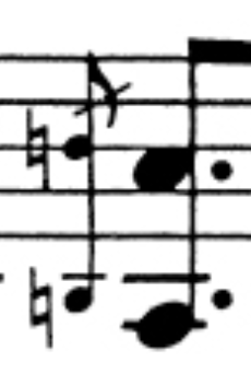
- Skärmavbild 2025-06-06 kl. 22.58.45.png (43.51 KiB) Viewed 20626 times
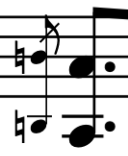
- Skärmavbild 2025-06-06 kl. 23.01.03.png (22.89 KiB) Viewed 20626 times
As you can see, the grace note not only has a smaller note-head and accidental, but also a reduced stem. I’ve now checked numerous scores with reduced staves, such as in violin sonatas, and found that the staff lines, stems, hairpins, and other notation lines are typically not reduced in size. This has always been visually frustrating for me in Finale, and now in Sibelius, and I see Dorico does the same.
If the staff size appears slightly smaller in older scores, it might be due to the small engraving tools (knives) that were used, but that’s more an artifact than a rule. Have you noticed how tiny and diluted full orchestral scores often look today when done in Finale or Sibelius? It’s surprising that no one has addressed this yet.