Page 2 of 2
Re: Staff and leger line thicknesses
Posted: 01 Jul 2025, 16:51
by benwiggy
The JSON values are used when you check the option to use the font's defaults, in the Music Fonts dialog.
Otherwise, Dorico uses the values in Engraving Options, which may be different.
Re: Staff and leger line thicknesses
Posted: 03 Jul 2025, 22:40
by hautbois baryton
I've thickened up some of these values (including bar lines), any improvement? I included a part with more ledger lines to better show the change.
RE: time signatures, the extra size is on purpose (a hold over from working with musical theatre books, where it is an essential feature).
Re: Staff and leger line thicknesses
Posted: 04 Jul 2025, 04:12
by Schonbergian
It's better, but you want to make sure it's evenly darker - now elements like the hairpins and bar numbers seem too thin in comparison. I would also even out the slurs by thickening the ends slightly but thinning the centre
Re: Staff and leger line thicknesses
Posted: 04 Jul 2025, 10:42
by Fred G. Unn
A few more comments ...
1) In addition to the above comment about hairpins and bar numbers, The rehearsal number enclosures are too thin as well. Stems also seem really thin.
2) The just released Dorico 6.0.2 version now has an option to align the bar numbers and multibar rest bar number range that you might want to consider.
3) Having the multibar (and single bar) rest count collide with the top of the staff reduces legibility. I would add a touch of space there.
4) I know you said the extra size with time sigs is on purpose, but it's not really working for me. If you're going to use oversized, then it needs to be even a bit larger IMO, as it just sort of looks like an error now. Also, when I've seen them oversized, it's often just at the top, a la Clinton Roemer:

- cr.png (2.78 MiB) Viewed 164591 times
BTW, Emily Grishman is sort of the current Broadway queen of music prep and she doesn't use oversized time sigs in her house style.
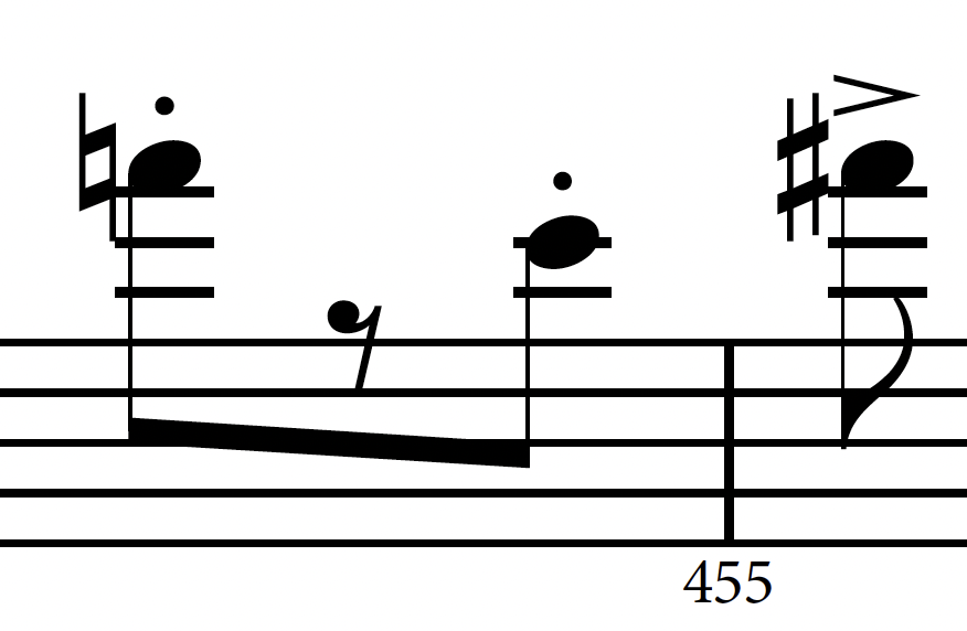
5) You might want to check your ledger line settings. The accidental shouldn't be touching and there should be a bit of space here.

- ledger.png (129.91 KiB) Viewed 164591 times
6) As of Dorico 6, you can use OpenType features if they are available in the font. It looks like you are using Minion for your bar numbers. If you select OpenType / Proportional Figures, you are going to get much better kerning on your numbers. Compare the below to yours.

- min.png (55.51 KiB) Viewed 164591 times
Re: Staff and leger line thicknesses
Posted: 05 Jul 2025, 22:45
by MichelRE
how do you know if a font is OpenType?
It looks like none of my fonts have anything in that "OpenType Features" box. It's always blank.
Is Nepomuk an OpenType font?
Re: Staff and leger line thicknesses
Posted: 06 Jul 2025, 17:44
by hautbois baryton
Thank you all again for your very thoughtful suggestions.
I much prefer the updates that I've made based on your recommendations... it looks so much less meager on the page! Here's the example.
Re: Staff and leger line thicknesses
Posted: 08 Jul 2025, 17:02
by Fred G. Unn
MichelRE wrote: ↑05 Jul 2025, 22:45
how do you know if a font is OpenType?
It looks like none of my fonts have anything in that "OpenType Features" box. It's always blank.
Click the + sign at the bottom which will open up a menu where you can select any available OpenType features. The features will vary by font, but it will look something like this:

- ot.png (102.62 KiB) Viewed 164279 times
Re: Staff and leger line thicknesses
Posted: 08 Jul 2025, 20:51
by MichelRE
ok, I finally found that.
now, does "kerning" have the same effect as "proportional figures"?