Page 9 of 11
Re: Clef design comparision
Posted: 19 Nov 2015, 15:45
by John Ruggero
I think you nailed the difference, Knut. While the cross is symmetrical on both, the eye is narrower on Wiener which makes the lower part of it dominate so that appears quite upright it and sit very solidly on the bottom line. I think that this is something that you might consider. In comparing the Wiener to the old Henle, I also see superiority of various kinds in the Wiener. in general, the Wiener feels more natural, the Henle more stylized.
Re: Clef design comparision
Posted: 19 Nov 2015, 18:50
by Schneider
tisimst wrote:[...] I now show you all the treble clefs that I've designed to work with LilyPond [...]
Sorry for the late reply, but congrats, very nice designs over here.
And I'm almost sure to recognize an italian inspiration here:

- italia-design.png (3.89 KiB) Viewed 17748 times
Very interseting.
Re: Clef design comparision
Posted: 19 Nov 2015, 20:21
by tisimst
Indeed! Italian is correct, Pierre. It is the design of Giovanni Murolo.
Re: Clef design comparision
Posted: 23 Nov 2015, 08:24
by Knut
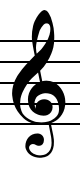
John Ruggero wrote:I think you nailed the difference, Knut. While the cross is symmetrical on both, the eye is narrower on Wiener which makes the lower part of it dominate so that appears quite upright it and sit very solidly on the bottom line. I think that this is something that you might consider.
Here's the revised clef in action. I've reverted the eye back to the earlier width. It's probably still not as narrow as the Wiener, but I think it's well balanced, and still a nod to the Durand clef.
- Gigue.jpg (260.08 KiB) Viewed 17706 times
Re: Clef design comparision
Posted: 25 Nov 2015, 07:04
by OCTO
I find your clefs now very harmonious!
Also the

is very nice. And

as well.
I have problem with

it is to much "italic", the horizontal lines are to much angled for my taste.
Also, I have some problems with noteheads, they look to much circled...
Re: Clef design comparision
Posted: 25 Nov 2015, 07:22
by Knut
OCTO wrote:I find your clefs now very harmonious!
Also the
is very nice. And
as well.
I have problem with
it is to much "italic", the horizontal lines are to much angled for my taste.
Also, I have some problems with noteheads, they look to much circled...
Thanks, Octo.
The angle on the horizontal bars of the
is the same as on the
, so changing one without the other, would make them less harmonious. Not all fonts use the same angle, but personally I like it this way.
The noteheads are supposed to be on the circular side, as this is common in french editions from the 1800-1900s. German editions generally feature bigger, more oval noteheads.
Also, more oval noteheads would mean wider flags, which would essentially change the entire identity of the font.
Re: Clef design comparision
Posted: 25 Nov 2015, 18:57
by John Ruggero
Great job, Knut!
Having now actually experienced the joys and frustrations of clef designing first hand, I understand how difficult it is to make the G clef. The slightest change in angle, position, thickness etc. makes a great impact on the whole. Even working directly from a model is difficult.
I think the latest version of your clef has integrity, balance and beauty; and it fits the rest of your font design well. For me, the eye is slightly tall for the spiral, but that is possibly what makes your clef distinctive.
Not having read his post, I immediately had the same impression about your note heads as OCTO. They seem a little "plump". I don't think that the long axis needs to be longer; but the short axis could be slightly shorter. Or would rotating them slightly clockwise do the trick? I looked through several French and German editions at high magnification and did not see the difference that you mentioned. Continued looking at your example makes me sometimes doubt my opinion, however. I ask myself: maybe I am just not accustomed to the distinctive look of the note heads?
The accidentals look fine to me, as well as all the other symbols. The rests are wonderful. The brace is beautiful. It might be placed a little closer to the left bar line for my taste.
Your font has a fresh, clean look that makes me want to play the piece. That's what it is all about. Congratulations!
Re: Clef design comparision
Posted: 25 Nov 2015, 21:09
by Knut
John Ruggero wrote:Great job, Knut!
Having now actually experienced the joys and frustrations of clef designing first hand, I understand how difficult it is to make the G clef. The slightest change in angle, position, thickness etc. makes a great impact on the whole. den working directly from a model is difficult.
I think the latest version of your clef has integrity, balance and beauty; and it fits the rest of your font design well. For me, the eye is slightly tall for the spiral, but that is possibly what makes your clef distinctive.
Why thank you, sir!
The eye might be a bit tall, yes. I haven't actually lengthened it, but with the decrease in width and the fact that I've moved it slightly upwards after increasing the size of the spiral, might merit a shorter eye. I'll have another look when my eyes are more 'settled'. I've stared way too much at this clef for a while!
John Ruggero wrote:Not having read his post, I immediately had the same impression about your note heads as OCTO. They seem a little "plump". I don't think that the long axis needs to be longer; but the short axis could be slightly shorter. Or would rotating them slightly clockwise do the trick? I looked through several French and German editions at high magnification and did not see the difference that you mentioned. Continued looking at your example makes me sometimes doubt my opinion, however. I ask myself: maybe I am just not accustomed to the distinctive look of the note heads?
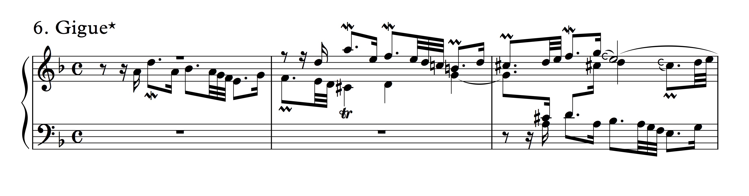
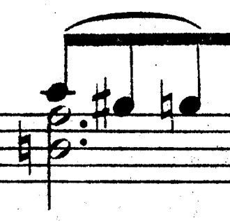
Well, the differences between 'French' and 'German' style might not be as clean cut as I make it out to be. It might be more precise to compare different publishers, regardless of nationality. However, the comparison below of (in my opinion) the epitome of French engraving, Durand, and a typical high quality German publisher like Peters (both ca. 1920) should give you some idea of the difference I'm talking about. Durand's noteheads might take some getting used to, but they lend themselves beautifully to the tight and busy conditions of modern music. My noteheads are actually more oval in shape than Durand's, (closer to those used by Eschig), in an attempt to make them more 'accessible'.
- Durand.jpg (27.21 KiB) Viewed 17656 times
- Peters.jpg (20.31 KiB) Viewed 17656 times
And just to make sure that you get an idea of the overall balance, here are the four main notehead types in my font:
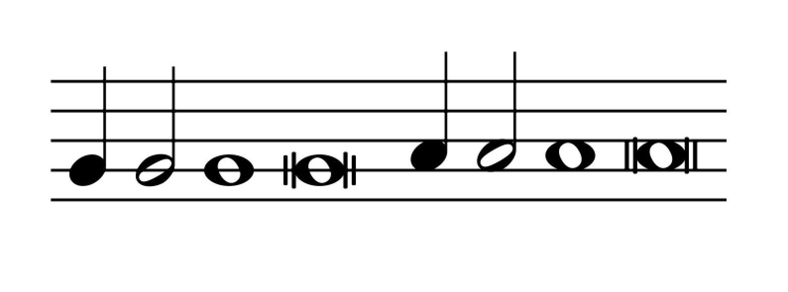
- Menuet main noteheads.png (41.39 KiB) Viewed 17651 times
BTW, I'm not really sure what you mean by 'plump' in this context, though. My English–Norwegian dictionary translates it as either
crude and tasteless or
large and awkward, none of which is very good.

Re: Clef design comparision
Posted: 26 Nov 2015, 17:41
by John Ruggero
A little more investigation showed that note head size and shape depends on the publisher. Durand does seem to have the smallest and most circular note heads, just as you said.
Re: Clef design comparision
Posted: 27 Nov 2015, 19:40
by John Ruggero
Sorry, I missed the final comment about "plump". Your dictionary is not correct: we say "plump" about someone who is not really fat, but not thin either. "Pleasingly plump" is an expression sometimes used of someone who is a little fleshy in an attractive way, but not fat. So I would say that your noteheads are "pleasingly plump", which is not so bad at all.