Page 1 of 1
Resized staff/note and line thickness
Posted: 06 Jun 2025, 21:10
by OCTO
I’ve just looked at benwiggy’s engraving in Dorico, and I noticed one thing that still perplexes me.
Have a look, original VS Dorico:
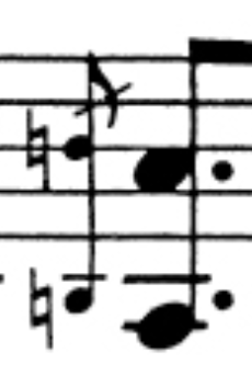
- Skärmavbild 2025-06-06 kl. 22.58.45.png (43.51 KiB) Viewed 22059 times
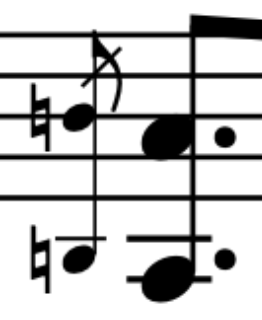
- Skärmavbild 2025-06-06 kl. 23.01.03.png (22.89 KiB) Viewed 22059 times
As you can see, the grace note not only has a smaller note-head and accidental, but also a reduced stem. I’ve now checked numerous scores with reduced staves, such as in violin sonatas, and found that the staff lines, stems, hairpins, and other notation lines are typically not reduced in size. This has always been visually frustrating for me in Finale, and now in Sibelius, and I see Dorico does the same.
If the staff size appears slightly smaller in older scores, it might be due to the small engraving tools (knives) that were used, but that’s more an artifact than a rule. Have you noticed how tiny and diluted full orchestral scores often look today when done in Finale or Sibelius? It’s surprising that no one has addressed this yet.
Re: Resized staff/note and line thickness
Posted: 06 Jun 2025, 21:16
by OCTO
Other examples, random taken (Debussy, Violin Sonata)
Re: Resized staff/note and line thickness
Posted: 11 Jun 2025, 05:17
by John Ruggero
What a great point. I agree. Reducing the thickness of the staff lines and stems gives a less substantial appearance and is harder to read. Perhaps you should make your point over at the Dorico forum, where Daniel will be sure to see it.
Re: Resized staff/note and line thickness
Posted: 11 Jun 2025, 14:06
by hautbois baryton
I have found that leger lines in Dorico for cued music are far too spindly, and I increase them by 1/4 space to make them more visible.
I'm not sure offhand the percentage difference between cued notes and grace notes, but I'm sure it's not far.
Re: Resized staff/note and line thickness
Posted: 17 Jun 2025, 10:26
by OCTO
John Ruggero wrote: ↑11 Jun 2025, 05:17
What a great point. I agree. Reducing the thickness of the staff lines and stems gives a less substantial appearance and is harder to read. Perhaps you should make your point over at the Dorico forum, where Daniel will be sure to see it.
I am not a Dorico user, so I don't feel it is OK commenting on something I haven't even used.
However, this is more-less a question that could be applied to all available software. Maybe LilyPond has a solution for that.
Re: Resized staff/note and line thickness
Posted: 19 Jun 2025, 12:37
by benwiggy
It has also been noted that Dorico scales slurs from grace notes, too. You can change the scale on a slur to "Normal" in the Properties, (though it's not always an improvement, given the short compass -- they can look like a dead slug.)
I think most computer software has been guilty of just scaling everything for different staff sizes, grace notes and cues, rather than compensating for the different size (as with optical size in fonts). Lilypond does use different fonts for different sizes; though how much effort goes into the designs, I don't know.
OCTO wrote: ↑06 Jun 2025, 21:10
If the staff size appears slightly smaller in older scores, it might be due to the small engraving tools (knives) that were used, but that’s more an artifact than a rule.
I imagine that quite a few engraving practices are based on the capabilities of the available technology. The question is: given that computer technology allows things that weren't possible before: what would we prefer?
I'm not sure that a Rastral size of 7 with the same staff lines as Size 1 would look optimal.
Re: Resized staff/note and line thickness
Posted: 19 Jun 2025, 20:12
by David Ward
I wonder if something along these lines might work: when the note size is reduced to 65% the stave line thickness &c might be reduced to 85%?
Today my old eyes have been struggling with a B & H study score of Elektra by Strauss. Some pages have a fearsome number of staves, necessitating a reduction of the stave height, but I'm unable to work out whether or not the stave lines are the same thickness. For comparison, I've just checked Die Frau ohne Schatten which also has some pages so crowded that the stave height has to be noticeably reduced. This score I have in the Dover edition (did I lend my old study score to someone?), an edition which has larger pages, making it a little easier to read. I still can't work out whether or not the the stave lines are the same thickness throughout.