Page 2 of 2
Re: Florian's Nepomuk - and reimagining a Durand score
Posted: 18 Apr 2022, 09:07
by benwiggy
OK, I've added the Roman numerals to the Regular and Italic styles. I'm pretty happy with the fonts now, and I've tracked down as many kerning pairs as I can find. So I'm declaring v2.02 the 'stable release', and don't intend to do any more for the time being, unless something hideous is uncovered.
I'm keeping Greek, Cyrillic and IPA chars as a longer-term project...
Re: Florian's Nepomuk - and reimagining a Durand score
Posted: 19 Apr 2022, 22:53
by Quirquincho
Outstanding work, thank you very much for adding the numerals! This will now be the default font in my personal projects (of which I hope to share something soon for critique).
PS: Should I let you know here if I come across any kerning pair issues in the future?
Re: Florian's Nepomuk - and reimagining a Durand score
Posted: 20 Apr 2022, 06:56
by benwiggy
Quirquincho wrote: ↑19 Apr 2022, 22:53
PS: Should I let you know here if I come across any kerning pair issues in the future?
I suppose....

Re: Florian's Nepomuk - and reimagining a Durand score
Posted: 19 May 2022, 17:35
by benwiggy
I've released a new version, 2.03, of Nepomuk.
There are now Small Caps variants in both Regular and Bold, so you can use small caps in apps that don't support OpenType features.**
(I've actually swapped the lowercase and small caps glyphs, so if you do use it in an app like InDesign, turning ON the small caps feature will switch the small caps glyphs to lowercase!)
Kerning has been improved.
A few glyphs have been added in some styles (to complete the same glyphs across the styles).
** Music Notation apps that don't support OpenType features include ... <checks notes> ... all of them.
Re: Florian's Nepomuk - and reimagining a Durand score
Posted: 19 May 2022, 17:53
by Sorel
Thank you for your hard and valuable work!
If I may post a suggestion, that would be the change in thickness between capital and small caps letters in both Bold and Regular styles. Adding weight to the small caps will fix the inconsistency.
You might find my kerning-related observation useful (Nepomuk Regular & Bold):
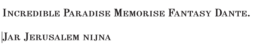
"Jar" and "jar" seem to have a noticeable difference in distance between the first two letters. I believe the problem lies in the right metrics of letter "J".
"ij" seems to be a little bit too far apart.
The first (capital) letter in "Incredible" looks a bit detached. The same (to its own extent) is true for some other capital letters. For instance, take the following words: "Paradise", "Memorise", "Fantasy", "Dante".
I will be happy to help and test in any way I can.
Re: Florian's Nepomuk - and reimagining a Durand score
Posted: 20 May 2022, 06:38
by benwiggy
I agree that the Bold, certainly, seems a little light compared to the caps. I used Fontlab's "automatic" kerning to standardize most of the letters.
I can see your point on the I of incredible, perhaps, but the D of Dante looks almost too close by my reckoning. The rest look pretty good to me.
Some letter combinations will show a lot of white space, but can't be moved up because they have some part that's already close, like SAL in JERUSALEM -- I think that's true for IJ, too. It look far apart, but the descender of the J makes it difficult to move closer.
- Screenshot.png (65.56 KiB) Viewed 11777 times
But yes, probably some refinements still to come.
Re: Florian's Nepomuk - and reimagining a Durand score
Posted: 20 May 2022, 18:01
by benwiggy
Actually, I've just done a 'hot-fix'. Small caps are a little thicker; a couple of rogue glyphs have been fixed, and the kerning may or may not be improved.
Re: Florian's Nepomuk - and reimagining a Durand score
Posted: 03 Jun 2022, 11:47
by benwiggy
Just to update: v2.04 now has even better kerning(!), a few more characters (including the T caron for Kaťa Kabanová), some discretionary ligatures for fj and ij, and other improvements.
https://github.com/benwiggy/nepomuk/releases
I'm hoping that's probably reached a sufficient level of ... sufficiency. The letters are intentionally quite tightly tracked: you can then letterspace them out if you prefer.
Re: Florian's Nepomuk - and reimagining a Durand score
Posted: 13 Aug 2022, 14:31
by OCTO
Very beautiful indeed!
Now you have reminded me that I want to continue working on Old Music Standard! There are plenty of things that need to be corrected.
Re: Florian's Nepomuk - and reimagining a Durand score
Posted: 14 Aug 2022, 00:52
by odod
Indeed a very good improvement here!
Thanks for the update
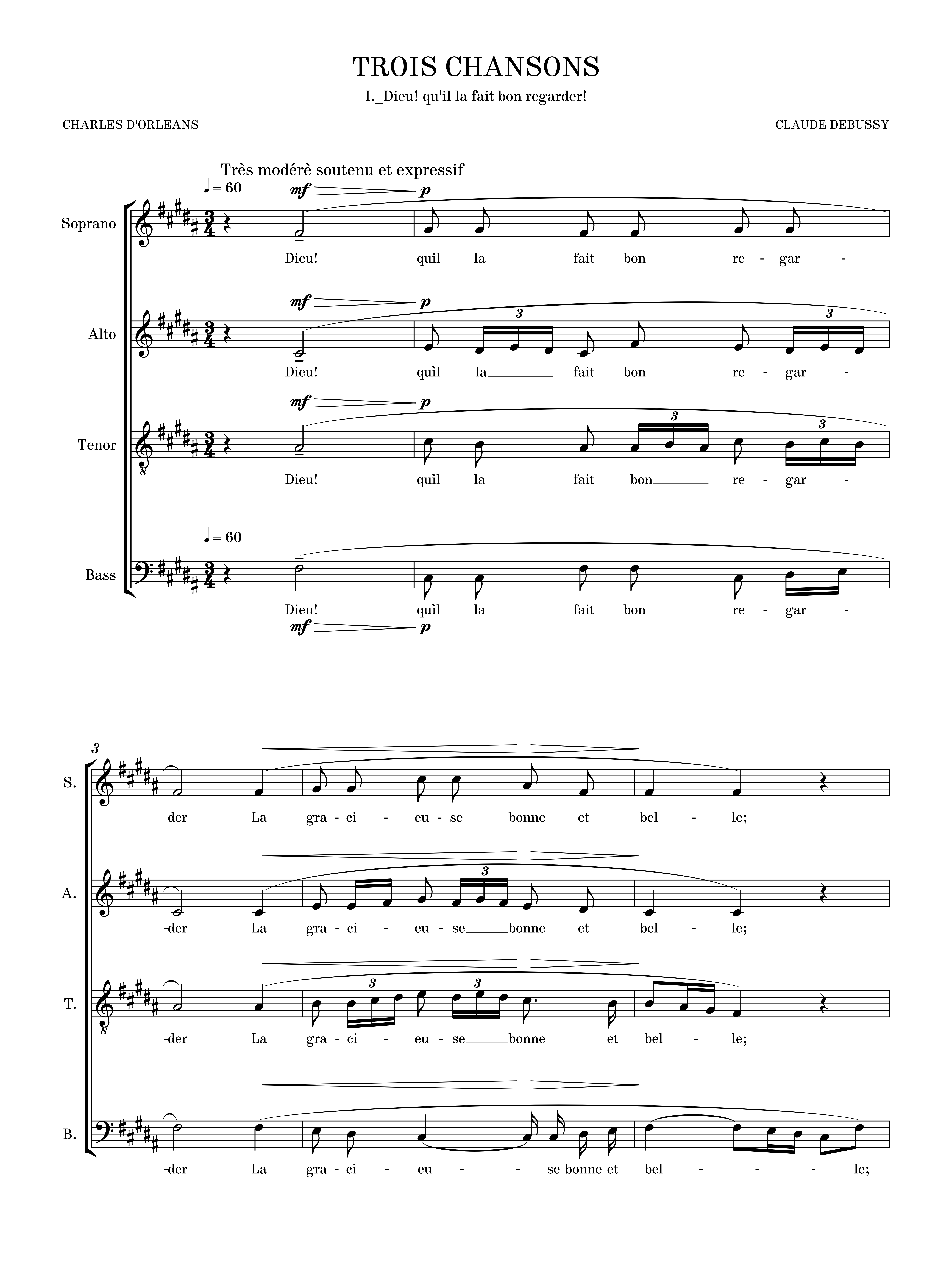
- Dieu! qu`il la fait bon regarder_ Claude Debussy_0001.png (1.01 MiB) Viewed 10360 times