Page 1 of 1
Trill, arpeggio and gliss wavy lines
Posted: 09 May 2022, 10:12
by benwiggy
What's your favourite wiggle?
I'm looking at the wavy lines used for trills, arpeggios and gliss. The variations are the amplitude, the frequency of repetition, and the thickness of the stroke (and any contrast in stroke as the shape turns).
Does anyone have a preference between these two:
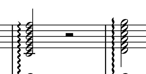
- Screenshot.png (20.26 KiB) Viewed 8884 times
So, one is more oscillatory, and the other a bit more slender.
Bravura favours the slender type; November and Abraham's MTF fonts favour the wavier kind. Maestro seems somewhere in the middle.
Please post any examples of your favourite wiggles, please!
Re: Trill, arpeggio and gliss wavy lines
Posted: 09 May 2022, 13:14
by John Ruggero
Maestro is my favorite, for the reason you mentioned:
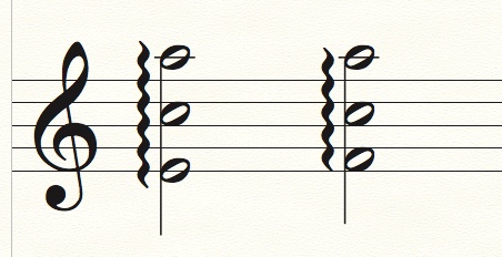
- Maestro arpeggios.jpeg (42.36 KiB) Viewed 8877 times
Re: Trill, arpeggio and gliss wavy lines
Posted: 09 May 2022, 13:19
by benwiggy
The few plate engraving examples I have look more like Maestro, but with thinner strokes in the thin bits. (though it's often hard to tell on pixelated scans and photocopies).
Re: Trill, arpeggio and gliss wavy lines
Posted: 09 May 2022, 20:07
by David Ward
I use Engraver, but I wouldn't go so far as having a favourite…
Re: Trill, arpeggio and gliss wavy lines
Posted: 09 May 2022, 21:05
by JJP
Especially for rolled chords, I like the example on the right, more like the Maestro and Engraver lines. They have a lower amplitude which allows the eye to flow down the line more.
The line on the left has a higher amplitude which creates more visual noise and implies oscillation. This hints at eye motion perpendicular to the line which I find unsettling. I feel the line should draw the eye up or down the length in most uses.
Re: Trill, arpeggio and gliss wavy lines
Posted: 10 May 2022, 02:41
by John Ruggero
Great analysis. That's how the left one strikes me as well, "unsettling". The one on the right goes to the the other extreme and is too mushy and undifferentiated and begins to look like solid line. The Engraver in David's example is OK but not prominent enough. But one often sees them like that in hand-engraved music.
Re: Trill, arpeggio and gliss wavy lines
Posted: 10 May 2022, 06:56
by benwiggy
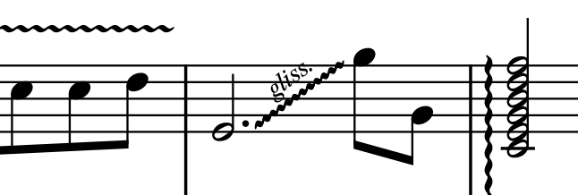
Thanks all. I'm revising the wiggly lines in Sebastian precisely because I wasn't entirely happy with them.
I've now got this:
- Screenshot.png (23.5 KiB) Viewed 8816 times
where you can see trill, gliss and arpeggio.
Here's Maestro:
- Screenshot.png (23.92 KiB) Viewed 8816 times
and here's Bravura:
- Screenshot.png (23.28 KiB) Viewed 8816 times
.... aaand now the differences between them all seem almost non-existent!!!

Re: Trill, arpeggio and gliss wavy lines
Posted: 10 May 2022, 19:17
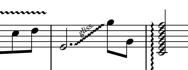
by John Ruggero
Interesting. The Maestro glissando in my Finale 25.5 default file looks like this:
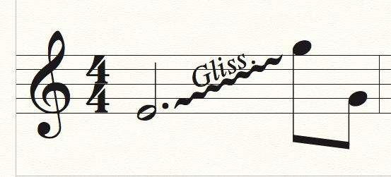
- Maestro gliss.jpeg (52.91 KiB) Viewed 8784 times
Re: Trill, arpeggio and gliss wavy lines
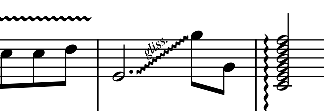
Posted: 11 May 2022, 11:40
by benwiggy
It's likely that Maestro has only one wavy line character for all types of notation, whereas Finale Maestro will have several different glyphs for different notation types and sub-styles thereof. The SMuFL standard provides several different 'speed' wavy lines for trills, for example.
Re: Trill, arpeggio and gliss wavy lines
Posted: 11 May 2022, 12:10
by John Ruggero
Thanks, Ben. I guess I don't care for any of the gliss. lines in your examples and prefer the gentler "speed" of the Maestro wavy line. And actually I really prefer a straight line for a gliss., which is what one usually sees in piano music.