Welcome aboard, John.
I don’t think I could—or should—hold back my praise for your analyses of music and scores by various composers. In my surroundings, it’s rare to encounter someone so passionate about these subjects. Your sharing has given me a deeper understanding of these composers’ works and their habits, and I am truly grateful for the opportunity to learn from it. I hope you will continue to maintain your enthusiasm as always; what you do is genuinely meaningful.
Returning to the topic:
John Ruggero wrote: ↑01 Oct 2025, 23:13
I rely on my eye to come up with what seems to me to be the most pleasing and musical result.
I believe that when one possesses exceptional “taste,” doing so is wise. Even an excellent engraver who follows a set of rules should adjust beyond those rules according to the actual situation. I have always believed that “when necessary, all rules may need to be broken.”
In modern software, I hope there could be a program that provides enough freedom for users to define their own basic rules and output consistently. When adjustments are needed, users should only have to make modifications based on this foundation. I think this represents a more ideal state.
Currently available software—including open-source MuseScore—generally encounters certain obstacles or bugs in this regard.
John Ruggero wrote: ↑01 Oct 2025, 23:13
In the case of the example with the ascending E-F and the descending F-E I would use Ross's solution because I find it is more restful and pleasing to the eye for beams to cover the staff lines as much as possible, as if succumbing to gravity, rather than between the staff lines, as if suspended in space.
I’m glad to hear an explanation of Ted Ross’s beaming from another aesthetic perspective—I think I can understand the meaning you’re trying to convey.
I’d also like to take this opportunity to share further why I find the style shown in the top post beautiful.
Before deciding on local details, I always try to grasp the overall structure first.
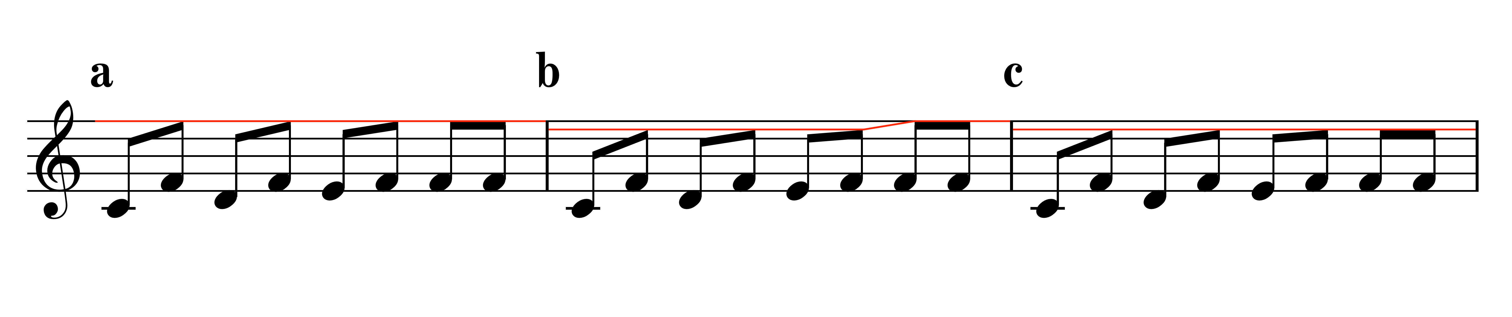
- 谱例2.png (211.46 KiB) Viewed 97 times
Within the staff, the default stem length is one octave. The height of the beam is essentially determined by the note closest to it (the outermost note), with the beam gradually slanting as the interval increases. In this style, beams of different patterns can align when the outermost note is at the same pitch, as shown in (a). Normally, the slant of a beam does not exceed 1 sp, but the engraver must decide whether additional adjustments are needed depending on the actual pitch difference or horizontal spacing.
Example (b) shows the solution given by Ted Ross in his book. Considering that the handling of 16th-note beams and 8th-note beams is basically the same, I can understand Ross’s reasoning. As mentioned earlier, this approach was originally devised to work around the limitations of printing technology. For that reason, stems for notes at the same pitch had to be shortened in order to accommodate different beaming patterns. This results in stems of unequal length for notes of the same pitch, which, in my view, creates a sense of visual imbalance and inconsistency.
Example (c) shows an adjustment based on (b). I think I have very rarely, if ever, seen anyone treat the F–F in this way.
The cleverness of (a) lies in the fact that this alignment arises naturally from the standard stem length. While it’s somewhat larger than the example Fred posted earlier, it’s still just a very local instance. In the context of an actual score, I believe this approach can create a more elegant overall impression.
It’s also worth mentioning that the above examples are based on the outermost note being placed in a staff space. If the note happens to be on a line, the case of a second interval (a 2nd) would differ slightly in order to align with the 16th-notes.