oktophonie wrote: 21 Dec 2020, 13:22
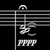
Yes, I never liked the mp ligature either and was a bit surprised to see it in Bravura. (Of course, mp is a bit of a nonsense dynamic anyway, as Berio used to say, but that's another matter)
Yes, the "best" way to start a symphony is in mp.
Actually, you don't need ligatures in pp or ff, if the symbols are designed and adjusted with care. Looking forward to see more of your work!
Finale 27.5 • Sibelius 2026.2• MuseScore 4+ • Logic Pro X+ • Ableton Live 12+ • Digital Performer 11 /// MacOS Monterey (secondary in use systems: Fedora 35, Windows 10)
oktophonie wrote: 21 Dec 2020, 13:22
Yes, I never liked the mp ligature either and was a bit surprised to see it in Bravura. (Of course, mp is a bit of a nonsense dynamic anyway, as Berio used to say, but that's another matter)
Yes, the "best" way to start a symphony is in mp.
Actually, you don't need ligatures in pp or ff, if the symbols are designed and adjusted with care. Looking forward to see more of your work!
how about this font octo? i think most Japanese music edition using this kind of font
SCHOENBERG Drei Klavierstuecke, Op 11.png (650.86 KiB) Viewed 10760 times
Yes, I've seen this quite often in Japanese engraving; it works rather well, I think.
I'm most intrigued by the text font though (like in b.14) - what's that?
odod wrote: 28 Dec 2020, 07:16
how about this font octo? i think most Japanese music edition using this kind of font
I am not sure. I would definitely NOT use it for my publications. Somehow it looks 'schizophrenic' to me.
Finale 27.5 • Sibelius 2026.2• MuseScore 4+ • Logic Pro X+ • Ableton Live 12+ • Digital Performer 11 /// MacOS Monterey (secondary in use systems: Fedora 35, Windows 10)
I like my Treble clefs to be reasonably upright, and not leaning too far forward or too far back. Sibelius's clef leans back too much, I think.
The top loop here leans a little too far forward.